The basics of designing a deck or patio include considerations of space, visual limits, light, color, textures, form and perspective as well as natural considerations like sound, wind, shade and sun.
After several walks around the planning trail, you've seen your possible deck or patio sites with a new perspective. At the very least, you have seen more and different possibilities for your outdoor rooms than you thought you had before, Now, consider some basic design elements, Some of our suggestions are very general and some are specific, but they are all things to keep in mind later when you sit down to develop your concept design and plan.
Sensory force: Decks and patios are spaces to do things in and to move through to get somewhere else.
There is a visual and sensual aspect of space, however, that greatly influences how we feel about being there, It could be called a sensory force -- the completeness of the feeling that grows out of successful integration of the uses for the spaces, In natural environments, a certain equilibrium usually exists -- a balance that creates what we often call "natural beauty," But in man-made environments such as your deck or patio, the balance or integration of elements must result from you , the designer, having strongly carried out your intentions, A strong "flavor": Your outdoor space will be most successful if you anticipate the "flavor " you want it to have, and then follow through consistently to get it. This is like making a ...
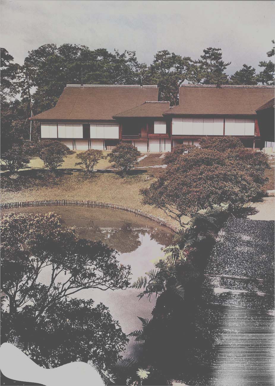
--------- The Katsura Imperial Villa, built in three stages
during the sixteenth and seventeenth centuries, exemplifies Intentioned
design, relating Interior and exterior living spaces. The additions
stand like a flight formation of wild geese, and orient decks and views
to avoid the hot summer sun and face the full autumn moon. The sensory
force. prevailed throughout the creation of this extra ordinary house.
--------------------
...stew. If you add a little amount of every spice on the shelf to the pot , the end result won 't be as good as it is when you add only the spices that blend well to create a distinct flavor , In designing spaces, you want to create a distinct flavor by making clear and intentional design statements, This distinct flavor or character will come from clear and simple forms that are used strongly, An example is the use of textures that contrast (but only a few of them) , If you are going to use an unusual angle, repeat it regularly throughout the design - don't suddenly start using an unrelated angle, If, for instance, you are using 45 degree angles on one side of the deck, you should not switch to 30 and 60 degree angles on the other side, enclosure and separation: Out door rooms are spaces that have some degree of enclosure, separating them from surrounding spaces, This enclosure is created by vertical projections from the ground, Shrubs, trees, the wall of a building and a multiple of other vertical things can suggest the closing in of space, Tree boughs or trellised vines overhead can suggest an airy ceiling, You should be conscious of the exaggerated effect of vertical planes in outdoor space, A slight drop or rise in elevation is far more noticeable than a slight extension or contraction of horizontal distance, For instance, it is easy to tell the difference between a 6-foot and 8-foot wall 20 feet away, On the other hand, it is not easy at all to distinguish between a 6-foot wall that 's 18 feet away and another 20 feet away, This point is important in thinking of outdoor rooms because you will want to create a balance between the planes of walls and floor.
Human scale: In general, spaces are comfortable if they relate to the scale of the human form, A good general rule says that external en closures are most agreeable when their walls are one-half to one-third as high as the space's width, If the walls are less than one-fourth as high as the width, the space won't seem to be enclosed, It will leak out, visually, and though it may still serve its outdoor uses well , it won 't have the comfort of the sensory force, When the wall s are higher than the width, the space may seem to be a trench or pit , which isn't necessarily bad, A small courtyard completely surrounded by high wall s can be a jewel of light.
In thinking about enclosure, keep in mind that the space to be enclosed need not be limited to the actual deck or patio area, You may find that your space is formed by trees at the back of the lot , and that what you want to do is feature the vista toward them, You will still want to create a feeling of space on the deck or patio, but you won 't be as concerned about its enclosure because that will be taken care of by the enclosure beyond, The importance of the sense of enclosure really can't be overstated as a vital part of your design, Look around you as you visit outdoor rooms and try to detect how well space is defined, Chances are that you will like best the places with visual limits that strongly define the space,
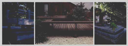
--------- Visual limits to deck spaces are suggested by railings. Clear
statements of these limits create a comfortable feeling of enclosure while
allowing views out.
Visual limits: It is important to make clear statements of visual limits when designing. This is sometimes not done in the design of deck railings or fences around patios. It is generally not a good idea to block the line of sight , that is, the zone between about 3 and 6 feet off the floor. When this zone is blocked, the space is visually neither here nor there. Although the edge of a deck or patio may obviously be its actual limit, if its edge supports a visual barricade 3 to 6 feet tall and open below, the space will leak out under and over the barricade. If the railing or fence goes all the way to the floor , or even just down to 2 feet from it , the space will close in visually; if the height is raised to 8 feet, the space will close in even if open below 3 feet.
On the other hand, a wall 5 feet tall and solid to the ground may not seem to close in the space -- and one 4 feet tall certainly won't.
Railings or other permanent obstructions in or spanning the critical line-of-sight zone create ambiguity by partially hiding the view. They tend to make us feel neither safely enclosed nor free to view the world . It is an uncomfortable sensation to have the normal horizontal plane of vision interrupted, either when sitting or standing.
To avoid interrupting this zone of sight , make any solid barrier 2 or 3 feet at most, or have open framework to the required height. If an obstruction must be solid within the critical 3 to 6 feet, it may be better visually to make it higher, definitely enclosing the space and blocking out the entire view.
The edges of space - of your deck or patio, or of the earth and the heavens - must be either curved or straight.
Usually decks have straight edges because lumber comes in straight pieces. Patios are more often constructed with curves, because paving material s are easily constructed in curving lines. Decks also can be built along curving lines, but when they are, the supporting structure may have to be complex.
When using curves, be careful not to use too many tight circles and loops. They can detract from the strength of the design. An example of this would be a patio with a sharply curved edge that neither increases the size of the space nor strongly suggests its limits. It is better to use curves with the same radii or with regular radial differences - such as 4, 8 and 12 -foot circles rather than 6, 8 and 12-foot circles -- if you are creating many curved forms. If only a few are being used, sharp differences in radius may be justified.
The interface between curves and straight lines can create interest.
Blending the two in a repetition of angles and gentle opposing curved lines is pleasing. This form is found in some Japanese gardens, where observation decks have some straight sides and some rock and gravel sides curving in brilliant contrast.
You should be very careful in using curves to be sure that they make a strong design statement. Unrelated curving forms can be as destructive of spatial integrity as meaningless straight-edged forms. Your outdoor rooms can have both straight and curved lines as design elements so long as they are used sparingly and strongly. In considering curved edges for your space, remember that trees with billowy canopies or groundcover plants that grow over the straight edge of the patio pavement are part of the total design. In looking at your site from all angles and without preconceptions, part of what you will have noted are the natural curved forms you can incorporate into the design.
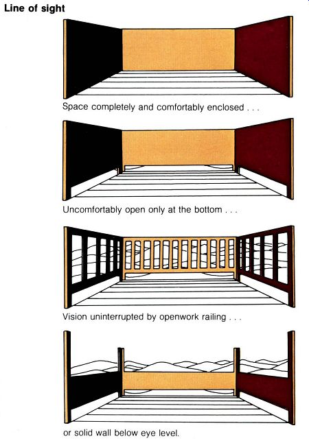
--------- Line of sight
Space completely and comfortably enclosed .
Uncomfortably open only at the bottom .
Vision uninterrupted by openwork railing, or solid wall below eye level.
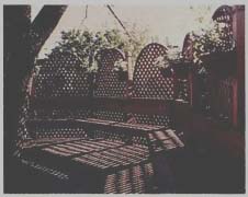
----- Another way to define visual limits is to block out a
view, as with the delicate lattice work in the distant - ground which encloses
the space.
----------- Rounded trees and shrubs soften angular designs.
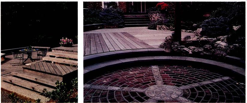
---------------- The radiating spokes of a circular design can symbolize solar projections, leading the eye and emotions out beyond, or, like the road, to Rome, drawing to the center.
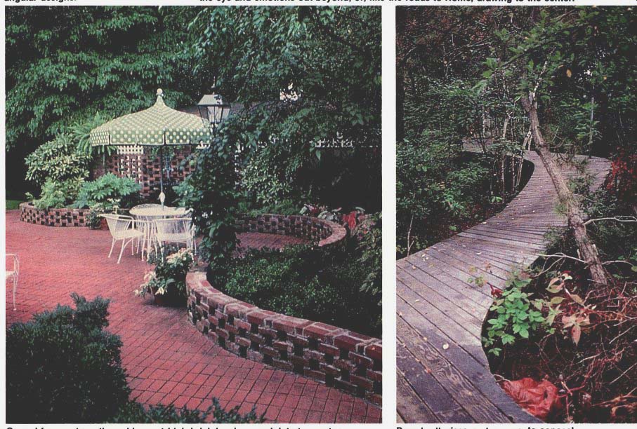
--------- Curved forms, strengthened by seat-high brick borders,
undulate to create a "backwater" dining area out of the circulation
pattern, amid the planting.
-------- Boardwalk rises and curves to conceal landforms and highlight Images.
Light: Daylight and night lighting, because they reveal space, are basic parts of outdoor design. The quality of daylight varies and is influenced at any particular time by the site location and orientation. During the course of a single day and during the seasons, the effects created by daylight will greatly influence the character of your design. At night, natural light from the stars and moon, and artificial lighting - both from beyond the site and lighting specially designed for it -- will vary with condition of foliage, reflectance of night air, and colors of objects placed in the light. Although it is a basic quality of all spaces we live in and move through, light is not easy to understand.
Tricks of light and color can have profound effects on the sensual force of space, increasing or decreasing apparent size, giving off warmth or cool ness, revealing fine and coarse textures, concealing complexity and creating it with shadows.
Color: Color as a quality of light is usually thought of in terms of hue and value. Hue is what we see that identifies the color as blue or orange.
Value is the quality that makes it seem light or dark, as in a light blue or dark blue. It is rare to find pure hues of color in nature, and when we do in bright autumn leaves or true blue sky or eyes, we take note. Usually the colors we see are hue mixes at various values.
Intense hues may evoke emotional responses, as does a reflectance of high value. It is unpleasant to be in a highly reflective outdoor space on a bright day. Because of this we wear dark glasses to reduce the light or value. Overcast sunlight diminishes value, as do tree canopies, outdoor space covers and big brimmed hats.
What might be an objectionable color of chaise mats in full sun might be quite agreeable in the shade of an umbrella.
On earth, where an atmosphere must be looked through, both hue and value are increasingly modified the further one is from an object , by dust or a pollutant in the air. For this reason, a pure hue or high-value color in the distance will not have the same intensity as close at hand.
Light striking surfaces can be identified as front light, back light or side light. If you had a family portrait taken, silhouettes and contrasts were probably heightened by side-lighting.
On a spring day you have almost certainly looked up through the pale new leaves of a street tree, and the back-lighting has made them seem to glow. Back-lighting is usually associated with the low sun early in the morning or late in the day, but it is also a popular night- lighting technique.
Lights are hidden behind a solid barrier so that only the diffused light away from the source strikes the far side of foliage or objects.
Front light and high intensities of light tend to produce reflected rays that mask the effect of shadows. As you design you may want to manipulate the available light to cast shadows that will strengthen created forms. To do this you must be aware of sun and moon angles and the seasonal effects of light in your latitude. Because shade has a profound effect on the tempera ture of outdoor spaces, you will want to study the shadow patterns cast by house and trees in siting your deck or patio.
Colors affect the feeling and perspective of space. Blue or gray colors strengthen the atmospheric perspective and thus seem further away. A light-colored space will seem bigger than the same space painted a dark or warm color.
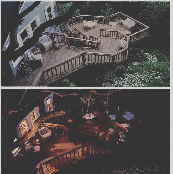
---------- Daylight streaks the forest floor and casts rays and shafts
of highlights. At night, the moon and artificial light Influence the extent
of the deck.
Forcing the perspective: In looking at the horizon, we see into the foreground, middleground and distant ground. The complexity of these three spaces - that is, their perceptible texture and form - is simplified as we look from foreground to distant ground. This is useful to understand in planning outdoor rooms, because it allows you to play tricks on the senses. In "forcing the perspective," you can make middleground objects appear to be in the distant ground by reducing their scale or by giving them finer texture: by this, we mean leaf size or shadow depth, or any other quality of the object that seems to establish its size or the size of its components. Coarse-textured gravel looks different from coarse textured plant foliage; although both are coarse, the gravel has a finer texture than the plants. . You can also force the forms to simulate greater perspective than actually exists by changing their size.
In the theater, the further upstage a piece of scenery is, the smaller it is painted to make it seem further away.
In laying out your garden rooms, this trick can be useful. If, for instance, you have a space only 10 feet wide at the side of your house, imagine what you could do if you forced the perspective with a lattice work of modules that decreased in size as it focused on a central image.
If you have a space you want to expand to look out onto from the deck or patio, use progressively finer textured plants the further away they are from the patio or deck. If your situation calls for just the opposite (the space being too big for intimacy), force the perspective inward by using larger textured plants in the middleground and distant ground and by increasing the size of fence modules or furnishings the further away you go from the main use area.
It is also possible to play tricks by combining texture reduction for forced perspective with a spun-off vanishing point. Objects in the actual middle ground are smaller, as if in the distant ground, and also the floor plane is directed around what seems like a natural edge and out of sight. An instance is a lawn that tongues out of sight behind shrubbery, leaving the impression that it goes on forever, or at least further than it actually does.
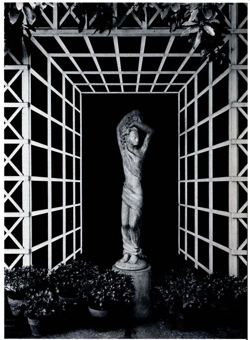
--------- Thomas Church, landscape architect master of forced
perspective, created expanded space In a narrow side garden with theatrically
manipulated lattice and forced textural perspective. Small leaved azaleas
In the "distance" contrast with the larger leaved pittosporum
In the "foreground" above.
Observer position: In discussing enclosure we noted that differences in vertical elevation have a stronger effect than differences in horizontal distance. With that understanding it is useful to think of what landscape architect Burton Litton defines as "ob server position." This is where you are, or where your deck or patio is sited, in relationship to the vertical plane of forms. Litton defines the possible positions as "observer superior," the view from above - from an upper level of a deck, from the roof or down into a valley; "observer normal ," the usual horizontal view; and "observer inferior," the view looking up into trees, perhaps, or at a mountain or building above the space.
In choosing your deck or patio site, recognize that the connection or inter face between your house and outdoor room will be affected by the observer positions. If the view is mainly up and out of the space, you will have more of a feeling of being enclosed than if the view is mainly down and outward.
In the latter case, you may create the exhilaration of an observer superior by exposing grand views. The confines of the space may be extended to the horizon, but a sense of security can still be given by a solid railing 30 inches high. Consider the observer position as your design concept grows in your mind.
Connections and sequence: As you start to create your spaces, keep these ideas in mind.
Remember that the enclosures you design will be centers of activity or relaxation. You will want to plan the connections of the various spaces -- the liaisons between house and deck or patio and garden -- to facilitate separate uses. You will also want to separate public and private spaces.
A hot tub on the deck, for instance, should be sufficiently screened from the sidewalk to provide privacy but you may want to have it directly adjacent to the living room. What is the logical pattern of connections -- kitchen to serving to dining to clean up? Think of how you will move through the spaces and how their connections should be.
Connection of space is a possible source of excitement if you can plan for it. Concealing and unfolding views--the opening and closing of space as you move - are ephemeral pleasures that can be experienced time after time. A series of small spaces -- parts of your deck or patio - can serve the separate uses you identify as necessary and they can undulate, interrupting or accenting the space with sequence. Spaces in a continuous balanced pattern, seen and experienced as they are moved through, heighten their form and strength.
Do not think of your planned spaces as being flat. They will be experienced in three dimensions, and you must plan them with all of their dimensions in mind. You can easily see or imagine the connections between two dimensions, but you will have to work hard at mentally seeing the actual spaces with three dimensions as you are drawing your design plan.
Mystery in space is pleasing as long as we can see the suggestion of a solution. It is never pleasant to be in a maze where there seems no escape. If there are visible objects, beyond the maze that give us basic , security, however , the mystery can be exciting. In outdoor space design, this idea can be carried out as a baffle wall that doesn't let us quite know what's beyond. This could be panels 6 or 8 inches wide and about 6 feet high angled to openings. As you walk along, you get just a hint - as in an old-time movie -- of actions happening be yond, flashes of what is there. This partial knowledge can create interest.
Another useful space trick is to extend the ground plane out of sight around a solid object. as earlier de scribed. When the lawn disappears around the shrub mass, we are left wondering where the lawn ends. From the deck or patio, it may seem far away, but in actuality it is only just a few feet beyond the shrubs. This disappearing lawn is so interesting to look at precisely because we can't see it all. Paths in the garden and private sections of the deck or patio can take advantage of similar design tricks, disappearing from sight , per haps to reappear.
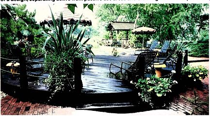
------- Connections and sequences highlight the different uses
Intended for the several parts of a design, separating active from passive
use areas and ordering them In sequence.
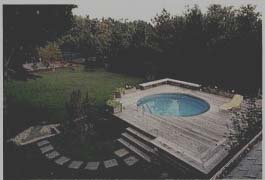
--------- Axes are by definition straight, but a strong visual leader,
like an arc of pavers, creates similar visual effects, guiding the eye
to or from a space.
Axial orientation: Views can be heightened by opening "windows" in foliage masses or by orienting your deck or patio toward them. If there is a view that you don't want to see, turn the space away from it by screening, by placing an eye-catcher somewhere in the desired view, or by turning the structure itself so it is actually faced in another direction.
Spaces have visual direction when they open toward views. Sometimes they have axial alignments, which are apparent visual lines running perpendicular to each other or in radiating arms. In Washington, D.C., for ex ample, major streets radiate from the Capitol. At Versailles, walks radiate out from cross axes on the main axis that forms the grand canal (see painting of Versailles on page 16). By taking advantage of the human response to look off into the direction that is suggested by design orientation--staircases, seating arrangements, plantings and so on--you can heighten or downplay neighboring views according to their desirability.
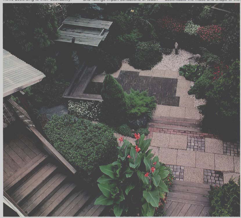
------- Different textures, used to separate functions or to highlight
the strong character of a design, add to the sensual force. When used spottily,
weakly or In odd erratic patterns, however, the result can be reminiscent
of a samples display.
-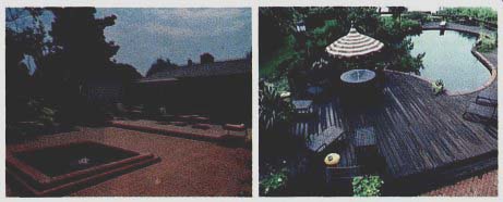
----- A form will relate to adjacent forms to increase or decrease
the sensual force. If angles and curves are simple and of a family,
strong designed forms will result.
Texture: We have made reference to texture as an element of forced perspective. The texture of the floor and walls and the colors chosen for them can unify and set off different areas of your outdoor rooms.
The surfaces of the floor and bench and railings impart sensations of touch as well as sight, and can have controlling influences on how areas are used. A rough floor surface, for in stance, will slow down traffic. Pea gravel adjacent to wood decking will , as a walking surface, create a very different walking pattern. If used consciously, these textural differences can give you, the designer, a means of controlling where people will walk and congregate and where they will sit.
Fine textures such as lawns, moss and large smooth pavements tend to accentuate the mass and shape of the ground form itself and to increase its apparent size. They often act as a neutral screen or background for other textural elements placed on them--furnishings, sculpture and people.
Coarse textures such as cobbles, bricks, tufty grass, herringbone decking and redwood blocks or rounds call attention to the surface itself , not the form or objects on it. For this reason, you should consider what texture range you are going to use to down play the form of the topography or highlight it.
In dealing with textures, as with all other design criteria, be clear in your intentions. Use coarse or fine textures, and materials of strong color definition sparingly and dynamically. Avoid mixing too many textures in a single pavement area, but do distinguish special intricacies or use areas with textures and textural contrasts.
For example, you can form a giant chess set in a paved patio by contrasting bricks laid out in the chess board pattern. Concentric circles of cobbles can be used as entrance court pavings. Or a course of bricks along the edge of a curved exposed aggregate patio can define its limits, then run off to define a path away from the patio itself.
In a patio, an area intended for barbecuing might be surfaced with smooth concrete (which is easily cleaned) while the remainder of the patio could have an exposed aggregate surface and thus be less reflective of light or more visually formal in keeping with use as a " living room." Textures are a detail consideration in your design, and will be chosen at the working drawing phase of the project. But in the early concept phase, you must begin to form ideas about the eventual complexity desired.
There are many other general design considerations to keep in mind as you create your deck or patio plan.
Spaces and forms, when consciously designed and intended to do so, can produce satisfaction beyond merely meeting use demands.
Form: Spatial forms some times have common symbolic connotations. Vertical forms can bring a sense of awe. Depending upon scale, the vertical could be the north face of Yosemite or a high wall on your neighbor's garage, painted to impress with its height.
Diminutive and intricate forms evoke curiosity and interest. Details of pat tern in medieval cobble pavements are an example. The upthrust, heaven oriented character of tall slender verticals is illustrated in rows of columnar trees and some garden sculpture.
The horizontal line is a static form, passive and apparently permanent, just as water rests in the horizontal.
Circular forms appear to have a closed or static nature. The ring is a symbol of this closure on fingers and in space. In space, circular forms may be islands out of the traffic, like eddies in a rushing stream. In an entryway, circular forms imply that it is a place to wait , entire of itself. When the door is opened, it is no longer a circle; the opening directs the visitor out of the entry and into the building or into the next space.
Projecting and jagged forms suggest dynamism. Jagged structures may imply speed or strength. They also may look merely sloppy. Projecting forms can imply power. A cantilevered deck, for instance, from which the footings aren't visible, will seem to defy gravity, floating in air, dynamically creating space.
Low, shelf-like coverings -- caves, canopied walks -- imply protection.
Like the spatial compression earlier defined as observer inferior, down in a narrow crack looking up and out, the low ceiling accents the horizontal, making vertical expansion strikingly dramatic upon coming out of confinement to open sky.
Similarly, the freedom of the open desert and prairie can be oppressive in its abundance, causing us to yearn for mountains or buildings that confine us. In a very open and level site, the juxtaposition of open and covered spaces makes both independently more interesting. On your deck, a big umbrella or trellis may add the quality of confinement you need.
Space created with an understanding of these basic realities of form and its elements can influence function and the sensual force that creates unconscious comfort.
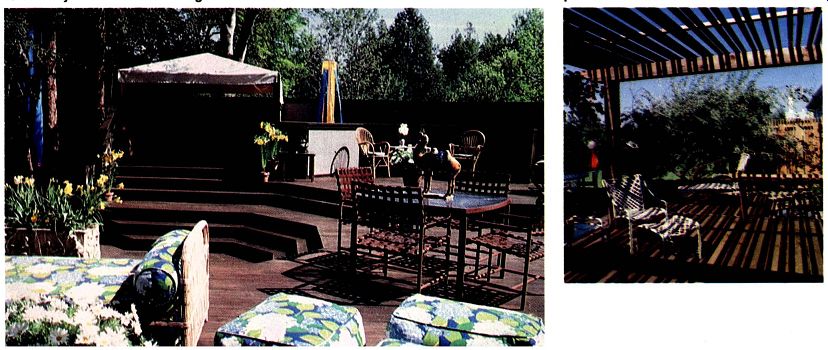
--------- Enclosures imply protection, and for some deck or patio
uses, can be as elemental to sensory force as the walking surface Itself.
-------------- Shadows contribute their migratory patterns to the collection of textures.
Temperature is a combination of direct sunlight, temperature of still air, the relative humidity and wind. As long as the relative humidity is between 20 and 50 percent, the comfort range for outdoor rooms generally lies between 70° and 80°F. When the relative humidity rises, it becomes increasingly uncomfortable at lower temperatures. If there is a draft, however, the comfort range is increased until the wind velocity reaches about 3112 miles an hour, be yond which it is probably too windy to be comfortable.
Cold air basins: Topography, or the land's form, generally influences the flow of air over it. Just like water, cool air hugs the ground and flows from high to low elevations. This process is dramatically revealed in areas where fog can be seen flowing down mountains into valleys and canyons.
At night, cool air will flow downhill and collect in pockets and reservoirs, held in by hills and buildings. If your patio is on the uphill side of the house situated near the bottom of the hill , you may discover that the temperature on the patio at night is higher than on the other side of the house where cold air is trapped and held. This characteristic of air movement was responsible for the sites chosen for classical Italian villas -- far enough below the crest of a hill to be in the lee of prevailing winds, but not near the bottom of the hill. Cool breezes fan such locations on hot days, but cold storms and night air have less impact.
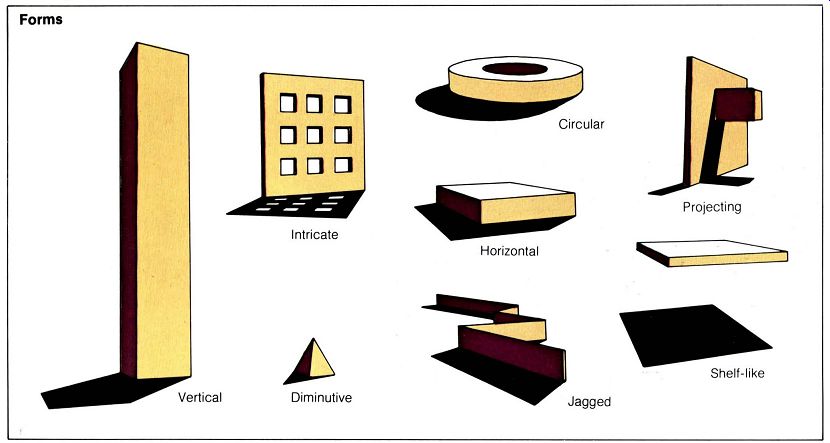
------------ Forms ; Intricate ; Diminutive ; Horizontal ; Projecting
Microclimates: Shadows, wind and sound are environmental conditions that must be considered in creating your design for the enjoyment of outdoor rooms. If any of these influential elements is critical at your site, you should do some additional checking to be sure you understand their influences at different seasons.
Even if you live in an area with a generally good climate, through design you can create microclimates that might be even better. By altering prevailing winds and creating more surfaces that collect and hold or discharge heat , your patio or deck can be a lot warmer or cooler than surrounding areas.
Heat: Surfaces have varying abilities to absorb and reflect radiant energy or heat. A perfect mirror, for instance, reflects back everything that shines on it without holding heat itself. A perfect matte surface, on the other hand, reflects no heat back but soaks it all up.
Wet- or dark-colored surfaces tend to be more heat absorbent than dry or light-colored ones. Most natural surfaces, such as stone, are relatively heat absorbent.
Conductivity is the speed at which heat or sound will spread through a material. A highly conductive material , such as metal , allows heat to flow rapidly through it and retains just a little. A surface with low conductivity, such as insulation board, will also hold little heat but will release it very slowly over time.
The speed of wind has a great effect on heat retention of objects and of the air mass in a space. The speed and extent that heat and sound spread out depend on wind and its turbulence.
Sound: Noise is distributed and contained by air movement or winds. In some instances, it is a desirable quality that should be fostered. An example is the splashing sound of a stream.
When a pleasing sound is intended in the design, plantings and structure must be designed to limit deflection and absorption. Since noise is carried by air movement, if you want to hear it , be sure not to block the air flow.
If, on the other hand, you don't want the noise -- street noises or neighbors -- or you want to tone it down, you will want to design the space to baffle and obscure the sounds as much as possible. To do this, create solid walls and windbreaks that reflect and deflect the sound away from the site.
Where the noise is too loud to be deflected, it can sometimes be masked by adding pleasing sound to it. A good example of this is New York's vest-pocket Pailey Park, where city traffic noises are masked with a waterfall.
Noises can also be disguised by plants that have rustling leaves, such as poplars.
If noise is a problem on your site, perhaps because you overlook a busy road or the neighbors' property dominates yours, consider solid walls for either deck or patio, and the ways you could add the sound of rustling leaves or moving water.
Wind: Wind tends to increase in velocity above ground obstructions that cause turbulence. At different elevations, strikingly varied directions and speeds of wind are shown by the movements of smoke or clouds. Close to the ground, too, there can be substantial wind speed differences. The wind speed at 1 foot above the ground may be only half that at 6 feet. This fact can make a difference if you are designing a quiet-use area on the windy side of the house. Enough shielding to protect someone sitting there could come from a 2-foot barrier. Be cause wind close to the ground is slower, the screening requirements for comfort in this zone are reduced.
On a cold day, if you can get out of the wind , the cooling effect of the moving air will be greatly reduced, and similarly, on a warm day, exposure to breezes creates a cooling effect.
Windbreaks: The objective of wind breaks is to block and divert winds without creating turbulence or low pres sure basins that will draw the wind down and into the protected area.
A solid vertical wall isn't a perfect windbreak because it causes turbulence, lowering the temperature on the protected side. Instead, a windbreak should deflect and guide the air flow over the protected area. Thick belts of shrubs and trees that are progressively higher the closer they come to the protected area can reduce wind speed by as much as 50 percent for a distance downwind on the protected side as much as 10 times their height.
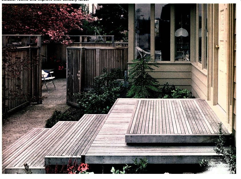
-------- Windbreaks and sound breaks, coupled with pleasing sound
maskers such as moving water and rustling leaves, can modify outdoor
rooms and Improve their sensory force.
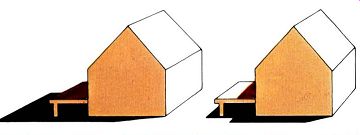
--------- Shadow patterns vary with the time of day and season
of the year.
Shade and sun: Shadows and shading are major influences on the temperature of outdoor spaces. In areas of year -round cool weather, you will probably want lots of sunshine and little shade. In areas where hot weather is usual , the reverse will be true.
Earlier you made mental notes of where the shadows were at various times of the day when you walked your loop trail of observation. In some cases this knowledge might be enough to base your design on. If sunshine is critical - either because you want to trap warmth or avoid the heat - you should study shadows on the site to determine and estimate their actual extent at all seasons.
To study the shadow patterns at various seasons, use the tables to calculate the length of shadows cast.
Another way to study the site is to make a simple model of it. Tilt it at the angle corresponding to your latitude and make scaled observations of where the shadows will fall.
Orientation is the slope of the ground surface relative to the angle of the sun. In the northern hemisphere, ground surfaces facing north have less sun than those facing south. The further north your site is, the greater the effect of this orientation will be, and the closer to the equator you are, the less effect it will have. Heat from the sun is most intense on surfaces that are perpendicular to the sun, regardless of the orientation of the ground. The angle needed for this maximum exposure will , of course, depend on the latitude, season and the time of day. As the orientation of any particular site is tilted to the south, the direct heat radiation is increased.
For instance, land with a 10 percent slope to the south will get the same direct radiation as a flat site 6 degrees closer to the equator. This is roughly the distance between San Francisco and San Diego, or between New York and Atlanta. Similarly, the orientation of a deck or wall surface will make a great difference in how warm it is. For instance, a wall angled to collect direct sun will be warmer than an adjacent vertical wall. Solar panels are oriented to take advantage of this fact , and in your space, absorbed and reflected heat can, like solar collectors, warm this area.
You may be thinking of using solar collectors to heat the house water or pool. Consider if and how you can incorporate their angled orientation into the general design of patio or deck. Can collectors be built into the windbreak with the south-facing surface serving both collector (heat) and deflector (wind) functions? The sensory force - that sum of qualities resulting from conscious design decisions - will make your deck or patio rooms much more than just activity areas. With it , your designs can create beauty, balance and com fort. It you consciously consider all these qualities in your design, whether they apply to it or not, your spaces will be more defined and successful.
Design testing: As you develop your concept ideas, check them against each of these design parameters:
---Simple forms
---Natural beauty
---Strong repetition of forms
---Enclosure
---Human scale
---Visual ambiguity and clarity
---Curves
---Straight lines and edges
---Light (reflectance and direction)
---Color (hue and value)
---Light (daytime, nighttime)
---Observer positions
---Connections, liaisons
---Sequence
---Mystery
---Axial orientation
---Texture
---Massive surface
---Diminutive object
---Forced perspective
---Vertical projection
---Horizontal line
---Circular forms
---Projecting and jagged forms
---Horizontal compression
---Vertical compression
---Openness
---Temperature (seasonal , day and evening)
---Microclimates
---Heat
---Noise
---Wind
---Shade
---Sun orientation Can you now strongly carry out your design intentions?

--- In hot Climates, shade Is beloved; deciduous
trees are equally revered In cold areas for their bare winter branches
which don't block the warming rays of the sun.