The work of renovating a run-down old house needs to be carried out by an owner with a good visual eye and the patience to see through the slow and laborious basic treatment to put the house back into good condition.
When this Edwardian terraced house in Fulham, London, was bought by its present owner, it was in a sorry state. It was virtually derelict and had been converted into flats. The ground floor had not been lived in for six or seven years, and there was a long list of defects, all caused by lack of good care over the years; from rising damp, rotten floor boards, and leaking pipes to damp in the roof.
The owner, a business consultant, could see the possibilities of the house, however. He was wise enough to realize that with time and patience he would be able to turn what was virtually a slum into a comfortable home. The proportions of the house were good, and it had the right number of rooms. His aim was to restore the place to its original function and to put in as many improvements as possible.
Before he even started to think about decoration, he very sensibly concentrated on the unseen part of the rehabilitation work that needed to be done in order to make the house sound for the future. So he began with weatherproofing, treating the rising damp, renovating the roof, putting in new wiring, eradicating the insect-life and installing central heating, as well as new plumbing. He undertook all the unskilled work-jobs like clearing the site of old lino, furniture and rubble, and stripping the old wallpaper and paint. Work like installing the central heating and renovating the roof he had professionally done.
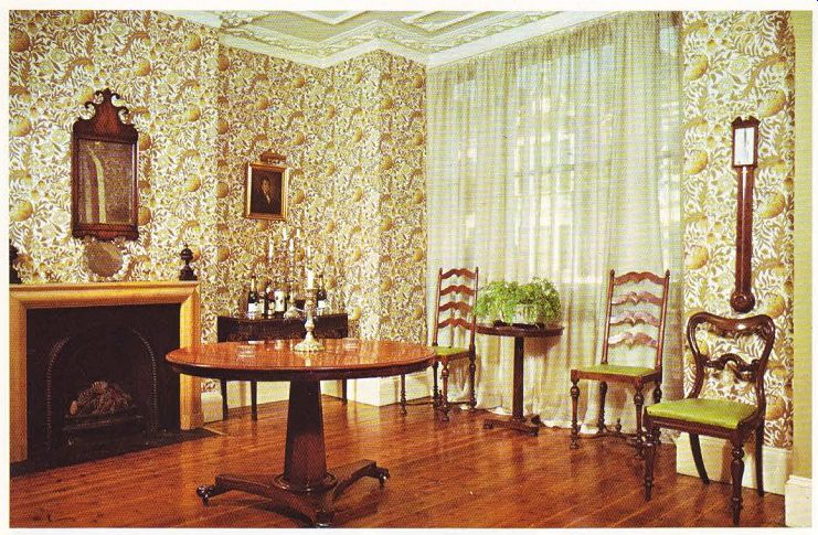
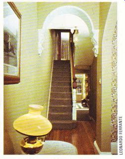
Houses like this one often have dark and narrow halls. The owner decided to make some unusual structural alterations here so that he could create a more spacious entrance. Now there is a pleasant hall-cum-dining room. The original wall between the hall and front room was removed, leaving a gentle sloping arch.
The main reason for making an arch rather than removing the whole wall was to preserve the old ceiling and to make a subtle division between the meeting and eating areas. In fact, one of the best things about this house is the way all the old plasterwork and decorative cornices have been carefully preserved. They now add a definite style to the house, showing up with a fresh coat of white paint.
The old floorboards in the new enlarged hall were sanded and sealed. This was not only the cheapest but possibly the most attractive treatment. The original fireplace had been removed and the owner scouted round until he found one that would tit in with the period of the house.

---- Above. The elegance and warmth of the dining room comes
from the rich finish of the circular table and the pine floors. The intricate
pattern of the wallpaper is an interesting contrast to the other areas of solid
color in the room. A graceful arch leading into the room is subtly echoed by
the curves of the tables, the facing of the fireplace and the outline of the
chair backs.

----------- Above. The clever construction of the hall invites the eye
to travel two ways up to the privacy of the first floor or into the airiness
and light ahead.

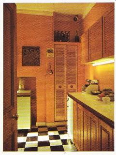
---- Above. The kitchen is defined in terms of straight lines, squares
and right angles a striking change from the gentle curves in the other rooms.
The strategic placing of lights softens the austerity of line, and enhances
the texture of the louvered doors.

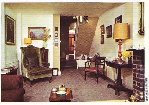
----- ABOVE. The attractiveness of the living room lies in its contrasts-the
armchairs are both light and heavy, the textures both soft {the moss velvet
chair) and hard (the grey bricks of the fireplace).
The cast iron grate he moved down from an upstairs room, and the simple pine surround came from a demolished house.
Final additions were the French-style wall paper in shades of brown and the smart tweedy curtains in an off-white color, plus deep beige paint on one wall and carrying up the stairs. The furnishings also reflect the period style of the house and there are some good examples of wise auction sale buying both in the hall and in other parts of the house. It is well worth looking around auction sales for old furniture of this type. You can often find some real treasures as well as good inexpensive bargains, which, with a new coat of paint will look just right in a room with a period flavor-and will be cheaper to buy than new furniture for people on a budget.
The doors in this house are yet another example of how close attention to detail can add a great deal to the final effect. When he bought the house, the owner found all the doors had been covered with hardboard and plastic decorative strips. He removed all this covering and found the original sturdy pine-paneled doors still intact underneath. Patiently he scrubbed off the layers of paint, using caustic soda, so the doors could be returned to their original pine finish. This sort of treatment is well worth considering for similar old doors, but caustic soda should be used with great care. It will certainly give almost the best results of any of the paint stripping agents. However, make sure it does not come in contact with the eyes, and wear strong protective gloves.
A complete transformation has taken place in the rear part of the ground floor. Originally there was a cupboard under the stairs with a door leading down to the cellar. A narrow passage way beside the stairs led through to a small kitchen with a bedroom beyond it. Leading off the bedroom was a dilapidated washroom with a lavatory and shower. One window bay was badly neglected and seemed to be coming away from the side of the house. The whole place was dark and depressing with an untidy small garden outside.
The owner wanted to bring in more light and a feeling of space. So he knocked out the interior walls, the cupboard under the stairs and the doorway through to this part of the house, to make a spacious sitting room with an open plan effect.
Access to the cellar is now through a trap door cunningly let into the carpet under the stairs. Now the whole of the ground floor is virtually open plan, apart from the kitchen, which gives a much greater feeling of space and light, To add more light in his new sitting room, the owner put in big windows which lead out into the newly paved garden. This is an excellent idea because it makes the whole room seem larger and in the summer, the garden seems an integral part of the house.
The chimney breast in the new sitting room had been blocked up and there was a solid fuel boiler. In here, the owner wanted an open fire to sit by. So he designed a new and attractive fire place with plain grey firebricks and a slate mantelpiece. An old fire basket was one-of his most successful junk shop finds. This type of fireplace would be fairly simple for a good amateur bricklayer to make. It blends well with the atmosphere of the room and makes a pleasing focal point.
The color scheme follows through the natural beige and white used in the hall, One of the chairs has been cleverly covered in one of the cheapest and most hard-wearing fabrics to be found-pillow ticking. Again the furnishings reflect the period style of the house.
The colorful orange kitchen was previously a bedroom, so the room had a complete re think. Practical floor and wall units were made to measure, using inexpensive standard size pine paneled and louvered doors. This way of making your own units is a particularly good one to remember. The frames and worktop can be fitted at little cost. The smart doors are good time and money savers and help to give the kitchen a professionally-made effect. There is a door leading out into the garden and the bright paint, combined with strip lighting under the wall cupboards and a collection of copper jelly moulds, make it a warm and friendly room for cooking.
Upstairs a small rear bedroom has been turned into a practical study painted an unusual terra cotta color. The old chimney breast has been cut away and turned into a neat and attractive bookcase. This has been cleverly done by putting an architrave round the opening and fitting bookshelves inside. Boldly patterned curtains and a collection of prints add to the masculine flavor of this comfortable working room, Next to this is a smart bathroom which is in a slightly deeper shade of terracotta with lashings of white. In here the owner has used a professional decorator's trick. To get the glossy effect, he painted the walls first with ordinary emulsion paint-the same color as he had used in the study-then he used a high gloss polyurethane seal on top. This has slightly darkened the emulsion paint but gives it a much more glossy finish than gloss paint only. A new bathroom suite was installed, and a smart blind at the window. Although this room is small and has been simply decorated, it shows how sophisticated a bathroom like this can look without costing the earth to re-decorate.
After years of neglect, this house is now sound and healthy once more. With its un cluttered decorations, it is a sophisticated home that shows what can be done with an old terraced house, using imagination, effort and know-how.
----------------