Simplicity of line can have a striking impact in house design. This Edwardian home has a streamline look--achieved through vivid imagination and an absence of fussy detail--without losing its sense of comfort.
It's difficult to imagine a home with practically no curtains, carpets or cushions to be anything but cold and sterile. But not with the house pictured here. It gets its warmth and attractive ness through simplicity of line, variety in texture and the use of color.
When designer Michael Green and his family moved into their Edwardian house, no one had lived there for a year, and the state of the house was a depressing sight with rot and damp everywhere. The Greens decided on a plan of action: they all lived in one room and began working from the top of the house down. They knew that if they started on the ground floor, the renovating of the first floor might always be a project of the future ! The plumbing, fixtures and central heating were installed, and then the Greens set out to convert their home. No architect or builders were used; Michael Green did the designing himself, and he and his wife did all the work involved.
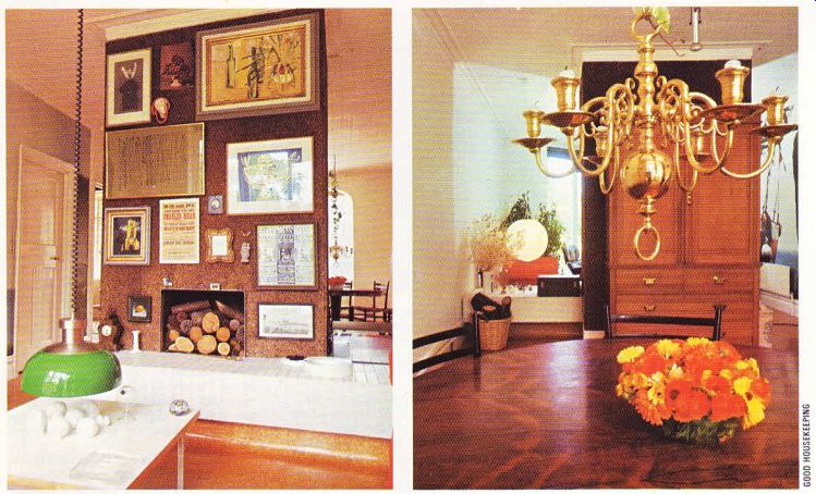
The most unusual feature of the house is the fireplace on the ground floor which has been left completely on its own, serving as a room divider. Originally there were two smallish rooms which the Greens thought of making into one large room. They discovered, however, that it would be far too expensive to completely remove the load-bearing wall and fireplace. It is difficulties like this that sometimes lead to ingenious solutions.
The Greens knocked down the walls on either side of the fireplace which was left free standing in a large column-like fashion. It was covered with panels of cork which blend in well with the wood in the fireplace. Cork is a good material to work with; it‘s inexpensive, the texture is unusual, and pictures can be easily hung on it. The picture arrangement here is extremely eye-catching and creates an effective focal point.
The opening to the fireplace was raised and an aluminum strip put around the edge. A grating supports the logs, and underneath there is a removable basket which catches the falling ash and makes cleaning easy. The cornices and skirting boards around the fireplace column were rescued from the walls which had been removed-the Greens didn’t want to run into problems of matching up. For other ideas on making a feature of your fireplace, consult a good DIY home manual.
The surround was made from a timber box, filled with cement and then covered with white easy-to-clean tiles. One of the nicest touches is the curve in the floor leading up to the white tiles. Mr. Green achieved this by putting molding behind the curve to give it the necessary support. The same technique is used on the vinyl floor in the bathroom, which curves up to cover the complete side of the bath.

-------- Above left. The fireplace is the main feature of this house.
It was left as a load-bearing divider when the two downstairs rooms were knocked
into one, and it is now an eye-catching background for the pictures. --- Above
right. The other half of the room is the dining area, where art attractive
feature is the genuine chandelier. An old linen press stands against the back
of the fireplace for cutlery and glass.
The ceilings and walls were in bad shape. The Greens used two techniques to combat this: embossed wallpaper and larger-than-life posters. The patterned embossed paper on the ceiling gives an Edwardian flavor to the room and effectively covers up cracks and peeling plaster with relatively little effort, using the correct materials and techniques.
The jumbo size posters are a great idea. They cover unsightly imperfections on the wall and cost the Greens exactly the amount it took to paste them to the wall. With two children, Mrs.
Green wanted to keep wall cleaning to a minimum. The posters are easy to wipe down and add personality to any room. Another method for protecting walls from showing the dirt is to have a large grouping of pictures. On the wall going along the staircase, where finger marks are likely to turn up, Mrs. Green has put pictures of various sizes and styles; they are a focal point with a practical purpose.
There are many interesting touches in the sitting room. The windows have been lowered to skirting board level, which gives a wonderful view out onto the patio and garden. The large expanse of window also makes the room look bigger. No fussy curtains impair the view; pull blinds are used, if privacy is needed. The Italian pendant lamp gives a splash of color; the green contrasts well with the more subdued tones in the room, Beyond the fireplace, at the other end of the room, is the simple and elegant dining room.
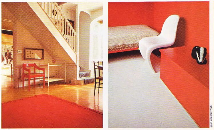
The slope of the stairs in this room has not been ignored. The space underneath is used for storing the trolley and also houses a red chair.
The red is then picked up in the warm reds and oranges of the throw rug. The circular rosewood dining table was bought for very little in a street market some years ago. Above the table is the only ornate piece in the room-a brass chandelier. This had been left by the previous owner. It was cleaned and the electrical wiring removed, and now is used with candles.
The Greens tried putting curtains in the windows which are set back and framed by an arch, but found that too much light was lost.
The original lead window panes are in keeping with the Edwardian motif.
Discipline had to be exercised in this room. A natural tendency is to keep adding to a room.
Mr. Green considered putting up a large mirror on the wall behind the dining table, but decided not to because it would detract from the simple elegance of the room. One of the most effective--and difficult to achieve-looks is an un cluttered and streamline one. The secret is investing in pieces which have good lines and are essential to the room such as the table, chairs and lighting fixtures, and then resisting adding many more items. The most effective decor is often the simplest.
The floors are covered with cork tiles which the Greens put down themselves. They first laid hardboard over the floor boards to keep the tiles from cracking and the floor from warping It was a difficult job, but they will not have to worry about repairs. The tiles are coated with a plastic seal varnish and don’t have to be polished, just washed.
Leading off the dining room is the breakfast room, which successfully combines the new with the old, The large dresser against the wall was left by the original owner and displays the attractive china. The lead window panes still remain. The more modern items are the curved plain white chairs, and the spotlights. A louvered door covers the central heating unit which used to be the old coal boiler, Two steps lead down into the cheerful kitchen.
The ceiling is covered with pine paneling, and the brick walls are painted white-an effective contrast to the blue laminated tops. The original quarry tiles have been left on the floor. The window sill has been deliberately sloped, so that dishes and bottles won't impair the view of the garden. Again, the lines are clean and stream line. A shelf, the width of the room, cleverly suspends from the ceiling.
One of the nicest features of the house is the patio. Mr. Green was inspired by the simplicity of Japanese rock gardens. He built the patio using brick columns as a foundation. He then covered the foundation with long timbered Victorian beams which he bought from demolition people. Pine slats were then put on top of the beams and a finish was put on which gives a grey-green color and blends in well with the colors of the garden. If you have the space, this is a delightful way of making the transition from indoor to outdoor living.
The four bedrooms upstairs continue the streamline motif of the ground floor. The master bedroom is a combination of olive green and white. One wardrobe is covered with a mirror and the other with beige hessian. The hessian covering is practical because it can be painted over if a change in color scheme is desired.
The stark and bold look in one of the children's bedrooms is a perfect example of how effective an uncluttered look can be. The walls, ceiling, chest of drawers and toy chest are painted in a brilliant red. The curved chair, bedspread and vinyl floor are stark white. The only departures from the red and white are a cork strip used as a pin board and a massive poster which covers one wall.
One solution to a successful house design is keeping to simple, clean lines. The Victorians liked the cluttered, crowded look in houses, but today's home, like this one, can have a sense of beauty and style, without fussy detail and complex color schemes and furniture groupings.

---- Above left. The staircase leads of the dining area and their slope gives
useful extra space to the room. Beyond this is the breakfast room, where jumbo-sized
posters have been used to good advantage to cover up poor walls. ---- Above
right. The simple furnishings of the house are particularly apparent upstairs.
The children's rooms are decorated in the clear bold colors they love, and
the furniture is kept to a minimum.