If you need a modernized kitchen with a playspace nearby so that you can keep a small child in view, a multi-purpose room made from an old kitchen and adjoining dining room is an ideal solution. Cooking, family meals and supervised play can all be catered for in this room.
This was just one of the adaptations carried out by the owners of a typical Victorian British ‘semi' in Surrey which could be applied to many other houses. They chose the garden side of their house for the new family room because it had a pleasant outlook and caught the sun.
Upstairs they needed an extra bathroom leading off the main bedroom, so that they could have their own self-contained suite. Rather than reduce living space by building the new bath room inside an existing room, they chose to build on. Their extension fitted neatly behind the garage, giving them valuable extra space at ground-floor level for a utility room, larder and boiler room.
Originally they had planned their new bath room to go over the garage, but this proved difficult because the garage foundations weren’t strong enough to take the extra weight.
The new extension is designed to give on to a pleasant small courtyard by the dining room window, It is built in the same bricks as the main house to complement it and form a complete unit, rather than a house and ‘afterthought'.
Blending extensions with existing houses is always a tricky job, and here the owners designed the alterations they wanted them selves, knocking out walls and old fire-places to the layout of the new extension. Then they asked an architect to draw up plans and deal with the often difficult business of obtaining planning and building permission.
Once the 'go-ahead' was given, the owner was able to begin with the kitchen. Here, he knocked out a wall between the old dining room and kitchen, and moved another wall between the kitchen and breakfast room; this involved putting up steel joists to support the walls. An old tiled fireplace was removed from the dining room. The floors were on two levels with about 2in. difference, so the kitchen was re-screeded with concrete to take it up to the same level as the boards in the old dining room.
The back door was moved to make a better entrance through to the new extension, and a rickety old conservatory outside the former dining room was demolished to let in more light.
Upstairs, there was a separate bathroom and lavatory to be modernized and an entrance to be cut through from the new main bedroom to the extension and its adjoining bathroom. The problem here was finding space for an airing cupboard, and ‘creating' space in the new main bedroom, which was smaller than the original one.
The solution was deceptively simple. The wall between the bathroom and the lavatory came out. The new master bedroom wall was moved a few feet into the old bathroom, making enough room for a floor-to-ceiling fitted cup board. The linen cupboard was built into the new bathroom with access doors on the landing outside ‘rather than in the bathroom. These alterations meant a smaller, but still adequate bathroom.
Once the structural alterations were completed, the owners could begin on the decor.
The house was treated as a whole unit, not just decorated haphazardly room by room, and the overall color scheme was planned. Often fairly ...

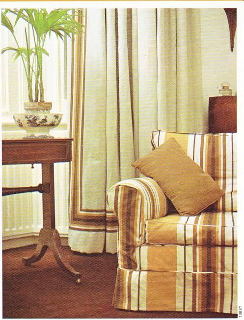
------- Above. Planned color co-ordination at its best-the browns
of the striped chair cover are picked up in the curtain border.
...small houses such as this ‘semi' benefit from a ’top-to-toe' treatment; it makes the house seem larger and more comfortable, giving a feeling of harmony and unity as rooms ‘flow' into each other creating an illusion of space.
The owners took the colors of the original Victorian floor tiles in the hall as their key.
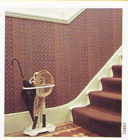
These are a mixture of browns with some blue and yellow. They added white, and began by using this for all the woodwork and for the walls above the dado in the hall. A brown geometric wallpaper was chosen to echo the floor pattern and emphasize the other brown shades.
The brown is re-emphasized in the drawing room and dining room. In the kitchen, the yellow and blue in the tiles are brought out to give a sunny effect. The brown is carried upstairs in the carpet and is mixed with yellow in the child's bedroom. Apricot-always a good foil for brown-is the predominant color in the spare bedroom, together with pink and green In the main bedroom and the new bathroom, the colors are fresh green and white, which tone well with the browns outside on the landing.
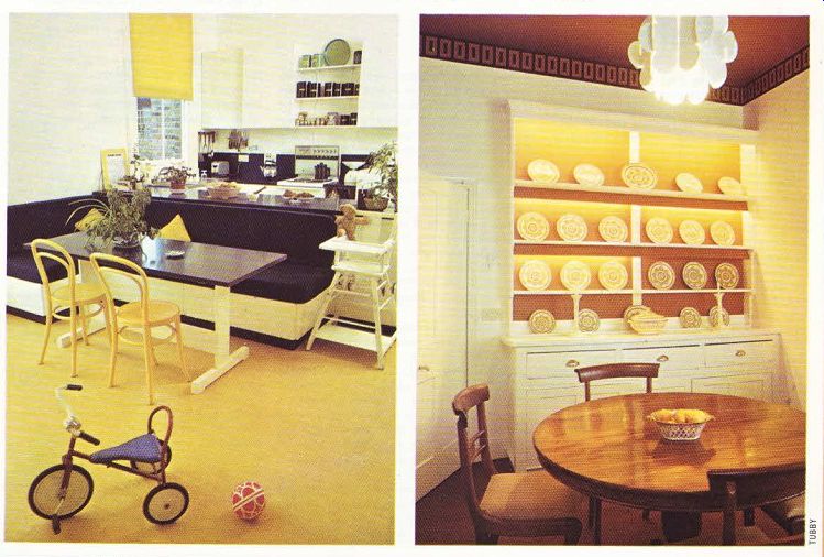
The separate areas of the new kitchen and playroom are well defined. The kitchen is built in a U shape in one corner, and next to it is a built-in dining area with an upholstered bench seat. There is little furniture in the play space, except for a shelving unit with toy cupboards underneath. The area is near the french windows which lead out into the garden.
The kitchen units and dining corner are in an unusual deep blue, which is emphasized in the expanse of laminated worktop. Vivid colors can be used successfully in two ways: you can single out one small feature such as a cushion in a striking color, to offer relief from an otherwise muted scheme, or you can use the dominant color extensively for maximum eye-appeal.
The fitted 'eating-corner' backs on to one arm of the kitchen. There are foam cushions on the bench seats, covered in blue tweed. This has been sprayed with a good dirt repellant,
which protects the fabric from spills-a practical tip to note. The owners couldn’t find a table to fit into this corner, so they had one made to measure this turned out to be cheaper than many ready made types. Purpose-built furniture can be made to almost any specification to suit your particular needs, and is always worth considering in cases like this.
Above the table, the blue motif is picked up again in the unusual spherical spotlights. They are directed on to the ceiling so that the light spills down softly. And the yellow is repeated in gloss-painted bentwood chairs.

--------- Above. Rich browns predominate in the hall-the tones in the
wallpaper are echoed in the stair carpet and the floor tiles.

ABOVE, left. A multi-purpose room, used as kitchen, informal eating area and
playroom. The colors look bright and sunny. --- ABOVE, right. The impressive
dining room for formal occasions. The dresser is lit inside to flatter the crockery
on display.
The owners planned to use the dining room for eating in the evenings and for entertaining.
Here the accent was on 'atmosphere', so they used an eyecatching caramel and sharp white.
The ceiling is papered in plain caramel, and there is an unusual geometric frieze in caramel and black round the top of the walls.
Blinds often 'dress up' a window more than traditional curtains. Here, there is a plain white holland blind, bordered in brown to complement the overall color scheme.
The drawing room keeps to this room-by room color scheme, with its deep brown carpet and ‘natural' colored curtains with brown striped borders. One sofa is also in the ‘natural ' -or neutral-color and has a striped skirt to add pattern. Another sofa is in soft apricot. All the shades are brought together by one large chair which is covered in boldly striped deckchair canvas. This is a good way of adding interest to an established color plan, and is a focal point in itself. The deckchair canvas is repeated as a curtain border and in the sofa skirt.
An unattractive 1930's fireplace was re moved. The owners scouted round demolished houses and eventually found a marble fireplace with a cast-iron grate which suited their house perfectly. Bargains are still around--if you look.
The final effect is one of a bright and friendly house, made more efficient by the new extension. It is smart yet full of inexpensive ideas, and is practical to run without looking clinical.