Setting up house when you have enough money to buy the furnishings you like might not seem to present many problems. But some houses--particularly older ones--need a special kind of treatment to prevent them becoming too austere and 'over-perfect'.
Making a house a home was the problem that confronted the owners of this Victorian terrace house in South London. They decided to approach the problem through an unusual use of color and a careful choice of furniture, both old and modern, to suit the house and make it welcoming.
The house had been built in 1890, and when the present owners bought it three years ago, much of the original Victorian dinginess lingered on. There was dismal brown paint everywhere, and the wallpaper was peeling off the walls. The rooms seemed too small and the atmosphere was chilly and uninviting.
To make rooms seem larger, a good tip is to lay fitted carpet in a plain color and continue it from room to room. This house has the ultimate luxury in this line, for every inch of floor-with the exception of bathroom, kitchen and play room-is fitted with oatmeal-colored wall-to wall carpet, The light tone serves to emphasize the extent of the floor area, and thus makes the house seem bigger and lighter. Any floor covering used on this scale will achieve a similar effect, especially when it reaches from wall to wall, as this takes the eye right to the edges of the room.
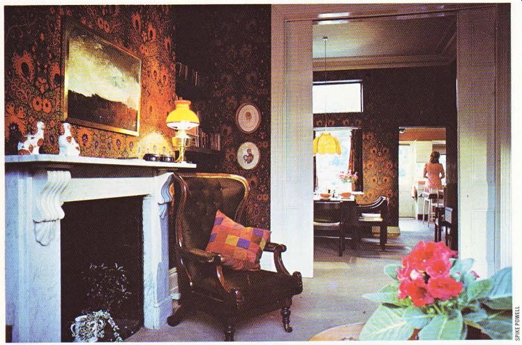
The once grim-looking sitting room has been transformed into a comfortable and original area for relaxation. Householders often stick rigidly to the idea that light colors automatically ‘open up' a small or dingy room. This is usually true, but in the case of very high Edwardian or Victorian rooms too much white or cream, for example, would only make them seem higher and chilly. The owners ‘warmed up' this room by papering it in a deep orange, black and grey Art Nouveau print. The sitting room, dining room and kitchen extension are all interconnected ’through rooms', and the paper is continued right through the two main rooms up to the kitchen door to give a feeling of unity to the whole ground floor. The sitting and dining rooms are separated by sliding doors painted white; when they are shut, these help to ‘bounce' light back into the sitting room from the open fire and modern spotlight.
The fine marble fireplace came with the house, and holds an elegant French grate. Any room no matter how interesting-needs a focal point, and an open fire is still the ideal way of providing one.
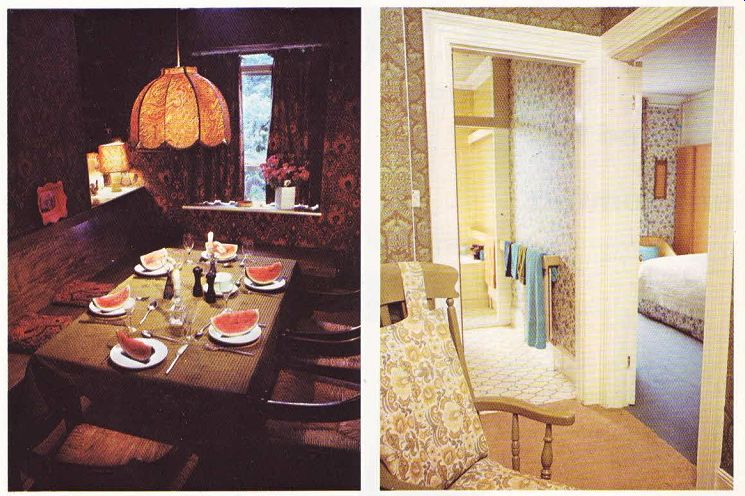
Rooms as high as these need solid-looking furniture and fittings; light, spindly pieces would be lost in them. Here, both alcoves on the side of the chimney breast are filled with sturdy beech shelves, which match the bench seating in the dining room and the cupboards in the sitting room. The beech originally looked too pale for its setting, so it was specially stained to match the greenish grey of the wallpaper and the frame work of the dining chairs. These were designed by the Italian Magistretti, and have the advantage of being both very modern and easy to mix with older furniture.
Other furnishings in the sitting room include a William IV recliner chair, a squashy black leather sofa scattered with home-made patch work cushions, and a square coffee table with a glass top revealing a dramatic print in green, gold and black. The furniture has been collected on grounds of personal taste, and not to follow one particular style Upstairs, the master bedroom suite is papered in an attractive floral print. In the bathroom, the bath and bidet are separated from the twin washbasins by a sliding door. This is a good idea where there are children-one person can now be washing while another bathes in complete privacy. It also cuts down condensation.
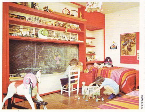
One effective way of protecting your treasured furniture is to provide children with a room of their own. Here, the children ‘s room has been fitted out with robust, and very colorful, furniture. Children love primary colors, and in this room red is the dominant theme.

-------ABOVE. The sitting room, dining room and kitchen form one
through room. The same wallpaper is used in both the sitting room and the dining
room to help unify the two rooms.

--- Above left. In the dining room the space saving bench seating is stained
to match the dark wallpaper and the frames of the Magistretti dining chairs.
--- Above right. The bathroom and master bedroom are decorated in an attractive
floral print. In the bathroom the twin washbasins and the bath and bidet are
separated by a sliding door.

This reduces condensation-and queues. ABOVE. In the children’s room the red
storage unit forms an eye catching match with the striped bedspreads. The cork
flooring is a sensible choice for children's rooms as it is both warm and
durable.
A red floor-to-ceiling unit provides eye catching storage, incorporating a pull-down worktop (at the right height for young children), slide-under toy boxes, and plentiful cupboard and shelf space. The center piece of this unit is a wide blackboard-an excellent ‘wallcovering ‘for any children's room. This one is sensibly placed at the child‘s eye level and has a ledge for chalks and dusters. Reds, pinks and orange make a bright splash of color in a tumble-rug, but the main area of flooring is covered in cork tiles for easy cleaning and toughness. The main danger in setting up a children ‘s room lies in trying to impose too much adult taste on it, but here, a sympathetic choice of furnishings allows the children‘s own toys and posters to predominate.
Another bedroom makes a feature of a deep warm pink: the walls and ceiling are painted in one tone, and the fitted carpet is in another. The bedspreads are cream lace; more pink would be too much of a good thing.
The house has emerged as a home, and a s home to be proud of. The period of the house has been flattered, not fought, and the bold color schemes have added the necessary warmth.