In a small flat it is often a good idea to link all the circulation areas such as the halls and corridors with one color, and co-ordinate the living and dining spaces with it. A different color scheme can be used in the main bedroom, and also in the kitchen and bathroom, to prevent the arrangement from becoming monotonous.
A three-room flat built round the light well at the top of a six-storey building, and with sloping walls under the eaves in some rooms, can be a daunting conversion prospect. This is why actor Jeremy Clyde decided to hand over the re decoration of his London flat to designer Paul White, who came up with a most satisfactory scheme.
Jeremy Clyde wanted the flat to be as flexible as possible, combining a pleasant working environment for him in the mornings with a welcoming retreat when he returned home from the theatre at night. He needed an effective background for his large and varied collection of pictures, ornaments, porcelain and antique furniture. At the same time, he wanted the con version to be carried out on a budget.
The drawbacks, although not insuperable, were many. The narrow hall was further restricted by a sloping section of wall; the bath room was entirely baby pink-both the tiles and the paint; and the ugly gas fire in the living room was made worse by a pale blue tiled fireplace surrounding it. The entire flat was decorated in sickly pastel shades of green, blue, pink and grey, set off by awkward radiators at odd intervals.
What space there was obviously had to be exploited and made to appear bigger wherever possible. The flat was in good structural condition, but a lot of making good was necessary before it could be decorated.
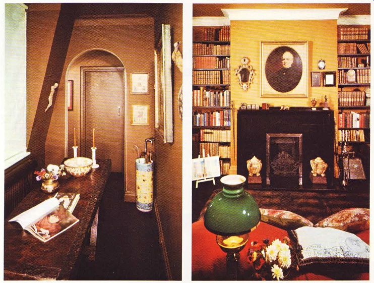
In the hall, everything has now been finished in matt brown paint; the sloping parts of the walls were ignored, and, together with the cornices and skirting boards, were ‘painted out' to make the ha'' appear bigger. Only the soffit of the archway leading to the other rooms has been highlighted in white. White Holland blinds cover all the windows, as curtains would get in the way.

--------- Above. The white-painted cornice makes the living room appear
taller. Slim black-painted industrial shelving takes up very little space.
A solid wooden butcher's block, which Vanessa Clyde restored, stained and sealed, now stands on two trestles and acts as a hand some hall table. The dark brown carpet carries on throughout the living and circulation areas; this is most important in a small flat, as then all the areas are linked and the total space appears larger.
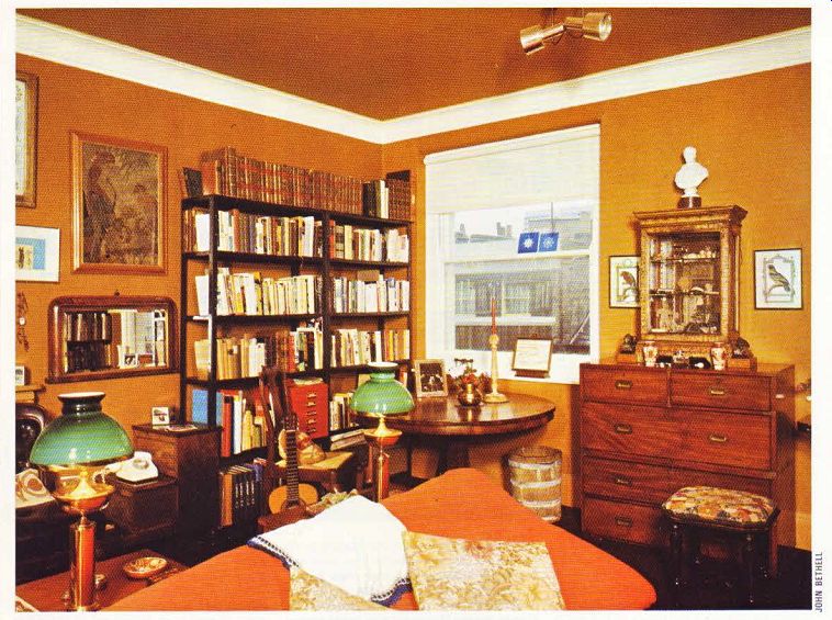
The 17ft square living room is entirely yellow ochre, which is a good background color for the furniture and paintings. There is ochre felt on the walls and matching paint on the ceiling.
Again, the skirting board has been 'painted out' in the predominant color, but here the cornice has been picked out in white to make the room seem taller. Even the radiators are painted ochre, so as to camouflage them. The pale blue tiled fireplace was given a coat of diluted pva adhesive to form a key. then painted matt black; the gas fire was removed and replaced by an open grate.
Most of Jeremy Clyde's books are housed in black-painted shelves fitted in the alcoves on each side of the chimney breast. An open book case built from industrial metal shelving bolted together and painted black holds the rest of his books; this has a lighter appearance than a fitted wooden unit.
There was not enough room for a conventional sofa and easy chairs, and so two enormous red floor cushions provide the main seating accommodation. They back up against a pair of library steps, on which two converted brass oil lamps stand. Their jade green glass shades combine with the red cushion covers to relieve the predominantly brown color scheme. When the lamps are lit in the evening, with a log fire in the grates a distinctly Victorian atmosphere prevails. Spotlights fixed to the ceiling and walls and directed on to particular paintings and pieces of furniture supplement these table lamps.
The small bedroom was painted terracotta, and became a studio where Jeremy Clyde could work in peace. The larger room at the back was fitted out as the main bedroom, with a straw color scheme.

-------------- Above left. The narrow hall is all brown, with a few
important details picked out in white. ---- Above right. The tiled fireplace
in the living room was transformed by a coat of black paint-a cheap disguise
for an ugly feature.

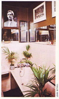
ABOVE: The pink tiling in the bathroom was retained,
and the walls and ceiling painted glossy brown. Mirrors, pictures and
plants cover the whole room.
The only cheap solution for the baby pink bathroom was to make positive use of the color rather than try to alter or conceal it. Rampant pot plants now cover much of the bath tile surround, which has been restored, and the rest of the room has been finished in glossy brown paint, which acts as an effective background for more light-hearted pictures.
The only color not in the brown spectrum is saxe blue. This is used with red in the tiny kitchen, Walls and ceiling, skirting board and cornice are again all painted alike, with odd contrasting splashes relieving the plain back ground. A gold-painted carved wooden fish hangs decoratively above the red and white gingham-covered table, and red plastic letters spelling the name Jeremy are fixed to the wall.
In this small flat, the maximum feeling of space has been retained by the clever decoration scheme. All the colors flow into one another, with no harsh contrasts in the main living areas.
The dark brown carpet fitted throughout links it all, toning with all the various colors, and the brownish scheme is relieved occasionally by a few important white details.