A small, box-shaped flat can be con fined and dull, but with some planning both structural and decorative-it can be made spacious looking and easy-to live-in. The actual size of the flat may not change, but the sense of size can.
When the Guerras moved into their flat it was conveniently placed in the middle of London, but in a sorry state-the walls and floors were rotting ; the kitchen taps were falling off. These faults were corrected, but major changes were not made. After the arrival of their two children, the flat simply wasn’t large enough for comfortable living. The Guerras looked for houses in the suburbs, but the thought of tedious com muting didn’t appeal. The price of other-London flats was beyond their means. The situation seemed hopeless-until they contacted Michael Blampied and he applied his skill and imagination as an architect.
The original layout consisted of four rooms two smallish bedrooms, a living room and a kitchen. The kitchen wasn't large enough to eat in, which meant carrying the food to the other side of the flat for dining. Ugly gas fires were installed in the bedrooms, taking up much needed space.
The architect succeeded in creating a sense of open space by changing the rooms around. The living, dining and kitchen areas were cleverly made into one L-shaped room.
The flow of space carries from the farthest corners of the kitchen, through the dining area, to the far end of the sitting room-no walls stop the movement. The two bedrooms were put at one end of the house. The narrow and dingy hall was miraculously converted into a cheerful and welcoming foyer.
On entering the flat, the eye immediately focuses on the attractive storage units ahead.
The rich looking mahogany doors with brass handles create an effective frame. The eye catching wallpaper looks like mosaic tiles in a bold yellow-an unusual and inexpensive idea.
The yellow complements both the dark rich mahogany and the gold trimmings, There is wall-to-wall carpeting throughout the flat. The color beige was a very good choice. It ‘s neutral-easy to tie in with other colors practical in that dirt doesn’t show, and visually appealing because the light color makes the rooms look bigger. When choosing a carpet, color-its effect and practicality should be kept in mind.
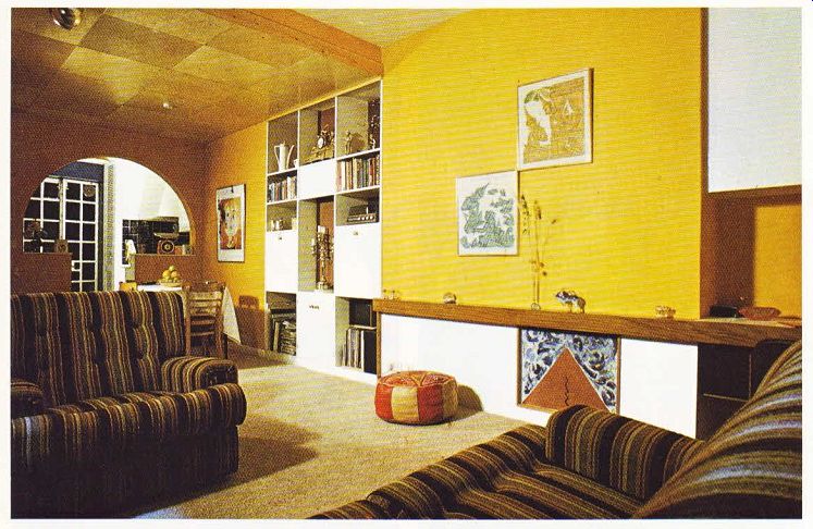
The L-shaped room has a great deal of character. The main ingredients working together to get this effect are the colors which are bright, the textures which are rough and woven, and-most of all-the delightful arch which breaks up the space between the kitchen and dining areas, The walls are covered with a warm yellow hessian. The yellow is then picked up in the heavy weave of the brown, black, yellow and white upholstery of the chairs and couch. The striped covers give a very smart look and are enhanced by the button backs. There is a shaggy brown rug under the mirrored-topped coffee table-another variation in texture. The blacks, whites and browns in the Turkish throw rug under the dining table echo the stripes in the couch weave.
There are some lovely touches in this room.
The Thai prints-bought at a shop round the corner-have been framed and create an un usual and modern design on the expanse of yellow. The arrangement of pictures is important to a room; it‘s often the focal center.
An original grouping of pictures on a wall can set the tone for the overall motif. The white wrought-iron strip that runs from the floor to ceiling adds a delicate touch and also helps to setoff the dining area.
The ceilings in the L-shaped room have been given careful consideration. In the living area, the ceiling was peeling and cracked. To combat this, the ceiling was covered with woodchip paper, which isn’t expensive, and then painted white. Woodchip paper is an excellent idea if you want to cover a surface which has cracks, and if you can’t afford re-plastering. It gives a slightly rough surface and covers up noticeable breaks in the plaster. Any color can be painted over it.

---------- ABOVE. View from the spacious silting area into the dining
and kitchen areas. A lowered plywood ceiling hides ugly beams and helps
set off the dining area.

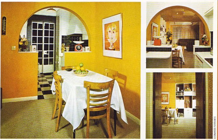
--- Above left. The graceful lines of the arch make a superb room divider
and allow the flow of space to continue into the kitchen. --- Above top.
Looking out from a compact kitchen. Counter spaces from the arch makes serving
easier and keeps dirty dishes and cooking out of sight from guests. ---
Above bottom. The entrance hall looks onto attractive storage units in the
L-shaped room.
Eye-catching wallpaper patterned like mosaic tiles contrasts well with the mahogany doors.
The dining area is set off by the ceiling, Plywood, cut into large squares, is pinned to the ceiling and covered with varnish. The lowering of the ceiling is another clever touch--it shows off the wood and also hides unsightly beams.
The spotlights on the ceilings in the dining and living areas give a soft and dramatic effect.
Mr. Guerra likes watching television with a light and Mrs. Guerra without. They com promised by buying spotlights--they could be turned in different directions, thereby giving off varied amounts of light. Now the Guerras both feel the lighting is right for them. Spot lights are versatile and decorative and can enhance any room, giving a strong clear light where needed for reading or paper work.
One of the most functional--and attractive features in the room are the wall storage units.
In a small flat, storage is at a premium. These cabinets are visually appealing; the brown and white color contrast ties in well with the yellows in the rest of the room. They also serve as a very practical item for storing a stereo, books, china and ornaments--all things that need to be either visible or easily accessible rather than hidden out of sight in drawers or stored in cupboards.
Probably one of the most striking and unique aspects to the room is the arch leading to the kitchen. Its beautiful, graceful lines serve as a superb room divider. The high walls provide counter space, and have been strategically designed to hide what you're doing in the kitchen. No one likes to see dirty dishes stacked up beside the sink, and most cooks prefer to have some privacy when preparing a dish.
Mrs. Guerra says serving is so easy now she wondered how she ever managed to run back and forth between the old living room and kitchen.
Arches can be made in a fairly straight forward method--the method you choose will depend mainly on the size of curve needed--and add an elegant tone to a room. Any break in normal flat surfaces and common right angles gives a pleasant relief to the eye.
The cool blue and white colors of the com pact kitchen contrast with the bright colors in the rest of the L-shaped room. The blue tiles are German and easy to clean. The white trim on the doors tie in with the other decor. There is plenty of working surface--a washing-up machine and refrigerator, covered with white laminated shelves, create the working surface. The central heating unit is hidden by a louvered door and takes the eye to the blue and white linoleum floor.
Outside of the L-shaped room there are other interesting touches. The bathroom has a bidet, and a wardrobe with a difference has been fitted into the master bedroom. Originally there was a fireplace which the landlord wouldn't allow to be moved. It wasted valuable wall space and didn’t look appropriate in a bedroom.
The chimney breast is now covered with plaster and floor to ceiling folding doors have been erected along the full length of the wall.
Shelves have been put up in the narrow part of the wardrobe covering the old fireplace, and items like shoes and hats are stored there.
The architect was practical, and in the deeper part of the wardrobe he has put up two rails for clothes. The rail on top is for clothes that are not worn often, and the one on the bottom is for everyday clothes. This technique creates extra space for hanging clothes and is particularly appropriate in homes with children--the clothes are short enough to be stored this way ! What was once an unimaginative and difficult flat to live in is now a comfortable and attractive home. One of the major keys to its success is the L-shaped room which gives the feeling of spaciousness and makes everyday living easy.