A large house with a lot of rooms--many intercommunicating--can be converted in a number of different ways with equal success. But in re-planning a house to suit a particular family, everyone ‘s personal needs and activities must be taken into consideration. It is well worthwhile to bear in mind that a conversion on this scale is a long-term project-so you must try to anticipate the future variations in the space allocation requirements of a growing family.
Remember that the space your children will need for hobbies when they are young must be easy to adapt as they get older.
Interior designers Peter and Juliet Glynn Smith outgrew their last house when their family increased in size. They then needed somewhere large enough to house them (plus three children and a nanny), with space for them both to work as well. The idea of a family room was a must, and this had to be considered as well as the usual kitchen, living and dining rooms. The lack of a garage and a garden in their last house had aggravated them into putting these needs well at the top of the list of essentials in any new house they looked at.
When they finally found the house that-in size, at least-fitted their requirements, they nearly gave up at the prospect of the mammoth task of converting it into a habitable dwelling.
The situation was delightful: close to the River Thames, with well-wooded communal grounds behind the house and their own ample front and back gardens. The rural river setting with its feeling of tranquility and the safe open places around made it a perfect base for bringing up a young family.
The house had been well built in about 1860, but was nonetheless in an extremely sad condition. It had last been redecorated about 20 years before, and then allowed to go to seed.
Most of the washbasins were cracked, and the bath had a hole right through it. The previous occupants-obviously mostly teenagers-had decorated their rooms with silver spray paint and gaudy posters. The playroom had been used as a motor cycle workshop, and so it went on throughout the house, each problem appearing more daunting than the last.
When the Glynn Smiths bought the two storey double-fronted house, it was not planned for modern living. There were several fairly major structural alterations that needed doing: central heating had been installed (rather badly) but it was old-fashioned and needed re-planning; the house also had to be rewired. There was masses of space, but it had not been put to the best use. The first job was to assign a function to each of the rooms and then proceed with the conversion.
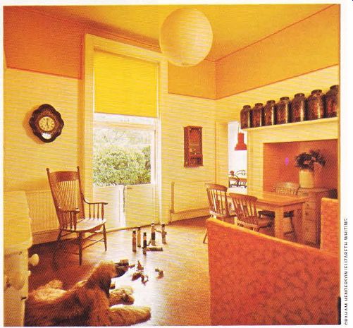
There were four main rooms on the ground floor; one of them, at the back, was more like a corridor with doors on all sides, and no blank walls to stand furniture against. This became the family room, and was brought back into circulation by blocking up two of its doors, thus allowing at least one wall for some furniture. A frieze painted above the fitted dresser cupboard unit now disguises the very high ceiling, and makes the room look less box-like.
Off the family room, there was a long narrow kitchen with cupboards on both sides, narrow ing it even more, and one high-level window allowing views of only the tops of the trees. A butler's pantry also led off the family room; it was like the black hole of Calcutta, with washing dripping onto the old floor. Thick pipes ran along the walls in all directions, and an old sink stood in one corner. A Victorian out building running along the side of the kitchen housed a lavatory and the oil tank which fed the large black boiler in the cellar.
The Glynn Smiths planned the ground floor round the kitchen, which was completely altered. First they had it gutted, then removed the wall dividing the original kitchen and pantry, moved the door to leave enough room for a good run of units, and replaced the high-level window with a full height french window leading to the back garden. Half the outhouse was knocked down so as to let more light into the kitchen, which had been dark and dingy; the lavatory and laundry room were retained. A door was knocked through to the old main room at the front, which logically became the dining room.
The dining room had been the old playroom.
It had a very badly pitted cork floor, walls covered with posters and built-in desks, a window seat over the antiquated radiator in the square bay at the front overlooking the front garden, and the walls and doors badly marked by darts and drawing pins. Paper-backed felt was used to camouflage the damaged walls, and white vinyl tiles give the floor a fresh, smooth appearance.
The other large room at the front looked like a furniture store, with heavy curtains and a pelmet. Its good points were that it was a particularly light and airy room and led through two french windows into a huge conservatory at the side of the house. It was an obvious decision to make this room into the studio, where the two designers could work in attractive surroundings. The conservatory along side, once heaped high with bicycles and painted (glass and all) in orange, purple and black, is now a bright garden room, lined with vines and colorful pot plants.

------------ ABOVE. In the family room, a decorating trick to lower a
high ceiling: a wide band of color painted at the top of the wall, banded with
yellow and red striped ribbon.
The living room at the back retained its former function because of its size and attractive view over the back garden, Once a drab, grey room, it has now been transformed into a cool, inviting, comfortable retreat by the addition of cream paper-backed hessian on the walls, a luxurious off-white carpet, and natural wool curtains and upholstery.
The ugly mantelpiece was ripped out, and the open fireplace simply edged with a chrome frame. A white plastic piano and exotic plants in enormous earthenware storage pots catch the eye, but the focal point is definitely the applique picture with ziggurat chequer-board pattern which hangs on one wall. It was designed specially by Juliet Glynn Smith, and made by Debbie Burnham, who sewed together the pieces of cream and white fabric with silver lurex thread.
The planning of the first floor and who slept where was dictated by the plumbing. The main bedroom was originally at the front above the studio-a dark room with a fitted wardrobe.
The two rooms at the back with a view over the garden were both more suitable for the main bedroom, but a choice had to be made between the added advantage of either a balcony or a bathroom. They finally decided that the opportunity of having a small dressing room and bathroom leading off the bedroom was too good to miss, so the back room with the balcony became the spare bedroom. The two large front rooms became children ‘s bedrooms with the nanny's room (formerly a dressing room with a washbasin) connecting with the younger children ‘s room.

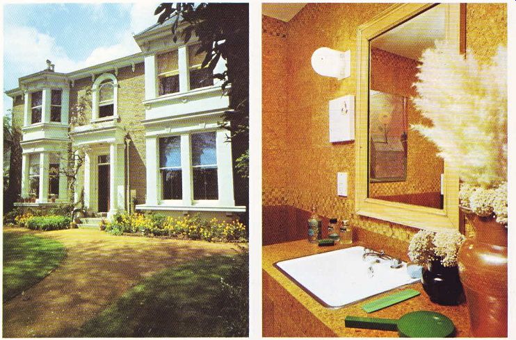
--------- Above left. A coat of white paint restored the outside
of the house to its former glory. The window blinds combine with the lowers
to add splashes of color. --- Above right. In the main bathroom, the areas
surrounding the basin and bath are faced in plastic-laminated cork tiles, which
water does not mark, with natural cork tiles on the walls above.

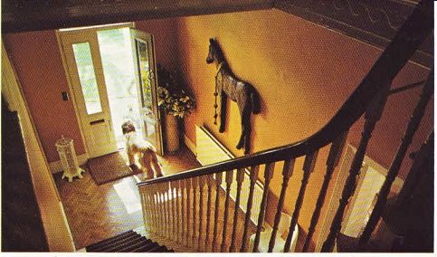
ABOVE. The welcoming hall is painted yellow. The curving banisters were painted
white, and the attractive herringbone-patterned boards in the hall were repaired,
sanded and sealed.
The main bathroom off the small dressing room was completely refitted, with a false ceiling put in, and a new bath and vanity unit built. The second bathroom was converted out of what was originally a combination of a high, narrow corridor, a lavatory and a linen cup board. By knocking them all into one, swapping the doors about, and adding a false ceiling and a new bath and washbasin, it became the children’s bathroom.
--------------