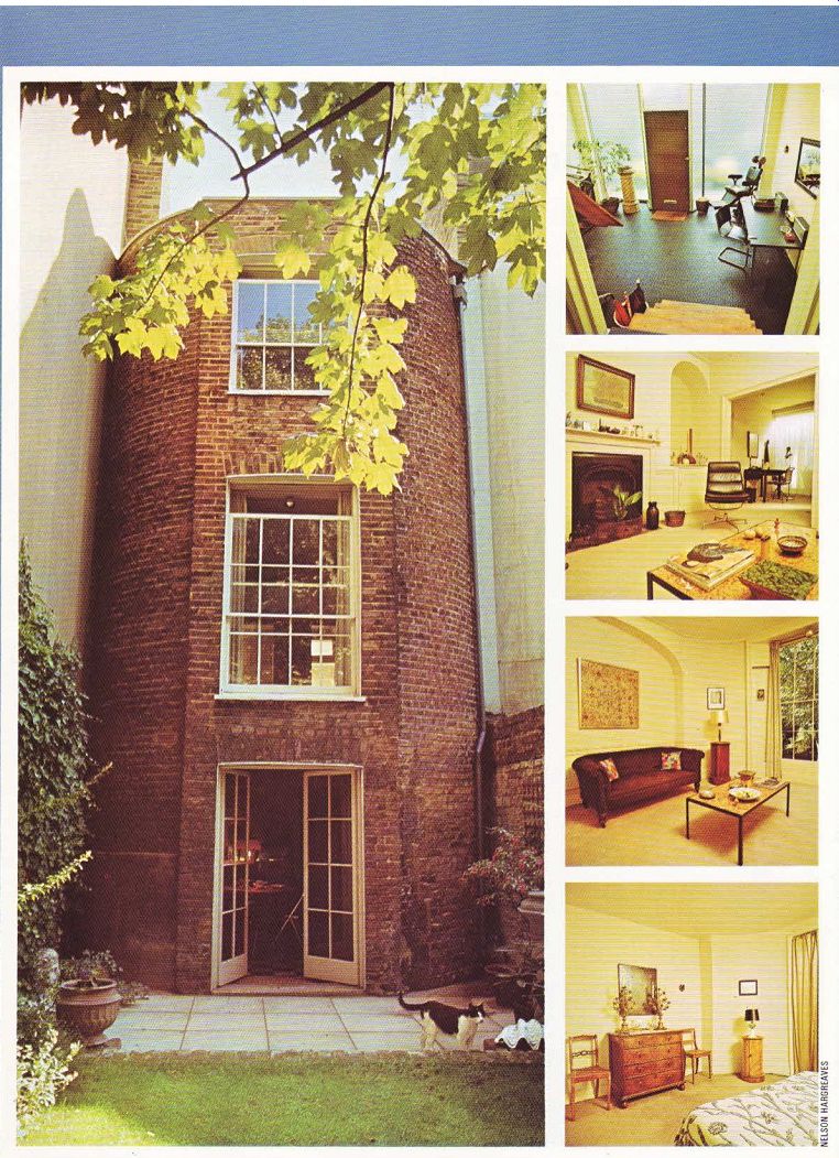

----------------- ABOVE far left. View from the back garden. The graceful, curving
brick wall adds a distinctive note to all three floors, giving the house-inside
and out-a unique look. --- Top Right. First a front garden, then an antique
shop, now a modem studio. Valuable light pours in through the glass paneling,
also adding to the light, airy atmosphere. A dentist's chair makes a striking
corner piece. --- Center right (above). Looking from the living room into the
study, with the studio beyond. The heavy, dark cast iron fireplace contrasts
well with the light, pastel decor. --- Center right (below). A living room
enriched by a handsome Chesterfield and rich marble table. The beauty of the
tapestry is heightened by the generous arch in the wall. --- Above: Bottom
right. The master bedroom with a rich walnut bureau, topped off with imposing
brass candelabra-once used in churches. The Indian bedspread adds a delicate
note.
Built in 1810 as a private residence in North London, this terraced house eventually became a shop-its location on a main road made it an ideal spot for business. About seven years ago it was bought by an industrial designer who had two objectives in mind when purchasing.
Firstly, there was an antique shop at the front which the buyer wanted to take over and perpetuate and, secondly, the rest of the house lent itself to a potentially successful conversion the inherent grace in the structural lines created a natural charm.
The house is long and narrow with a gently curved brick wall at the back which runs through all three floors. This curve adds an unusual note to the decor in the basement dining/kitchen room, the ground floor drawing room and the first floor bedroom. It adds an immediate note of distinction and elegance to the house.
Another appealing feature is the unpredictable floor levels. Originally there was a small garden between the front of the house and the street. In about 1880 it was converted into a single-floor shop. From there one flight of stairs leads down to the basement and spacious back garden beyond. A second set of stairs-about four or five steps-takes you up to the drawing room and study. This irregularity in floor levels adds personality to the house.
If you want your conversion to have originality, you‘ve got a head start if the house you buy has features like the curved wall here or the variety in floor levels. When house hunting, keep an eye out for aspects which could be high lighted. to give your home a different look. ‘Givens' are often neglected because the eye glosses over them too quickly. Look very care fully at the visual endowments or impediments a house has to offer before making it yours.
Conversion work in this Regency house began in the basement which consisted of two rather dreary, dark rooms. The windows on the curved wall were made into wide French doors, allowing more welcome light to filter into the room.
The partioning wall was pulled down and replaced with a steel joist which spans the 15ft width of the room.
Another wall was erected farther back to allow enough space for kitchen appliances to be fitted in without encroaching on the original space definition of the room. A false ceiling, built out from the steel joist, and floor tiles differing from those in the main body of the room, help to define this small ‘kitchen' area.
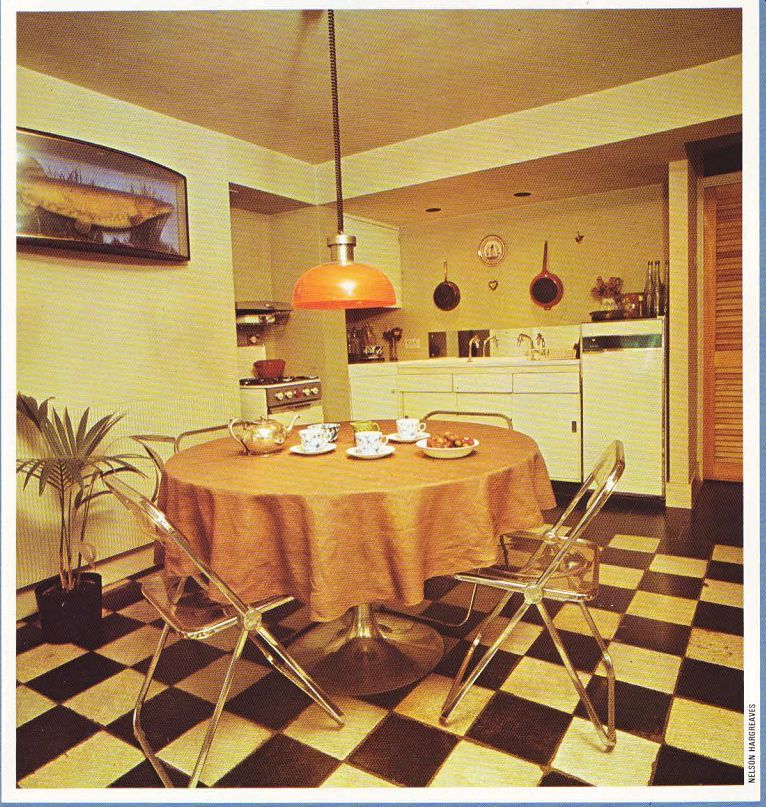
The effect achieved was one of greater spaciousness and light. All the furniture and decoration was then scaled to the room. A round dining table, complemented by perspex and chromium chairs, echoes the curve in the wall. The transparent and light texture of the perspex was an excellent choice for this small room; it allows the flow of space to continue. A heavy wooden or upholstered chair might have hindered the visual fluidity.
It's very important to select furniture according to the size of the room it ‘s going into. Light, delicate pieces can look lost and insignificant in a large room with a high ceiling, whereas heavy or bulky items can overwhelm a small room by completely dominating it. In general, furniture should follow the size dictates of a room. If you ‘ve already invested in a certain style of furniture and are moving, make certain it will fit in with the sense of space in your new home.
The adjustable Italian lamp over the dining table is in keeping with the light, non-bulky feeling of the room. Especially small spot lights were put on the low ceiling-consideration was given to their size so they would not seem too large in comparison to the room, A potted palm plant on the floor fits gracefully into the curve in the wall.
One of the most eye-catching visual accents in the room is the floor which is covered in black and white marble squares, arranged in a checkered design. The marble was bought second-hand, is easy to clean and adds to the period flavor of the house. The walls and ceiling were painted a neutral shade of off-white.
Behind the wall housing the compact kitchen units, an efficient bathroom was built. An advantage to this layout was that the plumbing systems of both the kitchen and bathroom could be made together. This also meant that there were no ugly pipes on the two floors above. The same coloring in subtle shades of soft browns and creams were used here.
Full advantage was taken of the area under the stairs which often becomes an untidy catch all for miscellaneous items in other homes. The area was broken down into three sections: a broom cupboard at the highest point, followed by an area for the dustbin, and finishing off with a section for kitty litter. The complete area was then covered with blockboard with the appropriate doors This is a superb example of how often wasted space under the stairs can be utilized for many purposes.
The flight of stairs leads up to the 'shop' which has now been converted into a studio so the industrial designer can work at home. It ‘s ideal because light pours in through both a slanted skylight above and the entire side of the house front, made from floor-to-ceiling panels of rough-cast glass. This unusual choice of material was made because it was relatively in expensive to purchase and install the glass, it helped to keep the former 'shop' character of the room, and also provided natural light for working. Durable studded rubber was put down on the floor which is very practical in that the studio also doubles up as a visually arresting entrance room.
The window, which was once part of the out side wall when the garden existed, was opened out to let more light into the study. It creates a lovely link between the studio and study between the street level and the ground floor, several feet higher.
The two ground floor rooms were basically left as they had been. The door between the smaller study and drawing room was widened to create a greater movement of space and light, while still giving the impression of two separate and distinct rooms.
The drawing room color scheme is a restful combination of beige, eggshell and cream with splashes of brilliant color scattered around in the decorative touches. The theme of ‘variations on an off-white color' is a consistent back ground throughout the house. This neutral coloring gives plenty of opportunity for experimenting with more dramatic colors on a smaller scale elsewhere.
Two bright patchwork cushions, for instance, set off the small chesterfield, covered in a deep brown suede. Similar vivid colors are seen in a 19th century tapestry, hanging in a gold frame above the chesterfield. Both the tapestry and the sofa are framed by a lovely-and original shallow arch which is another example of how an intrinsic aspect of a house can be used for maximum visual impact.
Another original feature which still holds a great deal of fascination today, is the deep alcove built into the recess created by the chimney breast. Its decorative treatment is very effective. Rather than trying to fill in the high space, all the knick-knacks on the shelf are low, leaving an expansive arch above where light from a 1930's lamp casts an eye-catching inter play of light and shadow. The absence of over powering decorations and the use of light create a strong visual impact.
Other furniture includes a modern leather swivel chair, a period armchair, covered in rich green velvet, a black cast iron fireplace and a luxurious coffee table. The marble slab serving as the table top was once a washstand top-it was bought from the Salvation Army in Switzerland. Its colors are a magnificent mixture of soft beiges, browns, rods and pinks Another feature worth noting in this room is the mahogany side table originally used in Victorian times for holding a chamber pot. Its cylinder shape repeats the curve in the wall which, as in the dining/kitchen room below and the master bedroom above, creates an appealing focal point.
The bedroom upstairs is sparsely furnished with a number of handsome pieces including a rich walnut bureau, enhanced by old French church candelabras in brass. Two wooden framed mirrors over the bed give extra depth to the room. The Indian bedspread is a subtle shade of soft green, accented with grey floral stitch work. The satin beige curtains are lined with felt for extra protection from strong sunlight.
The grace and attractiveness of this home largely results from taking full advantage of the inherent features which were available. It’s a good example of a conversion where the most was made of a basic structure.
--------------