In this housing scheme in Velp, Holland, the houses are built in circular groups instead of the usual straight streets or blocks. They have been specially designed so that they give the most flexible use of space possible, to create highly individual and convenient homes.
Their design overcomes one of the main objections leveled at modern housing that it looks regimental and offers few opportunities for imaginative treatment inside.
A generous landscaped garden goes with each house, and communal grounds help to boost a 'family' atmosphere. The scheme was designed by architects Schouten and De Jonge of Lievelde, and was landscaped by A. Gerts of Meteren. But even without the benefit of specialist advice, you can adapt many of their design ideas into your home, or your neighborhood. Many housing estates now operate 'Good neighbor schemes' where groups of house holders can establish their own communal amenities and take a pride in the neighborhood.
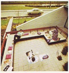
Though the whole idea is to make life more pleasant for the community, the individual houses themselves are built with privacy in mind. Each house has one blank outside wall with no windows in it, which is ideal if the owners-want to add an extension later. Another side wall slopes to enclose a private terrace at the back of each house.
All the walls-both the inside and outside surfaces- are of natural light-colored brick, with which the dark brown wood framing makes a striking contrast. Exposed brickwork in interior walls is fashionable, and its natural rough texture makes a room seem more welcoming. Pine boards, unpainted oak beams, and hessian hangings are other examples of such natural materials. They provide plenty of interest to the eye, making most ornaments unnecessary, and so leaving the room spacious and uncluttered.
This Dutch house is remarkable for its flexibility. There is enough room to re-arrange the space as the family grows up and its needs change. The interior combines both open and closed-plan features; you can leave it as one open area or divide it up according to your requirements. There is a covered area at the entrance which can serve as a carport or a sheltered play area, or even as a studio for messy jobs.
The upper floor can be left as it is or split into one large or two small rooms, and the space under the sloping roof can be used as bathroom, bedroom and storage space, or as two fair-sized bedrooms and a small shower area instead.

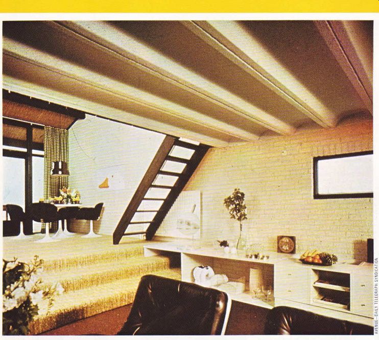
---------------- ABOVE. The interior is split into three levels-the lower
floor being sub-divided into eating and lounging areas. The upper floor is
reached via a 'ladder' staircase, and the two lower areas are distinguished
by their individual floor coverings.

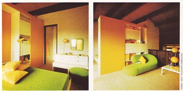
--- Above, left. Warm tones for the sleeping area upstairs. The orange and white
storage unit harmonizes well with the sharp green of the bedspread and yellow
cushions. ---- Above, right. Another corner of the upper floor that is reserved
for sleeping. Here the storage unit acts as room divider, and an ultra-modern
day bed provides an elegant focal point. The wall-to-wall carpet helps to create
an illusion of greater space.

ABOVE. A communal patio for several families who live in this housing scheme.
Obviously not every home provides such good opportunities for rearranging the interior, but nevertheless many homes keep too rigidly to the conventional use of space when they could be remodeled without much difficulty.
The appearance of the interior is as unconventional as its plan. In the living-room, attention is drawn to the ceiling by arched strips fixed between the beams in the flat part. Where the ceiling slopes, the beams have been left exposed to give a natural appearance that goes well with the unpainted brick walls.
It is always a good idea to plan your decor round the tones of the building materials. Here, very plain but subtle colors have been chosen to create a relaxed appearance. The sitting well, which is three steps lower then the dining area, has been carpeted in dark brown. This emphasizes the coziness of the low area with its open fire, and harmonizes with the brown and white of the loose furniture. There is a brown leather sofa, two matching easy chairs and six white plastic tables scattered around the area.
A round white dining table and four elegant chairs upholstered in brown fabric fit neatly into the dining area. Green and white checked curtains covering the window wall add a cheerful note.
The predominance of white in the overall color scheme is a deliberate move to add fresh ness to the interior. White brings a clarity to a decorative scheme that no other color can match, and also reflects light to make any room seem bright and spacious.
Setting up an unobtrusive kitchen in an open plan scheme is always a problem. Here it is overcome by tucking in a compact kitchen beside the dining area, with the units arranged into a wall that divides off a corridor running down the middle of the flat. Sheer beige curtains close off the kitchen when it is not in use, blending in well with the overall decor. Beige, oatmeal, grey, mushroom and other muted or neutral colors do not stand out from the back ground, and so are excellent colors for camouflage. Equal tones will camouflage, even where the colors are different whereas a blatant contrast in tone will highlight.
The upper floor is an open space above the living area and is reached by an open staircase from the dining section. This space could easily be divided off with a conventional brick wall, thus separating it from the ground floor, if more privacy was required at a later date.
The large upper area is split in two by a room divider constructed from double-sided cup boards. One section is used for hobbies, and the other is a spare bedroom. A flap-down bed is incorporated into this side of the room divider this is a particularly good idea for rooms where space is cramped, for example in a playroom that doubles as bedroom.
A small shower room completely tiled in white leads off the spare room. In the bedroom itself, a sunny effect has been achieved through the use of yellow and green, which is set off well by the white walls and units. The cupboard doors are painted yellow, a warming color to contrast with the cool green of the fabric on the pouffe and bedspread. Both colors combine in the flower motif of the curtain material, and are echoed in the cushion covers. Two-tone color schemes benefit from meeting in a focal point where the eye can quickly appreciate the contrasting or complementary colors.
The main bedroom has been fitted into the space under the sloping roof at the back of the house, with a bathroom next to it. A completely glazed wall leads on to the terrace, making the bedroom very sunny.
Pink and purple provide the bold color scheme. The double bed is enclosed by sheer purple curtains hung on a circular brass track.
The chairs are covered in pink fabric, and a pink and purple floral pattern is used for the bed spread, backdrop and curtains.
This house is an experiment with space-its keynote is flexibility and convenience for the family who will grow up with it. It is an ideal example of how to mould your house to suit the needs of your family instead of letting it dictate to you.
--------------