A narrow piece of land can present problems for house design. It requires an intelligent arrangement of rooms and well-planned placement of windows in order to take full advantage of outside light and space. This Australian home, built on a block measuring 33ft by 16ft (10m by 4.8m) was converted and ex tended, making an asset, rather than a drawback, of its 'narrowness'.
When Professor Bolton and his wife bought their narrow plot of land, the pre-World War I house standing on it was badly in need of renovation. Their first inclination was to pull down the old house and build a modern one with all the up-to-date conveniences. On closer inspection, however, and with advice from an architect, the Bolton‘s decided to alter the old house, taking advantage of the existing assets.
The facade had character which would con tribute to the attractiveness of the home. The main rooms were situated at the front of the house which faces north--the exposure which benefits most from the Australian winter sun.
More accommodation was needed-bedrooms and a play area for the children and a bedroom and study for the parents-but it would be possible to provide these through converting and extending. And so the work began.

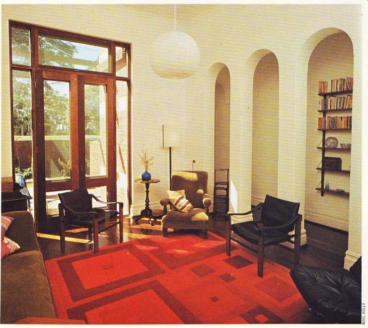
----------- Above. A living room with tall, elegant arches-once a solid
un-ambitious hallway wall. Geometric patterns in the brilliant red rug complement
spacious French doors.
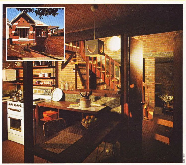
The exterior was given a face-lift. A new corrugated iron roof came first. Then attention was given to the brick walls which had an old-fashioned look because the lower half had been painted. The paint was stripped off, the entire wall re-pointed and then a splash of white trim added to break up the expanse of brick. A heavy iron-roofed verandah, which had blocked out valuable light from the living room, was pulled down and replaced with a more delicate pergola.
Some privacy was desired, but a high wall would have cut off the attractive view across the road. The solution was a shoulder-high brick wall which was gracefully designed in a circular fashion. A small garden was built up, styled for people who have difficulty in ‘finding time' for gardening. Instead of a lawn requiring constant attention, there are wood chips, and the plants, which will eventually grow much larger, are native to Australia and don't require much watering. The stepping stones leading to the back of the house have been positioned in a rather whimsical and graceful fashion.
It's very easy, when embarking on a con version, to put all your energy into fixing up the interior and forgetting about the exterior which really is equally important, A shabby or forlorn facade is a most unwelcoming sight and is a poor recommendation for the interior to come.
Make certain the outside of your home is not neglected--it ‘s a reflection of you.
Once the cumbersome verandah was re moved, allowing more light into the front rooms, renovation began on the living room. Originally there had been a long, narrow and uninspiring hall, running adjacent to the living room wall. It really served little purpose, so it was ‘treated' three tall and graceful arches were built into it.
The arches add a note of elegance, open up the space of the living room, while still suggesting the feeling of a hallway. Arches can be effective and decorative room dividers. If you' re in the process of renovating and want an original touch in your home, a plastered arch or curved wall can be used to add decorative interest and bring a new dimension to almost any room if used imaginatively.
The small front windows were replaced by large French doors which lead out to a pergola.
A brilliant red rug with stunning squares gives a rich tone to the room. The furniture is a harmonious mixture of antique and modern.
Ceiling spots highlight the 'hall' bookshelves at night, creating a dramatic effect.
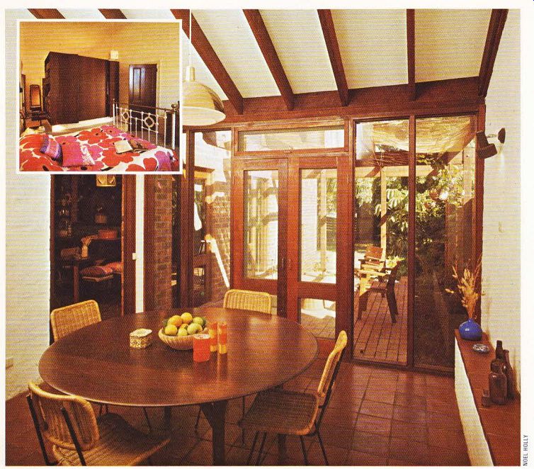
The dining room had been a rather dreary back bedroom. It was extended by raising the ceiling and lowering the floor. The drab fibrous plaster ceiling was taken out, leaving the natural slanting line of the original ceiling which then required re-plastering. The exposed wooden joists were left which create an appealing visual effect. The floor boards were removed, which substantially lowered the level of the floor, and replace with 9in. (228mm) brick tiles.
A small tiled ledge, running along one wall, conceals limestone footing and a damp-proof course. The original floor had been the height of this ledge which now serves as a handy shelf for display. Often features which emerge out of necessity, like the ‘camouflaging' ledge here, turn out to be eye-catching focal points in a room.
If your home requires a camouflage or disguise for ugly pipes, meters or radiators, consider making a feature of the ‘disguise', rather than trying to hide it apologetically from sight. You could also consider drawing attention to such an item by painting it with a coat of brilliant glossy color.
The spaciousness of the dining room was further increased by making one wall almost completely of glass. The French doors and surrounding glass panels don’t arrest the eye and help to bring the greenery of the patio from the outside into the dining area.
-------------
Two good techniques for making a room look larger have been used in this room. The first was to increase the actual amount of physical space available by raising the ceiling and lowering the floor. The second was to visually expand the space by opening out the view with glass, carrying the eye out to the patio.
-----------

Above. Attractive wooden joists, spanning a slanting ceiling, and a lowered
brick floor open out this once confined room.
Inset. An imposing teak wardrobe serves as a functional room divider with a bedroom on one side and a studio on the other.

Above. The handsome extension, made from pine and brick, with a rustic
kitchen fitted out with modern conveniences. Inset. The "face-lifted" exterior,
characterized by a rounded brick wall, white contrasting trim and a delicate
pergola.
A third technique for making the most of space was used in the bedroom-cum-study. Originally this had been the sitting room and back bedroom. A new and clever arrangement was worked out. The partitioning wall was knocked down and replaced with a large dark teak wardrobe which also serves as a room divider. One side is the study and the other, the bedroom, with wardrobe doors opening out on either side with a section for books spanning between.
If you're creating different areas to a room, make certain you use appropriate room dividers.
Plants, screens, arches or wardrobes are all likely possibilities. It's important that the dividers appear to be an integral part of the room, whether it be decorative, functional or both. A room divider which doesn't blend in with the rest of the decor tends to detract rather than contribute to the beauty of a room. The wardrobe here adds a rich tone to the room and also has a practical and appropriate function in the room.
The colorful motif in the bedroom begins with the bold red and orange flowers on the bedspread. The iron bedstead gives an old world charm to the room. On the other side of the wardrobe, the atmosphere is ‘booky' because of the desk and bookshelves, but the wardrobe ties the two parts of the room together. A small bath room leads off the study.
Having successfully convened the existing rooms, the Boltons set out to build an extension.
The narrow land ruled out building on to the sides of the house At the back of the house there had been an asbestos lean-to. This was knocked down and new kitchen and family room erected,
with children‘s bedrooms and a bathroom upstairs. The advantage to this set-up was that the children could play in their section of the house without disturbing the parents who might be entertaining in the main part of the house.
The new extension was made mainly with brick and handsome pine. The wood adds a feeling of warmth while the brick helps to keep this area cool on hot days. An attractive brass rubbing hangs on the brick wall and a light Japanese-type lantern hangs from the ceiling.
The Australian house is a delightful and unified living area. The narrowness of the land, rather than being a limit to the ‘growth’ of the house, has added to the appealing decor and layout.