The architects of those enormous Victorian houses must have placed little importance on the value of cooking, as--in marked contrast to the large reception rooms-the kitchen quarters are often meager.
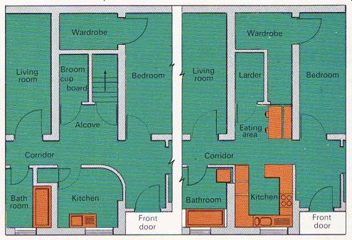
When designer Liz Goldfinger was asked to modernize a poky kitchen in a basement flat in North London, she realized that the curved inside wall separating it from the corridor had to be knocked down in order to incorporate an informal eating area. This would not only in crease the space available, but also enable light from the kitchen window to spread over the whole area.
The corridor leading from the front door and running along the middle of the flat separated the kitchen from an alcove opposite, which was to become the eating area. At the back of this alcove were doors to a broom cupboard and a staircase leading to the ground floor. This stair case was removed and the space used to enlarge a wardrobe in the bedroom behind. The broom cupboard became a walk-in larder, whose door was incorporated in a false wall faced with pine boarding.
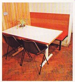
To make the most of the small eating area, a bench seat was built along one side of the alcove, with a cushion covered in red plastic and a pine backrest. The freestanding white laminate-faced table has a cantilevered top, as legs would get in the way.
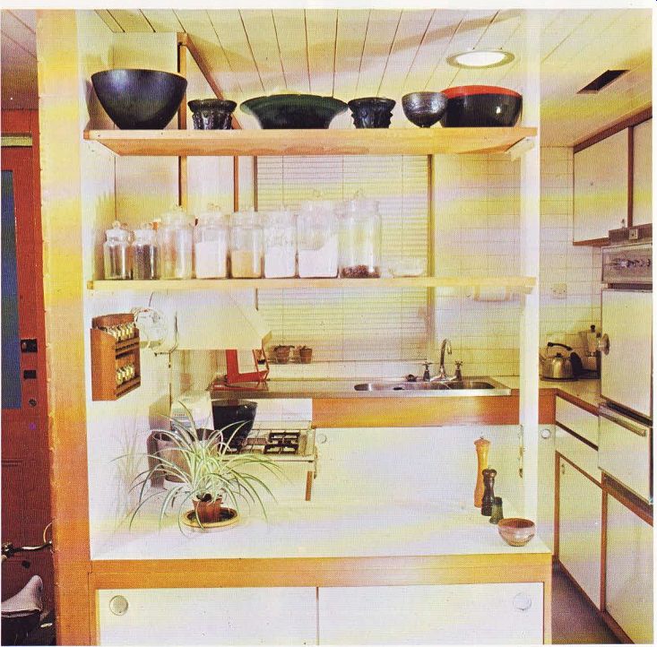
The kitchen is now open on the corridor side, with only a worktop/cupboard unit and an open shelf above dividing it from the eating area, creating a ‘bar' effect. The cupboard opens on both sides, so that china can be put in from the kitchen and taken out from the other side when needed for meals. There is no kitchen door-just an opening large enough for access.
The small square kitchen had to be carefully planned to make best use of the existing area, and provide adequate storage space. The white laminate-faced cupboard and drawer units were specially made to accommodate the hob, oven, large refrigerator and double sink unit.
All the cupboards have sliding doors, so as not to waste space. They are suspended on plastic track and have simple recessed handles.
Liz Goldfinger designed the wall cupboards particularly shallow. She finds them more practical than deeper cupboards, as bottles and jars stored two or three deep on a shelf tend to get knocked over when someone is reaching for something behind.
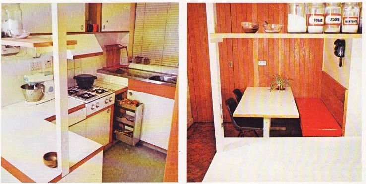
The stainless steel sink unit runs under the window, which has a washable Venetian blind, and the wall around is covered in white ceramic tiles. The recess for the refrigerator was made large enough to provide adequate ventilation space above and behind it. A metal vegetable rack was specially designed to slide out on tracks below the food preparation area.
The worktop surrounding the separate hob is covered in heat-resistant tiles. A large hood over the cooking area encourages fumes up into a false ceiling, and an extractor fan in the out side wall dispels them, Two small openings in the white painted tongued-and-grooved wood ceiling help serve the same purpose.
Electric wiring is housed in ducts in the false ceiling, and a specially made steel tube supporting the shelf above the ‘bar' unit conceals wires leading to the light switches.
Pale grey vinyl floor tiles are coved up at the edges to make cleaning easier-just one of many features which make this kitchen practical.
There is plenty of storage space, with room high up for those things that are seldom needed, and everything is easily accessible. The white finish on the units, light-colored flooring and pale wood all help to create a feeling of space in what was once a small, badly planned kitchen.

-------------- Above. Floor plans showing the area before (left) and after
conversion (right). The stairs were removed, an informal eating area fitted
in the remaining alcove, and the corridor wall of the kitchen knocked down
to link them.

Above. The kitchen is light, spacious, and fitted throughout. A false ceiling
holds all the electric ducts, and the steel tube supporting the open shelves
conceals wires leading to the light switches at the bottom.

Above. Looking through the doorway into the kitchen. The worktop next to the
hob is covered with white heat-resistant tiles, with a sliding vegetable rack
beneath. Above right. View from the kitchen through the 'bar' unit to the eating
alcove on the other side of the corridor.

Above: The fitted bench seat saves valuable space in
this small area.