A flat with no windows can easily look dark and bare if the design scheme lacks imagination. However, the additional space provided by the ‘blind' walls can be exploited to advantage, with fascinating results.
When a young French couple were flat hunting. they saw a large loft tucked under the roof of a house in Bordeaux. They immediately decided to convert it into a flat, even though this meant that they had to forgo the views through windows that are a valuable feature of more conventional homes. Architect Michel Sadirac was asked to transform the loft, with its nooks and crannies, beams and shadows, into a light and cheerful living space.
The long irregular loft space divided quite easily into living and eating areas at its wider end, with the kitchen,
bedroom and bathroom in the narrow part. The original criss-cross roof beams, which separate the various areas, have been picked out with white paint, but not emphasized so much as to break up the large open spaces. The original floor was very uneven, so it was leveled and covered throughout in natural coconut matting.
There are no windows anywhere in the flat, so daylight has been ‘captured' and directed downwards through deep roof lights which let in shafts of light all over the flat. The light is diffused by the predominantly white color scheme, which has been cleverly distributed by means of different finishes: rough-textured white on the plastered walls and partitions, brilliant white on the gloss-painted beams, and smooth white for the worktops and shelves.
Against this plain background Michel Sadirac has set a range of strong toning colors: splashes of red, orange and yellow on a mid-

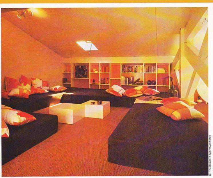
------------ Above. Foam-covered mattresses provide seating in the living
area, where a shelf unit on one wall disguises the roof slope.
brown floor. All the furniture has been adapted to complement the original structure: it is unobtrusive and functional, and made to measure to save space. Plain mattresses cut from 10in. thick foam and covered in dark brown fabric are arranged round the edge of the living area, with bright scatter cushions on them. The simple coffee tables are plain white painted cubes.
A practical and attractive feature of the flat is a long bookcase fitted along one wall, which conceals the roof slope on one side of the living area, and continues past the dining area and into the kitchen, where it forms a useful shelf unit.
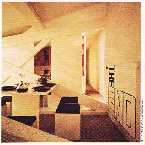
The compact dining area was also made to measure, with furniture reduced to its simplest form. White-painted cube seats with dark brown cushions stand at a table consisting of a white laminate top on a simple base. Panels of insulation board fixed to the beams that act as a room divider separate this area visually from the kitchen; openings are left in it for use as serving hatches to the dining area.

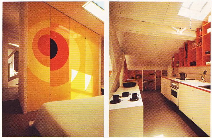
----------- Above left. In the bedroom, a geometric mural painted on the
doors of the wardrobe comes alive when they are opened. Above right. Red-painted
shelves cover the wall right up to the ceiling above the units on one side
of the kitchen, lit by a roof light.

Above. The compact dining room is tucked between the living and kitchen
areas.
Enormous black lettering livens up the otherwise dull radiator. The main living spaces are divided by natural open partitions formed by the criss-cross roof beams.
White laminate units along one wall in the kitchen house basic equipment such as a stain less steel sink, electric hobs and a small refrigerator. A red-painted wall unit of uneven pigeon holes climbs right up to the ceiling and is tailored to the slope of the roof; it provides visible and accessible storage for everything arranged on its shelves. A white laminate worktop similar to the dining table has been fixed to the partition between the two rooms, where it is easily accessible through the openings in the room divider.
The wildest splashes of color appear in the bedroom, where a geometric design in red, orange and yellow has been painted on the wardrobe doors. It comes alive when the doors are opened, revealing a vast storage space behind. A low white-painted shelf runs the whole length of the wall behind the bed, and continues into the bathroom, where flexible spotlights pick out the pure white of the walls and fittings.