Many people in Britain buy small Victorian terraced houses because they are relatively cheap and offer so much scope for improvement. They are generally solidly built and will stand up to a good deal of structural alteration-you can even gut them completely and refashion the interior to suit your needs.
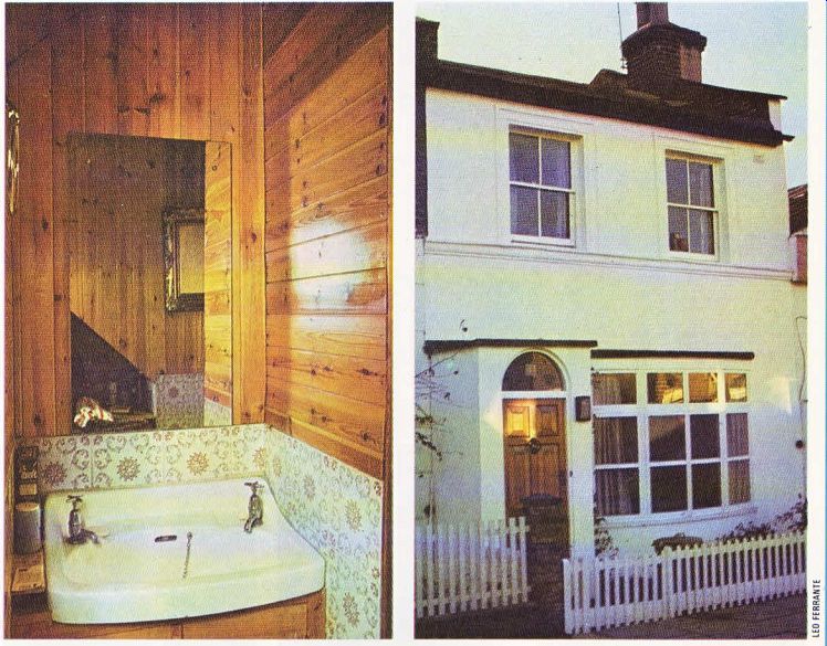
This house in Hammersmith, London, looks deceptively tiny from the outside. Only a new bow window and small porch give any indication that any changes have taken place, but the house inside has been completely reshaped.
If you have decided to make structural changes to your home and have the necessary money it is a good idea to be bold with your plans. Half measures will often result in a house where the new work clashes with the old structure and the overall effect is awkward and ‘bitty'.
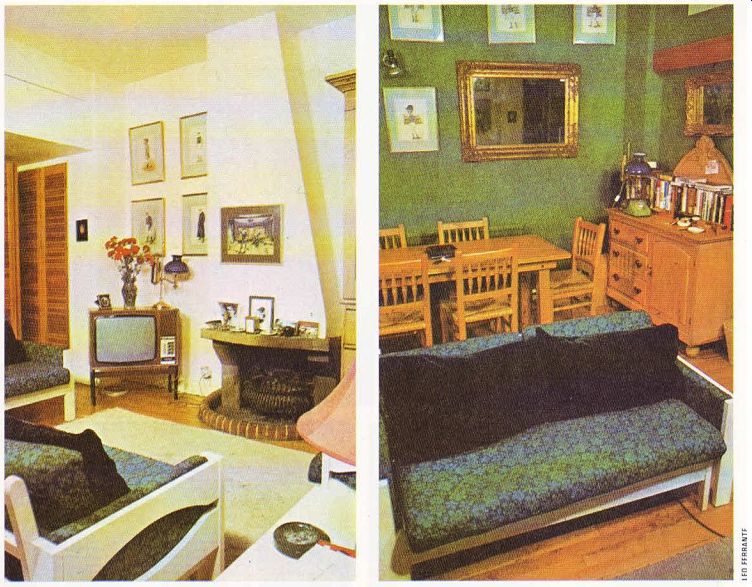
In this house only the original stairs remain the interior has been completely rebuilt. Down stairs a combined parlor and kitchen and the front sitting room were changed from two cramped rooms into one larger room, which can still be divided up by handsome louvered doors.
New wide french windows give on to a neatly kept garden. Here, an old chimney is featured as an unusual plant container, from which luxuriant ivy grows up to camouflage the cement rendered garden wall. Even the commonest garden plant can be made to look exotic if its container is out of the ordinary, and it is well worth spending some time and thought on ways of displaying your plants to advantage.
The french windows in the kitchen half of the through room and the new bow window in the other half provides the interior with plenty of light. The bow window is vacuum double glazed to keep heat in and noise out. The new porch was built out into the front garden to save space in the original tiny entrance hall.
The whole house, has been treated to new ...

-------------- Above left. The spacious living room is given a homely atmosphere
by the choice of an open fireplace. Above right. Attractive and sturdy design
is maintained with a,, the house's furniture-both old and new.
... floors and ceilings, and downstairs the partition walls-which were originally lath-and plaster have been rebuilt in sturdier brick. A steel girder which had to be incorporated in the new ceiling downstairs has been used to make one half lower. The space above now conceals cupboard space.
This is an excellent example of putting every inch of space to good use. Cupboards don't always have to be in conventional places as long as their contents don' t spill out on to your head and you can get at them without slipping a disc.
The average house wastes a fair amount of space simply by bad organization.
The rich glow of natural wood is much in evidence downstairs-the ceiling and floors are in matching boards, and the floors are sanded and sealed for extra shine.
The protruding chimney breast has been rebuilt to half its original size, following the path of the flue, to scale in with the room.
Previously it dominated the room and all the furniture in it. The whole of the chimney wall is painted off-white, and the opposite wall is a deep matt green, hung with Victorian racing prints in formal groups, There are blinds in a vivid green and blue fabric over the french windows and green covers on the comfortable easy chairs and settee. The color motif is repeated in a large green and blue shaggy rug which contrasts elegantly with the polished board floor.
The kitchen section of the through room has green and blue Italian tiles on both the floor and the walls for extra effect.
Any interior benefits from a strong line in color, and a consistent color scheme which might be carried from room to room throughout a whole house. Colors from the same part of the spectrum make excellent partners--especially if you are doubtful about your ability to mix opposites successfully. Here blue and green, two close colors, make a recurring theme through out the downstairs room, and blue is carried on into the upstairs decor. Red and pink; purple and indigo; and yellow and orange would all harmonize perfectly in similar schemes.
The downstairs bathroom has a 'sauna' look, with timber cladding on the ceiling and halfway down the walls.

---------------
Above left. The rich wood paneling seen here is used to good effect throughout
the house. Above right. The house looks deceptively small from the outside,
yet the white paintwork and bow window achieve a look of elegance.
The rest of the walls and the floor are tiled in fawn and grey patterned Italian tiles.
Upstairs the emphasis is on shades of blue.
The master bathroom is completely decorated in soft blue-even the sanitary fittings match the tone exactly-and there is a whole wall of mirrors to make the room look twice the size.
The small window is set off by Italian carved shutters painted white.
The master bedroom has floor-to-ceiling cupboards along one whole wall-solving storage problems in a room with limited space.
They are painted an electric blue and have a brass knob to highlight each cupboard door.
There is a blue bedside chest of drawers fitted with attractive blue and white patterned china knobs, and the blue is re-emphasized in the fabric of a lampshade and on the window wall (where the radiator is camouflaged by being painted the exact shade as the wall behind). To save space, there is a sliding door between the bedroom and bathroom.
The focal point of the bedroom is a huge white bed with a brass bedstead piled high with giant Indian-style cushions made by the owner’s wife. The floor is sanded and sealed.
All the furniture in this house is solid, un painted and dating from the Edwardian era, and most of it was picked up from inexpensive furniture markets. Plain pieces--perhaps relieved by brass ring-pull handles--look good with almost any decor, and prove to be extremely serviceable.
Originally the house was 'two-up, two down'--now there is the large through room and bathroom downstairs, and upstairs the space has been re-divided into two bedrooms and another bathroom.
There are many houses where space is badly organized. Intelligent planning and alteration could make them considerably easier to live in.
Sometimes householders consider adding on instead of simply reorganizing the space they have, often an easier and much less expensive operation. This house proves it. It has been opened up by skilful re-shaping and is both more spacious and more convenient to manage as a result.