Sometimes the charm of an old house can be lost through over-zealous modernization. If, like designer Mary Gilliatt and her professor husband, you are lucky enough to find an 'antique' farm house, you may find that it needs ‘de-modernization' to rediscover its full appeal. Often money is only half the story--it takes bold ideas and a fair amount of effort to turn a shabby house into an unusual home.
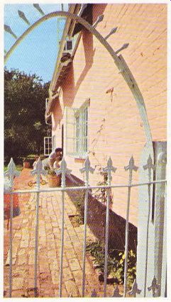
The Gilliatts discovered the farmhouse in an area of Suffolk, England, where they had already decided to live and immediately decided to buy the house, despite its obvious need for extensive alteration. It was really two cottages, one Tudor and one Victorian, which joined at right angles. Both were in fairly bad condition, with leaking roofs, birds nesting in the attics, and some dry rot. Attempts had been made in the past to modernize the whole house, with un becoming results.
The problem was to recapture the original character, and to add some personal touches without making the house impossibly old fashioned. Being a designer herself, Mrs. Gilliatt already had some ideas on what to do. but she also called in designer Paul William-White and architects John Abbott and Ian Hamilton Penney to help make the most of the house's considerable potential.


-------------- There were enough rooms to cater for the family and for a
reasonable number of guests (and their children); there were some fine old
brick floors which needed little upkeep and very little in the way of floor
covering ; upstairs, there were wide elm floorboards, and exposed oak beams
everywhere. The price of the house was reasonable enough to leave money for
quite ambitious alterations.
The existing scullery, a poorly-constructed, leaky lean-to was knocked down to make way for a modern kitchen with sliding glass doors giving on to a courtyard. The old kitchen--which was at right angles to the new one--was divided up into a utility room and a partitioned-off wash room and cloakroom.
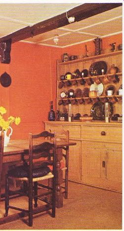
The designers built a larder in the middle of the new kitchen to act as a room-divider--one side of the room is now used as an eating area while the preparation and cooking of food takes place at the other side, out of sight. Because the existing floors were in fairly good condition and so attractive, they decided to find matching bricks to continue the expanse of floor out into the courtyard. One type of flooring ‘flowing' from one part of a house to another always makes it seem more spacious.
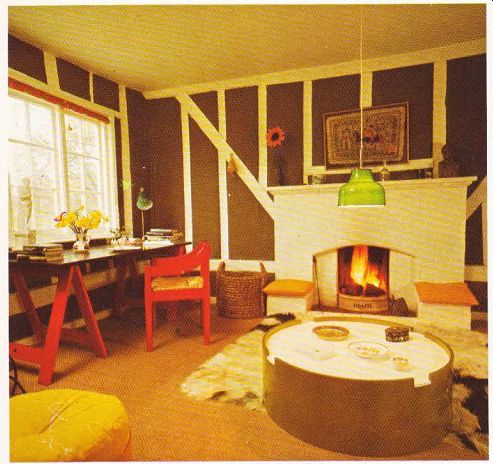
They knocked through the wall between the sitting and dining rooms, but left the fireplace between them standing as an unusual focal point, which could also effectively block out most of the view from one half of the room into the other, while the whole area could be used for parties.
Upstairs, in the Victorian part of the house, the master bedroom was large enough to allow for a second bathroom to be cut out of it.
The Gilliatts had to remove a pretty Victorian fire place which would have been in the way of one of the new bathroom walls. But throwing it away would have been wasting a valuable asset and the fireplace found a new home in the nursery immediately below.
One of the bedrooms already had a washbasin in it, and this was turned into a vanity unit incorporating a wardrobe. In this way, it could be closed off behind cupboard doors for extra privacy and tidiness.
The staircase was rotting when the Gilliatts moved in, but to their amazement, they found that a whole new staircase--built for looks--would cost less than they had budgeted for a top-quality stair-carpet! One problem here was integrating the new open-riser staircase visually with the heavier-looking exposed oak beams and generally solid look of the interior. Mrs. Gilliatt decide to brighten up the hall by painting the staircase with a clear red polyurethane stain, which would be both durable and cheerful.
To give a clear view right from the hall through the eating area of the kitchen to the hills beyond, an old window, which had originally been bricked up when the old scullery was built, was restored. The ‘resurrected ' window was extended down to floor level and filled with plate- [...]