Converting a derelict cottage can be a discouraging undertaking. It means dealing with problems of dampness, decay and deterioration, and once these have been coped with, consideration must be given to interior design. This early nineteenth century pair of semi-detached cottages were in a state of dilapidation when they were bought, and have now been transformed into a livable and attractive home.
When the Hedderwicks first set foot in these two semi-detached Somerset cottages, they were damp, chilly and unattractive. The wall paper was faded and peeling; the plaster was blistering and flaking; the atmosphere was heavy and dank. Major renovation was badly needed, but the site and price were so ideal that the Hedderwicks decided to go ahead with a conversion.
Rising damp was the most formidable problem; an architect advised the Hedderwicks not to tackle it-the effort and expense would be too great. A damp proof course wasn‘t feasible in such an old building, so another method, although expensive, was decided upon. It is based on a theory that dampness is assisted by static electricity, and can be prevented if the static is earthed.
To earth this electricity, an unbroken copper strip was inserted throughout the external walls, covered with cement and then attached to 6ft. (2m) copper rods which extend out from the building underground.
Although this method of overcoming damp ness was expensive to install in the cottage, it has proved to be very effective and a good long-term investment. A damp house is an expensive liability as dampness can cause deterioration and decay, as well as personal discomfort for the people living in it.
Originally there had been two small work men‘s cottages; these were knocked into one.
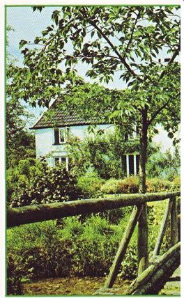
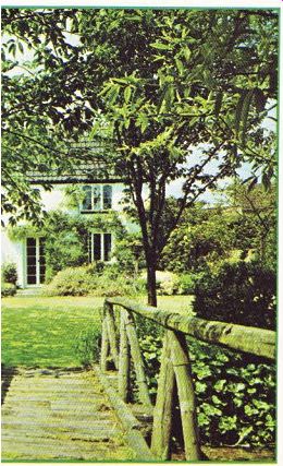
Neglected vegetable patches sprawled over the front garden, making it drab and featureless; the land has now been transformed into a beautiful and imaginative garden.
Curving steps, surrounded by abundant foliage, lead down a steep incline from the road to the front door which was built into what had originally been the back of one of the cottages.
On entering, the eye sees several floor levels, low doorways leading into various rooms, and an expanse of clover colored carpeting. The wooden doors are painted white with wrought iron hinges and handles.
From the entrance hall, two small steps lead into the sitting room. This had originally been two rooms-a smallish parlor on one side and a decrepit kitchen and scullery on the other. The partition was pulled down, the kitchen complex gutted and the old front door blocked up.

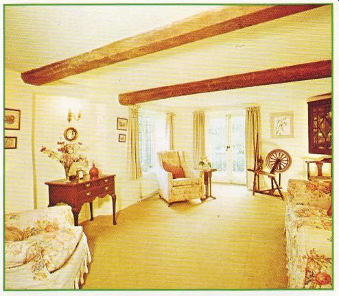
--------------- Above The period look is helped by two functional
and attractive beams, an Edwardian corner chair upholstered in a muted damask,
a Georgian table, a spinning wheel, and rich looking beige curtains.
The resulting room, measuring 11ft. (3.3m) by 22ft. (6.7m), is long and rather narrow and initially presented problems in design.
Mrs. Hedderwick cleverly coped with this ‘narrowness' by creating two areas in the room--a comfortable sitting area and an area surrounding the fireplace. This division was done by strategically grouping the chairs and couch in one part of the room and by using a large oriental rug in the front of the fire which sets it off and makes it seem like a separate unit.
If you're having difficulty in arranging furniture in a long or narrow room, try to 'open out' the space by making more than one area of interest. This can be done by grouping chairs and tables in one part of the room or by creating a separate visual area through the use of paintings or, as in this case, a fireplace and rug. By having more than one area of focal interest, the eye can be distracted from the shape or narrowness of the room.
Two functional and attractive beams, rescued from a builder's yard, support the bath above.
A durable asphalt surface was laid over the old flagstone floor. The room was then enhanced by lowering the tiny windows; the panorama of the garden can now be viewed while sitting.
Mrs. Hedderwick was advised to have modern double glazed windows, but she decided to have leaded windows instead, to match up with the windows still in use upstairs. The period look was not impaired by modern styled windows.


------------ Above. Major renovation was needed to convert a pair of damp,
chilly and unattractive semi-detached nineteenth century workmen' s cottages
into this livable and attractive house in a Somerset garden setting.

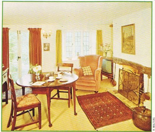
------------ Above. The living and dining rooms have been enhanced by enlarging
and lowering the tiny windows. Now the panorama of the garden can be viewed
while sitting. Lead windows match up with the original upstairs windows.
The hamstone fireplace is one of the most imposing features of the room. An old and sooty cooking stove was removed and a wrought iron screen, made by a Devon blacksmith, put in its place. Spanning over the fireplace and creating an impressive facade, is a large clavel-stone, found by the owners in a stone maker's yard. Three china plates fill in the space between the fireplace and the ceiling.
Moving away from the eye-catching fireplace, there is an attractive grouping-an unusual looking Edwardian corner chair, covered in muted damask fabric, and a dainty inlaid Edwardian table. Other period pieces include a Queen Anne chair and a Georgian table which show how effectively a variety of different period pieces can work together to make a harmonious whole. Too often people think that antique furniture should be kept to a single period. Mixing different types together can be more interesting visually--as long as the proportions, quality and design are right --and less of a strain when buying.
The hand-made couch and chair have proved to be a good investment; they have held up well over the years. The spinning wheel in the corner adds a note of interest--it was a wedding present, which means it’ s been under the owners' roof now for almost fifty years. The period look is also helped along by the wall fixtures which have an antique finish and the rich-looking beige curtains which are an antique velvet. Every item has been carefully thought out; no one item dominates the room, either in color or in size, and none of the furnishings suggest a modern look.
The colors in this room--as well as in the rest of the cottage--are soft and delicate shades often found in the surrounding countryside.
When going from the garden outside into the cottage, the eye needn’t adjust, the inside and outside are an integrated whole. The floral upholstery on the couch, for instance, has subtle shades of terracotta, blue and green with hues of yellow which are then picked up in the carpet.
The clover carpet, echoing the grass and greenery outside, carries through the passage way--made interesting by its variety of levels into the dining room. Here the carpet is the same color, but is a practical hair cord. The original cottages were virtually mirror images of one another and the present dining room and kitchen correspond to the living room on the other side. Lovely French doors leading out to the garden have replaced the former front door.
Some of the old beams can still be seen in this room, where the main motif is brass and wood. A beam spanning over the fireplace houses some eye-catching brass pieces: a chest nut roaster, a cream skimmer and a bed warmer.
Also in keeping with the motif are the horse brasses which hang from most of the wooden beams.
A small Welsh dresser doubles up as a useful sideboard-a good idea for a room with limited space. A Georgian dining table, made of oak, is just the right size for this cozy room. Soft shades of ochre and olive green in the curtains contrast effectively with the rich-looking pink velvet of the armchairs.
The dominant color in the adjoining modern kitchen and larder is white. A practical break fast table neatly fits under a leaded window which looks out on the garden. The southern exposure here is ideal, especially on sunny summer mornings.
The subtle and delicate colors found on the ground floors are repeated upstairs in the three bedrooms and bathroom. All the rooms share in common a floral pattern and a magnificent view to the garden. A sloping roof adds an unusual touch to the first floor landing.
Throughout the cottage there is a black and white motif seen in the white painted wooden doors and the wrought-iron handles and hinges. This certainly contributes to the period flavor. It's these little consistent touches in a house which can make the difference between an average looking home and an outstanding one. A modern, up-to-date fixture could completely spoil the period effect.
Before embarking on a home conversion, it's important to decide what look you want-a modern twentieth century look or a period one.
Once this initial decision is made, all the changes made or the furnishing bought should be in keeping with the theme you've chosen.
Although there is every modern convenience in this cottage, a period flavor remains. Contributing features to this look are leaded windows, low door-frames and period pieces in the furnishing.
It would be impossible to look at this cottage without taking note of the garden; it really is an integral part of it. A mill river runs through the full length of the garden which is filled with a variety of plantings including primulas, irises and mecanopsis. In the seven years that Mr. Hedderwick has been working on it, it has changed from a forgotten workman ‘s vegetable patch into a restful and charming garden.