Sometimes a house has to be altered considerably in order to make the most of its potential, and to give it ‘character'. But structural alterations can only work for a house if they are planned with fore sight and imagination, and add some thing positive to its good looks and value which will last for years.
Diana Mather's house in Fulham, London, was ideal for re-planning: it has the solid foundations and sturdy structure that usually go with Edwardian terraced houses, and had rooms of good proportions which would flatter her chosen decor. She planned to use her talents as interior designer to add something extra to the house which would make it original and yet cozy enough to feel like a home.
She and builder Alan Rand decided to build a loft room with an elegant wrought iron spiral staircase leading up to it from the first floor.
landing. This would provide a private 'den' for her son, and the staircase would add a sense of spaciousness to the house as well as being a focal point in its own right.
There were structural problems to be dealt with : first-they had to support the new floor in the loft on top of the wall which separated the two first floor front rooms. And because only a dormer window was being installed in the rear slope of the roof it was impossible to fit a whole steel beam into the room to span from party wall to party wall. So due to the extra weight on the wall beneath, the load had to be transferred to ground floor level as far as the footings.
This massive upheaval was an excellent opportunity to knock the two main rooms on the ground floor into one large lounge. This was spanned by a substantial reinforced steel joist with new concrete footings to spread the load, most of which was coming down from the loft room. And the wall immediately above it was discovered to be only a light wooden partition, so it was stripped of plaster and strengthened with wooden props.
In effect the weight of the new roof was carried by the whole house right down to the foundations so that no one spot would be forced to take the strain-which could be disastrous. It is always the best plan to discover the full implications of your structural alterations--before a wall buckles, or worse.
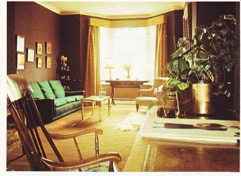
The new through room is welcoming, and is designed by Diana Mather to be restful to the eye. The color scheme is predominantly com posed of rich, warm browns with a white ceiling and white trim for a sharp contrast. A large shaggy rug in front of the period fireplace draws together several browns seen dotted around the room in accessories and gives the whole scheme a positive motif.
Floor-length hessian curtains in a soft mustard color give the room a glow, especially when the curtains are drawn and artificial lighting is used to effect. A vivid bluey-green three seater settee looks just as comfortable as it is, and sets the mood of informal relaxation for the rest of the room, The deliberate mixture of styles of furniture works well here-often period pieces and the starker lines of modern furniture flatter each other, especially if the tones of wood are similar, or there is another point of similarity which will bring the pieces together visually. Here the modern marble-topped table has the same ‘chunky' look as the huge gilt-framed mirror...

ABOVE. Color contrast in the living room. The eye-catching green on the
settee is set off by the subdued browns and golds.

---- TOP . The fireplace--a natural focal point-is enhanced here by the shaggy
rug, gilt-framed mirror and attractive wooden bookshelves and cabinets. ------
ABOVE. The copper warming pan on the wall, and the jardiniere tucked under
the minor, add unusual touches to the hall.

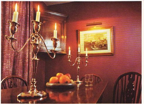
---- Above. The dark woods and aubergine walls give a masculine look to the dining
room.
... over the fireplace and emphasizes the solid look of the easy chairs and kneehole desk.
One special feature of the lounge is a timber clad recess containing bookshelves. There are two tones of wooden strip, laid on to form an attractive symmetrical pattern in between the shelves so the whole unit looks like a handsome bookcase of a very high quality.
There is a deep brown fitted carpet which adds a note of luxury, and the impressive Victorian rocking chair was picked up for nothing.
The Edwardian flavor of the room is under lined by the jungly plants in a brass jardiniere, and the framed prints in formal groups. It is the accessories which tend to give a room a character: an ultra modern room would contain characteristic objects made of chrome or plastic for example, and an Edwardian-style room needs pot plants and more sombre colors to achieve its point.
The dining room has aubergine walls with white window frames for contrast-white always adds crispness to an interior and seems to bring out the richness of any color used with it. The dining furniture is all antique and its dark wood blends well with the brown cork-tiled floor, which is carried through to the kitchen.
Sharp lettuce green and white brightens up the kitchen which is at the back of the house, away from the sun. Fitted wall cupboards and a breakfast bar make the most of the space, and all the worktops are covered in sensible easily wiped plastic laminate.
Diana Mather has made a positive feature of her hall. Too often halls are the poor relation in interior design-they are ignored on the grounds that nobody stays in them for very long.
This hall is so well 'dressed up' that it invites you to linger. There is an attractive polished wooden floor which catches the light from the fanlight.
The wallcovering is composed of pinks, oranges and browns in an Art Nouveau pattern which gives an overall amber glow to the hall.
And the expanse of wall provides an excellent background for a fine collection of old prints. A jardiniere cut in half is set flush against the wall to maximize the effect of the foliage against the wallpaper.
The new spiral staircase rises dramatically from the first floor landing; despite its sturdiness it looks delicate with its filigree pattern in wrought iron painted white. The landing was quite large, and the staircase fills in a dead corner.
The master bedroom used to be a bedroom plus a separate wc. The toilet has been extended to include a full bathroom suite taking a slice off the old bedroom, but still leaving a reasonably sized room. The bathroom is hidden behind a wall of cupboards a good practical point to note.
There is a vivid mauve carpet-a positive move away from insipid pastel shades for bedrooms and pink and mauve wallpaper. The bathroom suite is black.
A sunshine yellow curtain divides the new roof-room from the small landing, though it is only a formality as it ‘s the only room up there.
The walls have been rough-rendered and painted white, to reflect as much light as possible. An orange bedspread and yellowy orange curtains stick to the theme of sunshine colors and gives an overall cheerful look to the room. The house has not only been thoroughly renovated but given a whole new look which adds tremendously to its value and its appeal.
----------------