Turn-of-the-century houses are a converter ‘s ideal. They are generally spacious and solidly built, so major alterations are easier than in flimsier buildings, and offer endless possibilities to both architect and handyman. When the people who live in such a house take an architect's advice and then, as far as possible carry out the work them selves the results can be stunning-and inexpensive.
From the front, this house in South London, England, looks much like its neighbors, but the back is entirely different. The owners have built on a two-storey conservatory with a sloping roof and a complete wall of windows overlooking the garden. This integrates well with the back of the house and gives it a feeling of space and light. A conservatory can be an interesting way of linking house and garden: by bringing the garden into the house it extends both usable space within the house and enjoyment of the garden during the winter months.
Inside too, there has been a complete turn about. The main living and kitchen areas now take up the whole of the first floor--a good idea for the type of house where the most spacious and adaptable rooms are at first floor level The owners originally lived in the top-floor flat, and later, when they bought the rest of the house, they chose to keep their bedrooms there, opening up the rooms lower-down as a play room for the children, a workshop and a bedsitter for their student sister. The playroom and bedsitter are relatively cut off from the rest of the house, which gives the children and sister independence on the ground floor, and the owners peace upstairs.
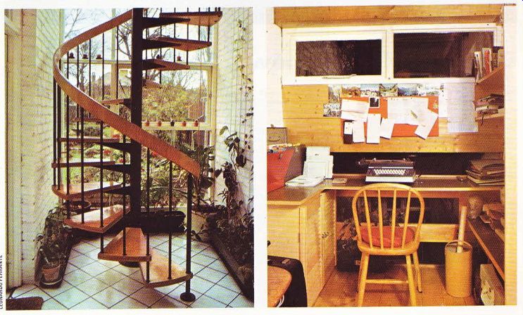
As the owners began to plan the changes to their home, it became clear that the structural alteration to the house would be considerable, so they asked architects John Spence and Partners to draw up suitable plans that would fit in with their tight budget. The high conservatory was the first consideration; it was planned to cover an area that had not been used to its full potential. The architect's aim was to put in as much glass as possible-hence the high wall of windows overlooking the garden and the glass roof, which catches the sun. To avoid enclosing the second-floor windows, the conservatory roof was designed to finish just below them, A doorway was knocked into the wall of the first floor leading from the conservatory through to the dining room. The house also has a back garden, which is reached from ground level through a gallery-cum-office that was created for the owner‘s wife, and down a spiral staircase from the conservatory; this can be seen silhouetted inside the high window.
Decor in the conservatory has been kept simple to flatter the plants and to harmonize with the rest of the house, where natural finishes are much in evidence. The conservatory wall has been left in plain brick and painted white. The exposed beams have been treated with sealer but not painted; the metalwork on the spiral staircase and the joist hangers are finished in black. Seen from inside at ground level, the conservatory might have seemed too long and narrow, but the cunning use of diagonally-laid white ceramic floor tiles gives it a much wider look. This is an idea worth copying for any long and narrow room.
Apart from knocking out walls and installing central heating, the owners have done all the work in the rest of the house themselves in their spare time. In the living room, for example, one of the main talking points is the new false ceiling made by the owners from tongued-and grooved ramin boarding. This particular wood was chosen because of its attractive pale color.
Each plank is quite wide, but has beveled cuts along it to make it look like three slim ones.
Installing the ceiling was a tricky operation.
First, a frame was made, which had to be sunk into the outside and supporting walls. Then the cladding was slotted tightly together and fixed with concealed nails. The whole ceiling was sealed immediately to keep the wood from shrinking or darkening.
Although the house was altered extensively, the owners had to keep to a tight budget, and one of the most rewarding and money-saving ways they found was to make their own furniture. Anybody could follow their example in making simple pieces of furniture--many DIY magazines on the market can show you how. One of the things they made was a sofa, which fits snugly into a bay window. The frame is of stained and sealed pine, and is lined with comfortable foam cushions. Generous bolsters form arm-rests, and the cover is of rich-looking olive-green velvet. For a small outlay, the owners have made themselves a highly individual and comfortable piece of modern furniture. A similar sofa bought ready-made would have cost ten times as much.
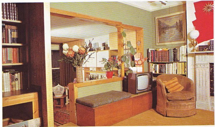
A wall was demolished to make an extension to the living room. To give an attractive ‘gallery ‘effect, it was only knocked down to just above waist level-a useful height that makes a good back for built-in seating. A beam with wooden props was put in to support the ceiling; this adds to the effect.
A small wooden staircase leads into the lower part of the room. This area has a sealed wood floor, and makes a good corner for dancing when there are parties. The owner removed an old fireplace and built in a row of shelves and cupboards to house drinks, stereo equipment (with four speakers) and ornaments. The cupboard-door fronts are finished with a practical white plastic laminate.
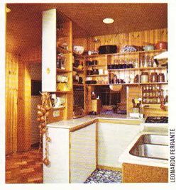
The kitchen was originally a bathroom and separate lavatory. It is now very much a cook‘s kitchen, efficiently planned with all the equipment close to hand. A cork-lined false ceiling was put in to disguise a row of ugly pipes.
There are built-in units to save space, and the window over the sink has been enlarged to let in more light. All these are ideas which could make a major difference to any kitchen. The floor and window sill are covered in attractive blue-and-white ceramic tiles.
On one side of the cooker there is a mar slab which was once a washstand top, and the other side a worktop of polished aluminum.
A good space-saving idea was to fix a sliding louvered door between the kitchen and living room. Two refrigerators are stacked one on top of the other and well hidden behind another louvered door. A hatch was built through to the dining room, where an old fireplace was removed and cupboards built in with louvered doors and black laminate tops.
The floor was stripped and sealed with an unusual finish worth noting: the owner used six coats of a white primer, which turns clear when dry and gives a soft polished effect; it is not as glittery as the more common polyurethane sealers, but has a subtle sheen. He has used this primer to seal all wooden surfaces throughout the house.
Old pieces of furniture can often be adapted to suit new decor with great effect. Here, a large dining-room table has had its original top replaced by a new and larger one of block board ; the legs have also been slightly modified A new table of the required size would have been an expensive buy, but by 'doctoring' an old one, the owners were able to use its strong frame to support the new top.
The two-storey conservatory is the touch that makes this house original, but the whole house is an excellent example of imagination and hard DIY work that has paid off handsomely.

------ ABOVE. The kitchen is a small but compact ‘island' between
the dining room and the living room. It is arranged so that all the fitments
are within easy reach. The walls and ceiling are clad in warm-toned T & G
and the floor tiled in blue and white.

--------- Above. A room with a view-to another room ! The separating
wall has been partly knocked through, and the inner room is reached via a few
steps at the side of the 'window', The color scheme is composed of subtle shades
of green.

--- ABOVE, left. The two-floor conservatory has a complete wall of windows overlooking
the garden, making the interior feel light and spacious. The spiral staircase
looks dramatic silhouetted against the sky outside, and gives access to the
garden. ---- ABOVE, right. The conservatory extension includes a first-floor
gallery which is used as an office for the owner’s wife.
This is a good example of getting the most from every inch of space, and planning to it in a room for all your needs.