Adapting to changing needs in the home requires a versatile imagination. A totally suitable home can suddenly become inadequate if a major change occurs. When this small Victorian cottage was originally converted, it was ideal for the couple living in it--until their first child was born. Then extra room was needed to accommodate the baby. An ingenious solution was found by building a cleverly conceived extension which fulfilled the demands brought about by the change in the family.
When teacher Julian Wolchover and his wife Janet, a textile designer, bought their London cottage in Parson ‘s Green, it was just the right size for them. An artisan ‘s dwelling, built over a hundred years ago, it consisted of two small downstairs rooms and two upstairs, with a more recent extension at the back-a ground floor kitchen and a bathroom above. An uninspiring concrete yard spread out at the back.
The Wolchovers were fortunate-before purchasing their house, a council grant had supplied it with a new roof, damp-proof course, bathroom and plumbing. A great deal of work ...
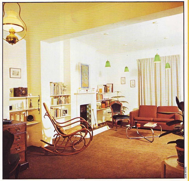
------- Above. Careful color scheming and the creation of horizontal
lines, by installing bookshelves, can visually unite a two-into-one conversion
of stylistically different rooms.
... still was to be done. Throughout the house the wood was rotting, including the floorboards, joists, doors and skirting boards; the general tone of the place was gloomy.
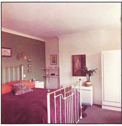
ABOVE. Techniques of effective conversion have been used to improve a bedroom.
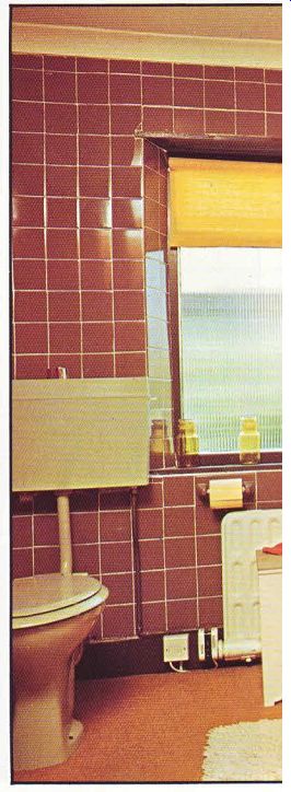
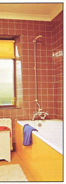
Above. The bathroom was reduced in size to accommodate a new passage, but
its new decor gives the illusion of space.
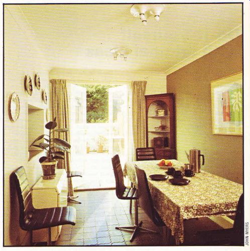
ABOVE. The small area available for the dining room extension has been put
to the most imaginative and effective use.
Architect Stan Playford advised the Wolchovers on the structural changes to be made.
The two pokey ground floor parlors were made into a single more gracious through room. A reinforced steel joist, supported by a pillar and wall buttress, replaced the original dividing wall.
A new staircase was built which also had the effect of opening out the space in the room.
The room now has an elegant and comfortable atmosphere. Soft, neutral colors-a co ordinating link throughout the cottage-were chosen. Most of the walls were painted white and some, a subtle shade of cobweb brown.
Rich brown wall-to-wall carpeting was put down, providing a flexible background for the rest of the decor. Two matching brown settees face one another from opposite ends of the room.
Splashes of contrasting color are seen in straight-back chairs, upholstered in a stunning peacock blue, wall ornaments and a period fire place, found in the country and brought back to town by the Wolchovers. The brightly decorated green tiles add a cheerful note and are effectively offset by the bold black tiles of the hearth.
The approach to color in this home was practical; the end product is restful and visually appealing. Conservative and neutral background colors tend to be the best choice for home decor. It then gives you an opportunity for bold or inventive color treatment in the decorative touches, like cushions, tiling or paintings. A mistake in color scheme or a change in your taste is far less expensive to alter if you are simply dealing with small items. A complete repainting or new carpeting requires far more money, time and energy.
Contrasting with the period flavor of the room is the modern looking coffee table, designed and made by Mr. Wolchover. The supporting 'legs' are made from chromium tubing bent to gracefully curve from the ground upwards. A slab of smoked glass with beveled edges became the top and, for a relatively small amount of money, a handsome and unusual piece of furniture has been produced.
A strategic technique was used in this room to bring the two sections together. The pillar, buttress and two chimneys--both different sizes--stop the fluidity of space in the room. To overcome this segmented feeling, shelves were built along the 'chimney' wall, filling in all the irregular recesses and creating continuous horizontal lines which carry the eye from one end of the room to the other. The practical shelves also serve as a vehicle for visually co-ordinating the room.
Upstairs there were fewer structural changes; most of the alterations came about through applying imaginative decorative ideas and hard work. The motif in the master bedroom is Edwardian, with an intriguing Japanese accent, seen in the wall prints. The legs of the brass bedstead were shortened by about a foot to give more spaciousness to the room and to eliminate clambering up into a high bed every night.
Louvered wardrobes were neatly fitted into existing recesses, created by the blocked-up chimney breast.
The Edwardian English oak bureau was in a sorry, state when the Wolchovers bought it.
The elaborate hand-carved facade was covered with a heavy black varnish, almost completely disguising its original beauty. The Wolchovers stripped it in a couple of hours, using caustic soda, heavy rubber gloves for protection, a floor scrubber and constant running water from a hose. They picked a day with a slight breeze to do the job to make certain the wood would dry out properly. If you're interested in enhancing your furniture by stripping and refinishing it, you will find that the job, although often tedious, has very rewarding results. Clever wall decorations, costing very little, are the six Japanese prints-bought as post cards at a London museum, and framed with ordinary black and gold frames-picked up for a very nominal cost at a common chain store. The array of small pictures adds a distinctive note without costing a fortune.
The adjoining room was used as a necessary studio for Mrs. Wolchover, who works at home.
When the baby finally arrived, it was the obvious place for him because the room was next to the parents' room and close to the bathroom.
Additional space was then required for the family.
Already existing at the back of the house was the kitchen/bathroom extension. Building adjacent to this. Mr. Wolchover conceived of a further extension which would provide room on the first floor for a studio and additional area on the ground floor for a dining room which meant the ‘two-into-one' room could be used exclusively for lounging. The concept was straight- forward, logical and met all the Wolchovers' needs. One major hitch arose.
Building onto the back of the house meant covering up the outside wall of what was to become the baby's room. By law this wasn't permissible because there wouldn’t be adequate light or ventilation. An ingenious solution was found. A two-floor extension was built with each floor being substantially lower than those of the original cottage. This meant the total height of the new extension would be a good eighteen inches lower than the main body of the house which allowed for a high window of regulation size to be fitted along the outside wall of the baby ‘s room.
Initially it appeared that the Wolchovers would have to be content with only a one-floor extension. Through inventive thinking, though, they got around a very real obstacle and were able to make a two-floor extension. A good house conversion or extension begins at the drawing board. It doesn't always take an architect to solve difficult problems; ideas and solutions are often generated from the people who live with the problem-they're the most involved.
In creating a passageway into the new studio, the large bathroom was reduced in size. It is now decorated in a vivid buttercup yellow with contrasting cocoa brown tiles. The bath was spruced up by putting hard board, painted a bright yellow, around the sides and finishing off the corners with a chromium strip. The floor is carpeted with a speckled golden carpet which gives a feeling of luxury and warmth.
The ground floor extension became the dining room which has easy-to-clean ceramic tiles in a proven pal pattern and French doors leading onto the patio beyond, The long trestle table is complemented with black pvc pedestal chairs with chromium bases.
The adjoining kitchen window was lowered and now is the serving hatch between the dining room and kitchen. The outside door became the passage between the two rooms.
The compact and efficient kitchen is, perhaps, one of the most notable aspects of the house.
Faced with a kitchen measuring just over eleven feet by seven, the Wolchovers knew they would have to do a lot of careful planning to accommodate all the modern equipment they wanted. They sat down with a layout of the kitchen on graph paper and then tried different arrangements of fitments, juggling until they found the best combination.
The equipment they were using was modular, most pieces measuring 21 in. in width. This meant that exactly four units could be slotted along the seven foot wall. Now the small kitchen has washing and drying machines, a dishwasher and an abundance of cupboard space and working surfaces. The tall fridge/ freezer fits neatly into a recess, emerging from where the original kitchen door was blocked up.
The key to this successful conversion is the significant emphasis that went into the planning stage. All possible space was utilized to the full, taking advantage of every corner and recess; and complementing this clever planning, is the simple and attractive decor.