When architect Alexander Hamilton Fletcher, partner in the Richmond firm of Manning-Clamp & Partners, was called in to convert a late 19th century house in Surrey, his brief was a common one. His clients wanted a practical family house that was easy to run without help. He did this by turning the house 'back to front'.
The clients had three school-age children; a boy who was to have his own bedroom, and two girls who were happy to share a bedroom so long as they had a playroom as well. This would later become a sitting room where they could entertain their friends. A studio-cum hobby room solved the problem of somewhere for any member of the family to do dirty jobs, practical activities and homework. A large living room was needed, with a dining area near the kitchen rather than an individual room. A separate laundry, however small, was a must.
The architect decided to put the main living quarters at the back of the house, to get away from a dull road with a northern aspect, and to take advantage of the view over the 50ft south-facing garden at the back. Therefore the ground floor of the house was completely re-planned, and the large room at the front, usually used as the main living room in houses like this one, became the hobby room.
The large room at the back became the living room, and was enlarged and made L-shaped by the addition of a sloping-roofed single-storey extension. This runs almost all the way across the back of the house in place of a lean-to porch and kitchen, both of which were removed.
With the greater depth that the extension gave the living room came the problem of in sufficient light, so the architect designed cone shaped roof lights to throw the daylight back as far as possible into the room. The deep shafts, topped with two sheets of clear glass with matt fiberglass between, diffuse the light without causing glare.
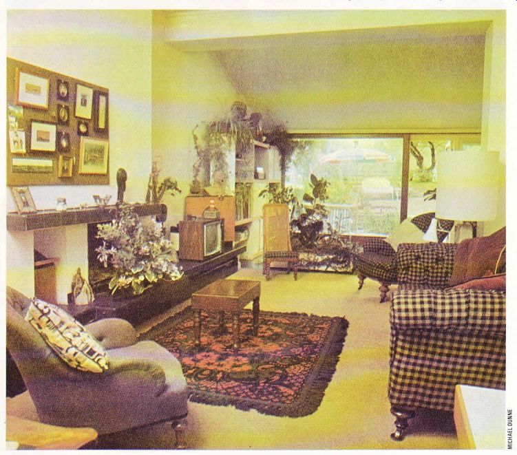
---------------ABOVE. The extension added at the back of the house has
made this living room a better size. Glazed doors slide right away to link
the house with the terrace in summer.
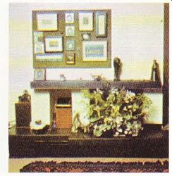
------------ Above. The wooden mantel was replaced by this tiled hearth
unit. The pictures above are grouped on a panel of hessian-covered pinboard,
to avoid marking the wall.
The dining area, tucked round the corner in the extension, has the maximum amount of window area, with a large double-glazed door at the back which slides right over to open on to the terrace outside in hot weather. A side-hung door provides access to the garden at other times. The living area is delineated by a carpet, laid for safety at the same level as the black pressed clay tiles used in the dining area, kitchen and hall. As the ground floor had a suspended wood floor, this had to be specially prepared for the tiles. This was done by removing the boards, cutting them up and laying them as a base on battens between the joists, which were then topped with expanded metal; all this was covered with a concrete screed on which the tiles were laid.
In the living room an ugly wooden mantel was the first thing to go. This was replaced by a combined hearth and seat unit with a shelf above, faced in black tiles, running along one side of the room. The working fireplace was reshaped, with a skirting radiator fixed below, so that the hearth is now about 1-ft above the floor level.
A major feature of Alexander Hamilton Fletcher's domestic design work is his concern that the circulation areas should be strategically planned for maximum accessibility with mini mum inconvenience. He believes that every family house should have a passage running through, giving access to kitchen, living and dining areas, but without conflicting with the cooking activities or going through the living room. In this way the mother can supervise her children while she is working in the kitchen, without running the risk of colliding with a small member of her family while she is carrying a hot saucepan.
In this house the old dining room was gutted and completely refitted as a practical modern kitchen, with the 'throughway' alongside it, running from the hall to the dining area at the back. An 'administration centre', housing tele phone, directories, cookery books, first aid and a notice board, is strategically placed in this passage, within easy reach of everyone. The kitchen units were made of birch-faced block board with pine frames and lips, simply treated with a polyurethane varnish. The electric hobs were set in a specially made slab of cast terrazzo.
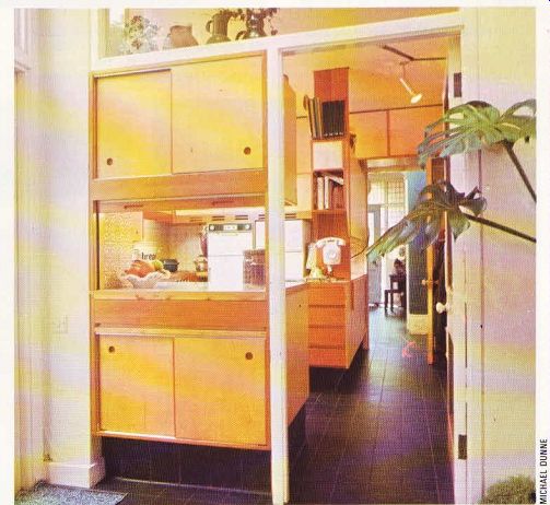
-------- ABOVE. The fitted kitchen is connected to the dining area
by a hatch. A passageway runs from front to back, giving access to all the
rooms without going through the kitchen.
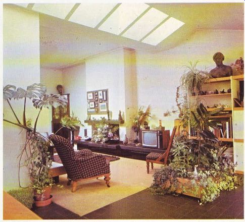
------------- Above. Looking into the living room from the extension
at the back, which houses the dining area. Cone-shaped roof lights throw light
into the room without causing glare.
Upstairs, two rooms were knocked into one to form the main bedroom, now the full width of the house and overlooking the back garden.
Fitted wardrobes built all along one wall were designed to enclose two old chests of drawers to form ‘his' and 'her' dressing table units with a mirror at the back of each recess. Painted dark turquoise to match the walls, they sink well into the background. A study area up one end is similarly fitted, with a shelf unit with hinged flap-down front supported on chains. A pin-up panel on the wall displays pictures effectively.
Two small windows were knocked into one and the sill lowered, making a picture window over looking the garden. The entire back wall is curtained in gold silk.
The focal point in this bedroom is a late 17th century Portuguese travelling bed which dismantles completely for transporting. Made of Brazilian rosewood, its four posts resemble barley sugar columns, and the bedhead is a screen of stalagmites and stalactites. The wall behind is plain, as a patterned wallpaper would obviously compete with the ornate bed; instead an attractive patterned wallpaper has been used on the ceiling.
The ceiling in the main bathroom was lowered by 18in. to improve the proportions, and the false ceiling, the wall above and below the basin, and the bath are all paneled in hemlock.
The area round the basin and at the head of the bath is faced with Italian glass mosaic tiles, with a large mirror in the recess adding to the apparent size of the room.
In this conversion the clients were given just what they asked for. The decorations are as simple as possible, and designed to make cleaning easier. The clay tiles in the hall just need wiping over, and the sisal stair carpet lasts practically for ever. The bedrooms are close carpeted, the units in the bathrooms are tiled in, and the kitchen is planned for ease of running.
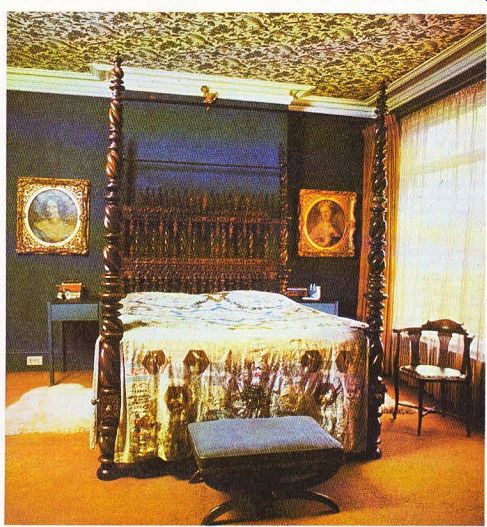
--------- Above . The focal point of the main bedroom is this
Portuguese travelling bed. The patterned wallpaper on the ceiling acts as a
perfect foil for the plain walls.
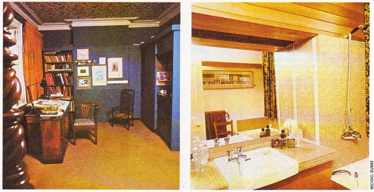
----------ABOVE left. A study area was provided at the other end of
the main bedroom. The dark turquoise paint is an attractive background for
the collection of pictures.
-------------ABOVE right. The main bathroom, where the false ceiling and cupboards are paneled in hemlock. The areas round the bath and basin are faced with honey-colored glass mosaic tiles.