Money isn't the only key to successful redecorating. Good ideas and effective methods of execution are equally important. This house lacked style and comfort when it was bought, but through imaginative ideas and a great deal of energy, it has turned into an easy-to-live in and attractive home.
This Australian house was drab and dreary looking when Don and Marina Gutteridge bought it. Built in the late 1940‘s and made of brick and tile, it is a typical design of that period.
Dutch born Marina Gutteridge decided to re-decorate the house. Her budget was limited but through the use of color, imagination and interesting 'Dutch' touches in the decor, an attractive and distinctive home has emerged.
The front door opens directly into the living room which had been awkwardly shaped, dark and unwelcoming. By introducing light colors into the room and by using light pieces of furniture, the room now has a bright and airy appearance. The walls were covered with a fresh looking green and white patterned wallpaper. The ugly fireplace was painted olive green, along with the skirting boards, window and door frames, to tie in with the wallpaper.
The choice of color was a good one. Olive green is neutral--it blends easily with other more vibrant colors--and is restful on the eye.
Before choosing the main color for a room where you spend time relaxing, consider its versatility--will it be a good background for your upholstery, paintings and curtains, and will your eye tire of it over a period of time ? Soft colors generally are the best choice and also help to lighten up a room. Leave the more striking colors for rooms where you spend less time, or for decorative touches.
The olive green divan couch, which conveniently doubles up as a bed for overnight visitors, was given a more stylish appearance through the use of cushions which lie abundantly and casually on the couch. Often, clever use of items like cushions can improve what might otherwise be an ordinary looking couch. Cushions aren't expensive to buy and, if you ‘re handy with a needle, not difficult to make, and they can go a long way to enhancing any room.
The couch sits under a window in an alcove which has been turned into a cozy area for chatting and relaxation. Space was saved by removing the arms from a two-seater settee. A white shaggy rug, which ties in with the dainty white wrought-iron side table, brings the grouping together.
The room now gives the feeling of lightness because of the color treatment and because none of the furniture is heavy looking or over-bearing. The straight-back armchair, for in stance, isn’t bulky and has been enhanced by the petit-point upholstery which depicts the Gutteridge family crest. Two similar armchairs with graceful lines, and placed in front of the fireplace, are also covered with a delicate petit point floral pattern. There is an absence of heavy cumbersome furniture which contributes to the spacious and airy feeling.
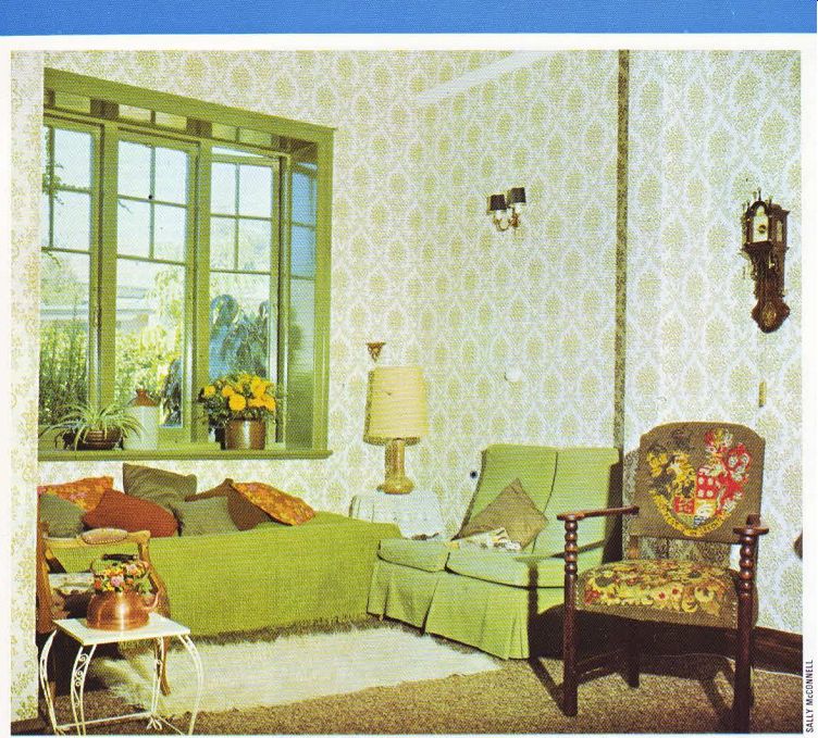
-------------- Above. Making the most of a small living room alcove. Delicate
furniture and light colors eliminate a cluttered look. A petit-point chair
depicts the family crest.
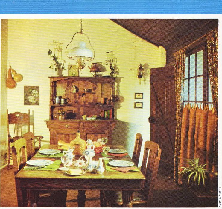
-------------
Above. A verandah turned sun room/dining room, as shown by the slanting roof.
The furniture was resurrected from a junk shop, stripped and refinished by
the owners. Bright cafe curtains add a festive note.
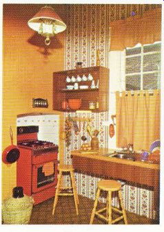
Above. A cooker fits neatly into a tiled alcove in this colorful and compact
kitchen, where bold rusts and browns dominate.
Contrasting to the bright and fresh appearance of the living room is the ‘heavier' look in the sunroom-cum-dining room. The furniture here is darker in color and mainly wooden, which gives a far more ‘weighty' effect. The attractive dresser, table and chairs were bought at a junk shop, stripped and refinished. Money, as shown here is not a prerequisite to a visually appealing room. The furniture in this room was not expensive to purchase-the most important ingredient that contributed to the rich finish was the effort that went into re-doing it.
Further effort was put into making the curtains which give a lovely Dutch flavor to the room.
Rust-colored hessian cafe curtains, reaching to the ground, hang on a brass rail. At either side there are full length curtains with an old fashion floral print. The overall effect of the window tends to give the room a distinctive character and the cafe curtains give privacy and style without blocking too much of the light.
A single item, like the cafe curtains, is sufficient to set the tone of a room. Finding one item which has distinctive character can be a very effective technique for creating a motif in a room. The main thing to remember is that once your central item is established, keep the other furnishings in line with the theme which has been introduced.
The Dutch flavor of the dining room carries through into the kitchen where similar shades of rust and brown are seen. The color design here was bold and inventive. Originally the walls had been white, which only accentuated poor lighting from the one window. The high ceiling was painted a chocolate brown, to lower it, and then the walls were brightened up with patterned wallpaper with the woodwork in a matching orange.
Orange cafe curtains are effectively used again. Rather than buying a cooker in conventional white, the Gutteridges bought one in a bright red which fits neatly into a tiled alcove.
An old sink was removed from the opposite corner and a new stainless steel one put under the window.
Although this room is small, the use of dark colors has not limited the sense of space. Other techniques for creating spaciousness were applied: the stove was put into an alcove, a freezer was stacked over the fridge, and a suspended counter was built into the wall, allowing more room on the floor.
There are really two methods of 'expanding' a room-one is done visually through the use of color or mirrors and the other, as in this room, is done through careful and clever planning of equipment. If a sufficient amount of time and thought is given at the design stage of a kitchen, more efficiency and space can emerge at the finished stage.
In contrast to the Dutch flavored kitchen and sunroom, is a light and modern master bedroom.
The decor is simply done in stark white; the only color is seen in little ornamental touches. The dressing table, which had a sombre green stain on it when bought, was stripped and painted white. The mirror was detached and hung on the wall-a clever idea if more surface space is needed on a dressing table. The floors were given a face-lift with sanding and polishing which is another example of how effort, more than cash, can give an attractive result. The bed head was livened up with patterned contact paper.
It's interesting to note how the various rooms in this house have different looks which do not distract from or overpower one another. The period flavor of the sunroom, for instance, harmonizes well with the streamlined appearance of the bedroom. House design needn’t .be consistent from room to room.
A far more appealing approach to decorating, which can result in a more dynamic and attractive home to live in and to look at, is one where rooms have different characters, colors and appeals. If each room can capture an individual mood or feeling, then you can pick the surrounding that suits you most as your mood changes. Never limit yourself to total consistency; variety in design can be exciting.
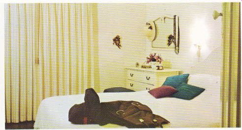
-------------------
Above. A simple decor in stark white makes this bedroom striking and streamlined.
The mirror was detached from the dressing table to give more surface space.
Patterned contact paper livens up the bed head.
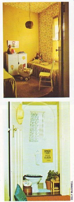
TOP. Bright citrus coloring creates a cheerful atmosphere in the children
‘s bedroom. Decorative flowers pasted on the cupboard were cut out from left-over
wallpaper. ABOVE. Once an entrance hall, now an attractive wc. A superb example
of how space can be utilized to best advantage.
In the children's room, there is a cheerful and bright mood. The citrus coloring is not over bearing because it was cleverly broken up with a lively print wallpaper which stretches from one wall onto the ceiling. This effect is good because the floral print is not confined to one wall only--as is often seen--but continues on so the eye isn’t abruptly stopped as it moves up the wall. With the right techniques and materials, wallpapering a ceiling is not nearly as difficult a job as may be imagined.
The bedspreads, curtains and cushions were made in a matching citrus. The cafe curtains are particularly practical in this room. They keep out the strong afternoon sun so the children can nap. They also provide privacy while still allowing light in when required. The flowers pasted on the cupboard add an individual touch; they were cut out from some of the left-over wallpaper.
The lampshade was made by Mrs. Gutteridge by taking an olive green string and methodically winding it around a wire shape. Bamboo rings decorate the hanging flex. This attractive lamp shade cost very little to make, but succeeds in adding another individual element to the room. If you ‘re interested in making your own lamp shades, wire frames and covering materials are available at most good department stores.
Another ingenious innovation in this home was executed when the wc was built, There had been no wc inside, so a side entrance leading from the garden into the hall was blocked up and the necessary plumbing installed. A small entrance hall often becomes a catch-all for items which are haphazardly left there. In this case, the space was put to good advantage by building a wc into it. The archway to the hallway can still be seen which adds an unusual note. The greatest advantage in devising this wc scheme was that it didn’t reduce space in any other part of the house.
This Australian home had once been drab and characterless. It now reflects the taste and style of its owners and, for a modest cost, has been turned into an attractive home.