Bold, bright colors aren't an essential ingredient for a warm and welcoming home. Simple colors-applied with imagination and intelligence-can create a dynamic effect. This one-room house in Holland does just that. The gracious and elegant appearance emerges from the simple use of black and white.
Having only one room to work with can be difficult, especially if eating, sleeping and entertaining areas must be included. It means a great deal of advance planning and an effective color scheme to unify the room.
On entering this Dutch house, there is a feeling of stark and striking beauty coupled with luxury and style. The different structural levels and shapes give variety-the eye constantly moves from one plane to the next. There is no one focal point, but a well-integrated and well-balanced total effect.
There is no place for unnecessary pieces. Every item must be functional and yet in keeping with the overall design. The first consideration is where to begin. In this house, the central island unit became a focal point. It is functional because it houses the open fire, the central heating boiler and the cooker-these being the only sources of heating for the room. The hearth effectively brings together the living area.
The sitting well centers around the black carpet--a perfect color for a carpet when you don't have too much time for housekeeping. A surprising number of people can sit and relax on the black and white sofas. The cushions add an air of casual comfort. Attention to detail such as throw cushions--their color, size and texture make a big difference to the atmosphere of a room. It is a touch that can be done inexpensively, but can go a long way to enhancing a living area.
The flat surfaces, cleverly arranged at different levels, and the centrally-placed low table, are laid on a plywood covered wood frame that has a rough plastered finish.
Surface space is essential in a sitting area and you can create an original look by experimenting with various table types and heights. It is too easy to buy matching side tables where contrasting tables could be much more visually appealing. A low table at one end of the sofa, perhaps, with a cocktail cabinet at the other you still have the same amount of surface space, but you've gained new storage area and leave behind the more old-fashioned 'balanced' look.

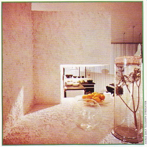
--------------- Above. Bird's eye view of a streamlined kitchen. Rough
rendering adds a delightful Mediterranean touch.


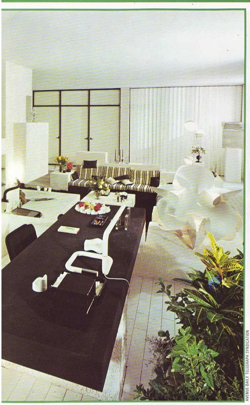
Above. A living area in striking black and white. The large oblong slabs,
used as table tops, effectively break up the large expanse of clinical white.
Touches of color come from the ornamentation only, leaving a feeling of stark
beauty. Unseen sleeping areas are cleverly concealed in two corners.
---------------
A consideration to keep in mind, if mixing un-matching furniture, is that at least one aspect in the design has to link the items together.
Color can do this, as in this home. Shape is another method; a technique also used here.
Note how all the furniture is cubic-the few exceptions being the decorative items such as the lights and the sculpture. A harmonious and co-ordinated look is not a matter of luck. It means a great deal of advance planning with particular attention to the color scheme.
The tiles covering the raised hearth in front of the open fire tie in with those on the floor surrounding the seating area. The advantages of using this type of material is obvious--no need to worry about stains on the carpet and the annual carpet shampoo can be a thing of the past. The low white walls break up the area around the central island unit, depending on their various functions. The problem of combining working and living in this one-room house is solved in an inspired and logical way. Suspended in the whiteness of the low white stone walls, white tile floor and white central unit, are two large worktops. The oblong slabs of black create a dramatic contrast and save the room from a clinical look. The tables have many uses drawing, typing, writing, sewing and hobbies.
The thick worktops are made from black stained wood, covered with black laminate. The built-in drawers are white. The rough plastered pedestals supporting the wooden slabs are found again in the kitchen area, The table tops could have been left as natural wood but the owner didn’t want to break up the black and white motif by introducing a new color tone. Every last detail has been thought about in terms of color, from desk lamps to ashtrays. In a small room, it ‘s a good idea not to use too many colors (although a variety in tone can be exquisite)--there simply isn’t enough space. The flowers and table fruit are the only items which contrast with the black and white motif.
Tucked away in two corners of the room are relaxing-cum-sleeping areas, surrounded by low white walls which create a sense of privacy. A screen or cupboard unit can also be effective as a room divider; they also can be changed without major reconstruction.
Enormous windows are fitted into nearly all the external walls. The rose garden can be seen by opening the vertical blinds. A change in the angle of the slats alters the view of the garden. Again the choice of ‘Curtains' is in keeping with the rest of the decor. Rather than using bright colors or soft fabrics, easy-to-clean slats are fitted into the windows. The straight, simple lines of the blinds echo the simplicity of line throughout the rest of the house.
The kitchen-cum-breakfast area is the most enclosed section. Black shelves, serving also as a working surface, have been built into the waist-high walls. The black and white theme is carried out in the refrigerator, washing-up machine, oven and hob. The table, like the large oblong desks, is supported on a cubical pedestal and easily seats eight people.
One of the most interesting details in the house is the rough rendering of the white surfaces. It suggests a slightly Spanish flavor and also eliminates the white-walled hospital look. The great expanse of white is broken up by the rough finish--far more restful to the eye.
This finishing technique needn't be done by the professional. It simply requires taking gypsum plaster, such as Artex, and spreading it on the surface. Then, using either a stippling brush or a spatula, the rough design can be made while the plaster is still wet. It ‘s easy and gives an original touch. Dirt won’t show up as much either.
Many ingredients work together to make this Dutch house attractive and comfortable.
The most important factor in creating a sense of harmony and co-ordination is the use of color. The restriction to black and white except for the ornamentation-is the key to success. Before planning the design for any room, make certain your color sense is being used to the best advantage--it can make the difference between an ordinary decor and a vibrant one.