A small flat can easily appear poky and it is not always possible--or desirable to make it more spacious by open planning. But the effect of open planning can be achieved by a few simple ideas which still allow the rooms to keep their separate identities.
When Urban Projects Ltd. bought a two storey house in Fulham, London, the front part of the ground floor was an off-license, with living quarters behind and above it. They decided to keep a shop at the front, occupying part of the ground floor and basement, and convert the rest of the house into self-contained flats.
Interior Projects Ltd. was called in to supervise the conversion of one of these flats and plan an interior design scheme for it. The two rooms and small kitchen which were to become a comfort able bachelor flat on the ground floor had served as part of the living quarters behind the off license. Because it was on a corner site, there were awkward shapes and curious angles everywhere.
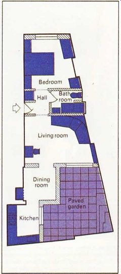
The first job was to plan the basic layout of rooms and find space for a bathroom. Various factors governed the final layout, such as the plumbing and room sizes. A new kitchen was built on at the back, because the existing one was inadequate. As there was a small garden behind the house, it was obvious that the living room should be at the back, despite the southern aspect of the front of the house. The bathroom had to be internal, because there were windows only at the front and back of this ‘long black strip'.
The only way to lighten the flat was to make it as open plan as possible, and to streamline the layout so that along view of it was possible from either end. Breaking up the area would have made it appear even smaller, so the doors leading from the hall to the bedroom and living room are glazed with opaque glass and slide away into the wall. This allows all the light that pours in the large window at the front to shine through the whole length of the flat.
The center part of the load-bearing wall separating the two original main rooms was removed, and parts of the rooms on either side were used to make a tiny bathroom, which was tucked in the middle of the flat. Steel beams were slung in above for support, and the piers that remain on each side both have a useful function. One frames the shower at the head of the bath and also screens the lavatory; the other is used to form a coat cupboard in the hall. The high ceilings which normally enhance the proportions of large rooms in Victorian houses only added to the problems in this tiny space. So the ceiling in the entrance hall and bathroom in the middle of the flat was lowered, providing stacks of storage space above the false ceiling. It is accessible from both the bedroom and living room.
Ugly angles in the bedroom at the front have been concealed by a built-in wardrobe in the alcove at one side of the chimney breast, and a specially made chest of drawers in the other.
These are linked by a curved white laminated dressing table top, providing a knee hole below.
The specially made bed, built on a plinth, tilts at the head end for extra comfort while sitting up, The foot end can be raised to get at the storage space in the base. A simple bed-head unit pro vides a shelf on each side.
In what is now the living room at the back of the flat, an ugly fireplace with bookshelves around it was removed. As part of this room was ‘stolen' for the bathroom, one wall now lines up with the edge of the chimney breast.
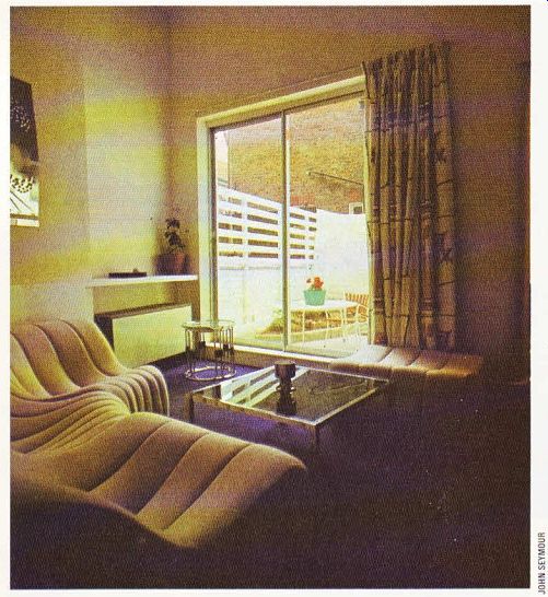
A timber frame was built into this corner to house a curved seating unit, which nestles well out of the way. This leaves the maximum amount of open space, which is important in this room, as it leads to both the dining room and the garden.
A sloping section of the ceiling below the stairwell was straightened off to provide more storage space and house two spotlights directed down to give additional light. Since space was at a premium, a small black laminated cantilevered desk was fitted to the wall under the low part of the ceiling. Fitted corner shelves also take advantage of this alcove.
The window at the back of the living room was replaced by large sliding doors which lead on to the paved garden. The garden is fitted with a barbecue and non-corrosive furniture, The optical illusion gained by taking the living space into' the garden by means of a large window area makes the living room appear much bigger.
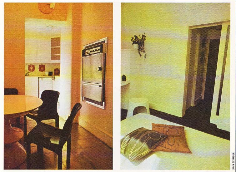
The old kitchen at the back has been trans formed into a dramatically-lit dining room, with the emphasis on night-time entertaining. As the room was so small the designers wanted to give it some extra height, and they were allowed to ‘steal’ the area directly above this room and so make it double-height. The window over looking the garden was blocked in and replaced by a high-level window opposite.
Because this room will be used mostly at night, a feature has been made of the lighting.
Four spotlights--red, gold, green and white controlled by dimmer switches, create the right mood. White Holland blinds cover the window to reduce this room to a tall white funnel, with an eye-catching mural on the ceiling.
Above the dimmer switches a smoked perspex 'control panel' conceals the meters, whose red pilot lights shine softly through at night.
Next to it a double oven is recessed into the wall, within easy reach of the hostess while she is still sitting at the dining table. This arrangement also leaves more room in the kitchen.
The new single-storey kitchen was built on to this room at the back, making the dining room another through room. There are, however, no inter-connecting doors to get in the way--only arches with rounded sides. Wooden units were built round the walls, incorporating a double stainless steel sink and refrigerator. The fitted hob has a hood above leading fumes to an extractor fan. Lemon laminated worktops and white Holland blinds on the door leading to the garden give the kitchen a fresh look.
A stunning feature of the dining room and kitchen are the stainless steel floor tiles, which reflect everything and lighten the whole area. Through out the flat the design has been kept as simple as possible, with one theme being carried through to help create a sense of continuity.
The walls are painted white throughout, and the purple carpet links the living areas, with bright stainless steel tiles in the dining room and kitchen. Even accessories like door-knobs are the same throughout, The open-plan layout takes advantage of all the available light and disperses it throughout the flat. The result is a compact flat where the limited space has been used to best advantage in practical terms and at low cost.

------------Above. In the living room a curved seating
unit fits neatly into a corner. The glass and chrome tables appear less bulky
than wooden ones of the same size.

ABOVE. The floor plan of the flat.
The kitchen was built on and the bathroom was made by removing part of the wall between the two main rooms and taking space from both.

---ABOVE. The original tiny kitchen was transformed into an unusual dining
room. The designers made it extra high by 'stealing' the area above and made
a feature of the lighting for night-time entertaining.Stainless steel tiles
are also used in the kitchen (beyond). Some borrowed light is given to the
dining room by the French door in the kitchen which opens on to the paved
garden. ---- ABOVE Right. The awkward shape of the bedroom has been disguised
by built-in furniture. The only strong color used is the carpet which links
the rooms.