It looks spacious and expensively furnished but, that apart, there is nothing remarkable at first glance about this comfortable living room in Kensington, London. And that shows how misleading a first glance can be--for the spaciousness and opulence are illusions, Designer Mary Gilliatt has taken a through room of quite modest proportions--thousands of suburban semi-detached houses have one as big--and by a series of gentle deceptions made it grander than it really is.
How was it done? First, the fact that it is a through-room helps. A combined room like this, usually made by adding a living room and dining room together, nearly always looks, greater than the sum of its parts.
Then, Mrs Gilliatt used a carpet with a strong element of white to reflect the white of the ceiling. Together, they carry the light through from the windows at one end to those at the other, making the whole floor area seem bigger.
The furniture was chosen with the same idea in mind. Armchairs with low backs intrude far less than higher-backed ones would have done: you look over, rather than at, them. And their height corresponds, instead of clashing, with that of other furniture-result, a clean set of horizontal lines through the living room ‘picture'.
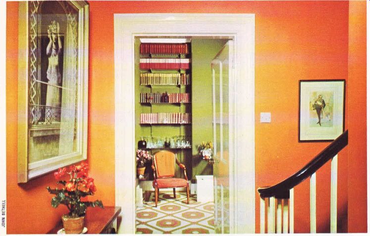
Similarly, although some bookcases were necessary for a family whose books already filled a massive bookcase in the hall, heavy looking, wooden bookcases in the chimney alcoves would have been visually overpowering.
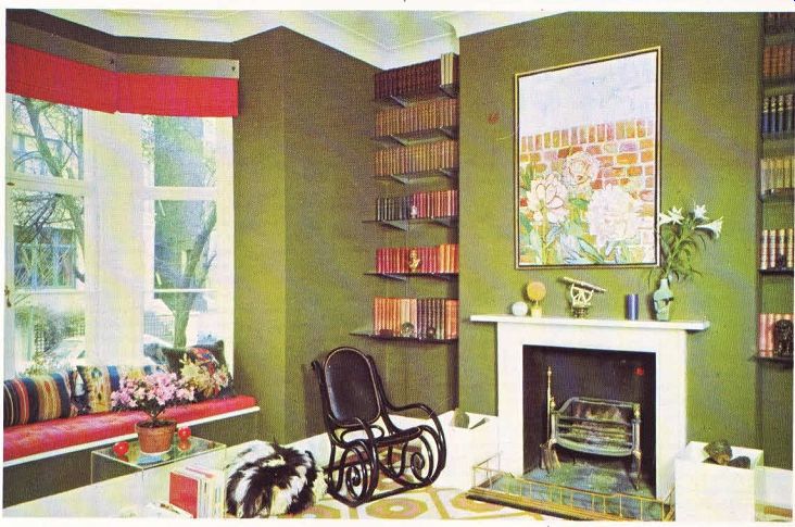
The wall-mounted plate glass shelves used instead simply vanish into the background, particularly at night, when they are lit from below, leaving visible only the gleaming spines of the books themselves.
For the same reason, the heavy mid-Victorian mantel was removed, and replaced with a plain, white-painted mantel shelf.
In a room which is used for living, and not just for show, plenty of occasional tables are necessary. In this room they are simple Perspex cubes, turned on their sides--handy, because they double as magazine racks, but almost invisible until you start to count them. These were bought ready made, but you could easily make them yourself.
That is another aspect in which the room is deceptive: cost. Apart from some valuable antiques--a touch of extravagance, but not vital to the basic plan--the kinds of furnishing used are not inherently expensive.
The macaw-green wall fabric which sets the tone for the whole room, for example, is plain felt. Laid over a conventional wallpaper lining paper (to cover minor flaws in the plaster), it is rich in appearance but, bought in 6ft (1.83m) rolls, less expensive than a good wallpaper The carpet, specially designed to pick up shades of the colors elsewhere in the room, is now a standard pattern. And the Roman blinds--they fold down concertina-fashion, rather than unrolling, to give a softer look--are in Indian cotton.
Mrs Gilliatt is a firm advocate of fabric wall coverings in cheerful colors. In the sort of ’grey' light that you get in Britain, for example, pale shades can often turn insipid or ‘washed out' . Bright colors, on the other hand, give living rooms and bedrooms a much cozier, more welcoming look.

-------------- In the entrance hall, above, bight orange welcomes the visitor,
while in the living room, above right, macaw green sets the scene for a comfortable
stay. The Dutch grate and Thonet rocker, both early 19th Century, sit easily
beside the square, plain ultra-modern Perspex log boxes.
The designer used a variety of techniques to make the room look larger. Glass bookshelves avoid the 'heavy' look of wooden ones, while Perspex occasional tables melt into the background and, below right, the whites in the carpet and ceiling carry a light, spacious look right through the room.
Suiting the height of other furniture, like the 11th Century chest, below far right, low armchairs help produce a clean, uncluttered look.

---------------13