Skyscrapers, as one commentator noted, “are the ultimate architecture of capitalism.” For over a century, architects at the top of their profession have been drawn to skyscraper design as they have to no other private commissions. Some, like Daniel Burnham and Cass Gilbert, made their names designing commercial towers. Others, like Mies van der Rohe, Richard Rogers, and Cesar Pelli, made their names on other types of buildings but have subsequently left significant marks on the skylines of the world’s great cities.
The respect accorded these designers for their towers underscores the artistic aspects of designing skyscrapers, and some of the world’s tallest towers can rightfully be considered a form of civic art. But skyscraper design is more about math and science than it’s about aesthetics, due to the number of people these buildings house and the heights they must reach. It’s also about money: skyscrapers are designed both to generate income and to serve as a long-term investment in urban areas where land values are high.
Skyscrapers are shaped by a series of very specific functional and financial considerations. The building must provide a certain amount of living or working space on a given site in a way that makes it attractive to tenants, at a cost that is affordable to the building’s developer, and in a configuration that meets all building and planning regulations. It must also be structurally sound, withstand great gravity and wind loads, and operate seamlessly for thousands and thousands of users. While important in the marketing of a building, aesthetics are in many ways a secondary consideration.
The task of designing a building thus presents as much a managerial challenge as an architectural one, with each decision involving myriad experts from different fields. It may start with a vision, but that vision must be translated rapidly into specific answers to some very tricky questions:
How tall should it be? How many floors should it have and how high should each one rise? How big should the floor plates be? What form should it take to best resist wind loads? How many elevators will be needed and where should they be located? What kind of skin should the building have—glass, brick, steel? How secure does it need to be?
Even the most talented architect could not answer these questions alone. While he or she takes responsibility for coordinating the design effort, it takes a sizable team to get it done: structural and mechanical engineers; elevator consultants, security and building code specialists, curtain wall and façade advisers, and office layout experts—to name but a few. Once these experts have done their work and an initial design is produced, construction estimators are hired to take a first look at how much that design will cost and how long it will take to build.
The process takes time—often multiple years. The first phase of the design process, often referred to as “schematic design,” alone can take anywhere from a few months to a year. Developing the design further, known as “design development,” takes many months more. It’s very much an iterative process: designs that fail testing by the structural engineers must be reworked; designs that are too expensive must be tossed aside or rethought to bring them down in price; floor plans that don’t pass muster with potential users must be rethought until they do. Thousands of hours of consultant time and millions of dollars of the developer’s money will be spent before the first shovel touches the ground.
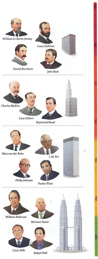
ABOVE: Poets in Steel [1890-2000]
• FIRST CHICAGO SCHOOL
William Le Baron Jenney; Louis Sullivan; Daniel Burnham; John Root
Also known as the “commercial style,” the First Chicago School grew out of the structural innovations pioneered by William Le Baron Jenney. The style was further developed by Jenney’s protégés Louis Sullivan and Daniel Burnham—both of whom performed their architectural internships at his firm—as well as John Root. The Home Insurance Building of Chicago was designed by Jenney and exhibited many of the distinguishing features of this style, including a steel frame with simple masonry cladding and large plate-glass windows.
-- 1915 --
• BEAUX-ARTS
“Beaux-Arts” refers to the neoclassical architectural style taught at the École des Beaux-Arts in Paris in the late nineteenth century, which heavily influenced U.S. architecture between 1880 and 1920. The best known architectural firm specializing in the Beaux-Arts style was McKim, Mead, and White; Cass Gilbert spent his early career there before starting his own practice and subsequently designing the neogothic-inspired Woolworth Building. Raymond Hood’s art deco masterpieces also characterized the period. More ornamental than the practical Chicago School style, Beaux-Arts buildings featured arched windows and doors, classical architectural details, and statuary and sculpture.
C. McKim; Cass Gilbert; Raymond Hood
-- 1940 --
• INTERNATIONAL STYLE AND SECOND CHICAGO SCHOOL
The international, or modernist, style, also known as the Second Chicago School, emerged initially in the 19205 and 19305; however, the Great Depression and World War II prevented it from flourishing. The 1950S completion of the United Nations headquarters, the Seagram Building, and Lever Building in New York—all distinguished by their boxy shapes and sleek glass façades—ushered in this new era. Best known among the internationalists were Mies van der Rohe, I. M. Pei, and Philip Johnson. Around the same time, Fazlur Khan, a structural engineer working for Skidmore, Owings & Merrill in Chicago, developed the concept of framed and bundled tubes—which would allow the skyscrapers of the late sixties and early seventies to reach even higher into the sky.
Fazlur Khan
• SUPERTALLS AND GREEN
At the end of the twentieth century, the quest to build taller expanded worldwide. Drawing on the structural innovations developed by Khan, Cesar Pelli designed the record-setting Petronas Towers in Malaysia. A decade later, Bill Pedersen and his colleagues at Kohn Pedersen Fox designed the supertall Shanghai World Financial Center in China. Simultaneously, as an awareness of global warming gave rise to the “green building” movement, architects began to look for ways to make buildings more energy efficient. The green skyscraper designs of Sir Norman Foster, like those of Cesar Pelli’s son, Rafael, ushered in a new era of sustainable building design.
Rafael Pelli
Selecting a Design:
Even on a heavily constrained site in the middle of a dense city, a skyscraper can take many forms to meet a developer’s programmatic needs. Historically, skyscrapers in Chicago and New York have either taken the form of a tower on a podium or have risen straight up from the street. They typically have been square or rectangular, although more recently some have taken a more elliptical shape. Most frequently, they have ended in an elegant spire or been crowned by a blunter, functional top.
Today there are many, many more options for skyscraper forms. Thanks to technological advances, towers can bend back on themselves or incorporate large openings to decrease wind resistance. Their service cores may be on the outside of the structure rather than in the middle of it. They can twist and turn, and—in seeming defiance of the laws of gravity and conventional building wisdom—can even be larger at the top than they are at the bottom.
In general, residential buildings tend to be slimmer than commercial ones. Residential floor plates are smaller, so as to allow natural light into most, if not all, rooms. In commercial buildings, natural light is less of a consideration and large, flexible floor plates are more likely to meet tenants’ needs.
But there are few other rules that define what shape tower is appropriate for a particular site. So long as the developer’s functional and financial needs are met, the choice of form is largely an aesthetic one. In some cases, a particular architect will be chosen by a developer and asked to provide one or more designs. In other cases, developers will hold an informal competition among short-listed architects to select a preferred design—sometimes paying them a stipend for their time and effort.
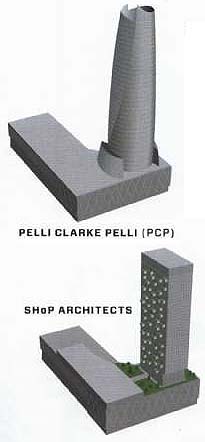
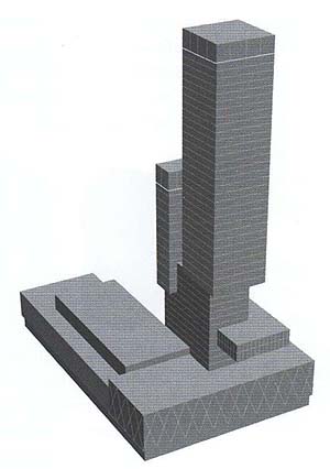
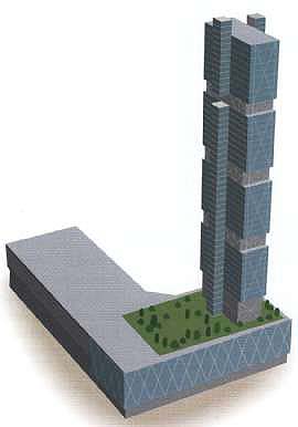
A tower for the bus terminal: In 2008, the Port Authority of New York and New Jersey and its partner, Vornado Realty Trust, invited four firms (a fifth was added subsequently) to submit preliminary designs for a tower of roughly 1.6 million gross square feet (150,000 square meters) that would sit atop a newly renovated wing of the Port Authority Bus Terminal at West 42nd St. and 8th Ave. in Midtown Manhattan. This north wing of the bus terminal had been constructed in the 1970s with the knowledge that a tower would someday rise above it; hence, the structural supports to take the gravity load were built into the terminal. But even with the limitations of an already built foundation, the designs submitted by some of the world’s foremost commercial architects differed radically from one another.
PELLI CLARKE PELLI (PCP) This elliptical-shaped tower design presented o dramatic contrast to the rectilinear bus terminal podium upon which it would stand. The skin of the office building appeared to wrap around the structure in a series of folded leaves projecting upward from the base. The lobby of the building would be located on West 42nd a main thoroughfare that offers easy access to crass town transportation.
SHoP ARCHITECTS The design far this tower was the “greenest” of the four entries. The firm designed a classic rectilinear tower but incorporated a system of hanging gardens on its southern face. A sky lobby was located on the fifth floor of the terminal, where a car drop-aff facility would operate in conjunction with the terminal’s existing ramp structure. Double-paned glass was specified to allow for better management of solar and thermal impacts.
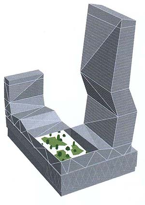
TALLER DE ENRIQUE NORTEN ARQUITECTOS (TEN ARDUITECTOS) A building that literally bent in the middle— not once, but twice—was featured in this submission. External bracing needed to stabilize the structure featured prominently in the building’s appearance. The building’s lobby would be located an the corner of 8th Ave. and West 41st St., the latter an underutilized street that offered capacity far taxi drop-off and black- car queuing. A publicly accessible sky terrace projected south from the building’s fifth floor across the roof of the southern half of the bus terminal.
KOHN PEDERSON Fox (KPF) This tower design was composed of two vertical elements: one sized to reflect the old McGraw-Hill Building adjacent to the tower’s western flank along West 42nd St. and one that reached higher, to reference Renzo Piano’s New York Times Building across the street on 8th Ave. They rose as port of a series of cubes of different sizes, mimicking the cubist form of the podium at the building’s base. The initial design included a series of a trio midway up the tower, to be used by corporate tenants as points of connectivity between their office staff on separate floors.
ROGERS STIRK HARBOUR + PARTNERS
This entry was ultimately awarded the schematic design contract—after each of the four original designs was ruled out on account of cost, aesthetic, or constructability issues. The design produced by the Rogers team resembled none of the other proposals. To ensure that the flow through the bus terminal below would not be impeded by penetrations from above, the firm chose o unique side-core design that featured elevator banks on the north and south extremities of the building. This resulted in large, unobstructed floor plates that would provide flexibility to potential office tower tenants looking to maximize internal layout options. To segregate office workers physically and psychologically from the busy bus terminal, a sky lobby—accessed through a bank of shuttle elevators at the building’s 8th Ave. street-level entrance—was designed to welcome workers an the fifth floor of the structure.
Designing the Shanghai World Financial Center
The construction of the Shanghai World Financial Center, the world’s third-highest building, highlights just how complex skyscraper construction—at the intersection of engineering, architecture, economics, and even politics—can be. Begun in the early nineties, when Japanese developer Minoru Mon hired Kohn Pederson Fox to design a building in Shanghai’s Pudong district, the building was not completed until 15 years later.
Two gently sweeping arcs rise in prismlike fashion from the ground to converge near the top of the tower, representing the confluence of the earth and the sky.
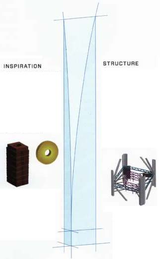
STRUCTURE:
The building’s foundation was laid in 1997, but the Asian economic crises brought a halt to the project. When it resumed, in 1999, the developer wanted a bigger building—a 15 percent increase in gross area. Building bigger on the existing foundation required decreasing the weight of the building by 10 percent and redistributing its load.
So a new structural system was devised: by introducing outrigger trusses—which connect the building’s core with mega-columns on its corners—the size of the core walls and the weight of the steel on the perimeter were significantly reduced.
Design Development
The choice of a design that meets a developer’s programmatic needs, in terms of the amount of square footage on each floor and the type of use, and shares the company’s aesthetic sensibility is an important first step in building a skyscraper. But the selection of a conceptual design represents only the beginning of a design development process that typically takes anywhere from 12 to 18 months. During that period the design will be refined many times and in many ways—in response to the building’s structural needs, to its projected cost, or simply to the changing aesthetic whims of either the developer or potential tenants.
Sometimes the design process takes even longer, because design criteria change along the way or because the project is put on hold for some reason. Many of the building projects halted in the wake of the 2008 recession may take a different form than originally envisioned when they are ultimately constructed.
INSPIRATION:
Inspiration for a tower’s form can come from many places. In the case of the Shanghai World Financial Center, architect Bill Pedersen’s inspiration came from ancient China, when the earth was represented by a rectangular prism and the sky by a circular disk.
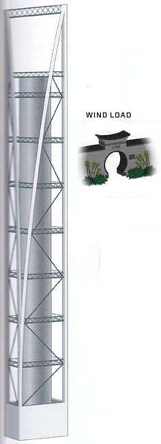
WIND LOAD:
The structural system was not the only component of the building that would witness significant change during the design process. To reduce lateral loads on the building as much as possible, a circular hole (referencing a traditional Chinese moon gate) was placed atop the building.
It allowed the wind at higher elevations to pass through, thereby reducing the lateral pressure it exerted on the structure.
At first, ideas of reducing its circularity by introducing a promenade across the circle, or a Ferris wheel within it, were explored. These were ultimately dismissed in favor of a trapezoidal hole.
POLITICS:
However, the circular hole came under criticism for evoking the rising sun of the Japanese flag—a sensitivity no doubt related to the nationality of the developer and the history of Sino-Japanese relations.


Zoning:
The visions of skyscraper architects are colored by a variety of things, many of them engineering-based, such as the weight-bearing capacity of foundations or the flexibility of certain materials. But they are also shaped by rules and regulations governing land use— including building codes, height restrictions, and what is commonly known in the United States as zoning.
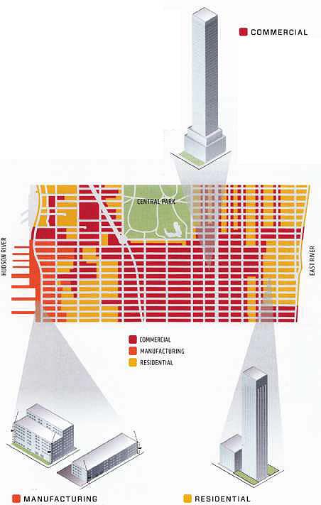
Zoning and land-use regulation are important in understanding skyscraper design for several reasons. They determine the use allowed on a particular site ( For example, residential or commercial), the size of a building, and sometimes even its shape.
The world’s first zoning ordinance was passed in New York in 1916, on the back of an outcry over the Equitable Building’s towering façade and the seven-acre shadow it cast over lower Manhattan. Since that time, zoning has been a key land- use tool for urban planners around the world, both to protect against incompatible uses and to ensure that light and air continue to reach city streets in even the densest of urban areas.
Modern zoning and land-use regulations are more refined tools than they were a century ago. They still protect against incompatible uses, but they may also incorporate parking requirements, sustainability practices, street-wall heights, sidewalk widths, and even rules relating to advertising on building façades.
In the last half century, zoning has also become a tool to incentivize development of a certain type of building or of related amenities, such as parks or public plazas. Today it’s actively used to encourage the mix of residential and commercial uses now thought of as central to successful neighborhoods as well as to facilitate special forms of development at geographically unique locations, such as transit hubs or the waterfront.
A sample of Manhattan zoning:
In Manhattan, a variety of district designations govern the size and Use of buildings. Designations beginning with an “M” signify a manufacturing district; those beginning with an “R” signify residential; and those beginning with a “C” signify a commercial district. Generally, the letter designation will be followed by a number that conveys the intensity of activity permitted in that district: RB districts, For example, permit midrise (eight- to 10-story) buildings, while R districts allow higher floor-area ratios (FAR). The FAR determines the amount of floor area permitted as a multiple of the area of the building lot.
• COMMERCIAL: Most C6 districts are areas well served by mass transit. Corporate headquarters, large hotels, entertainment facilities, retail stores, and high-rise residences in mixed buildings are permitted a maximum floor-area ratio (FAR) of 10 or 1 times the size of the base site.
• RESIDENTIAL: Rio districts permit the highest residential density in the city—a FAR of 10 that can be increased to 12 if provisions for affordable housing are included. In Manhattan, much of Midtown and downtown, as well as major cross-town streets and avenues, permit Rio density.
• COMMERCIAL
• MANUFACTURING; RESIDENTIAL
• MANUFACTURING: M2 districts occupy the middle ground between light and heavy industrial areas. They are mapped mainly in the city’s older industrial areas along the waterfront, including Manhattan’s Hudson River piers, and hove varying floor-area limitations.
Incentives:
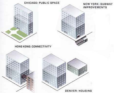
The phrase “incentive zoning” is often used to refer to floor-area bonuses that are given to developers in exchange for the provision of certain public amenities. Perhaps most common among the amenities that planners aim to provide is affordable housing. Developers of residential towers will commonly be incentivized (and sometimes required) to build affordable housing at or near the site of their tower or, alternatively, pay a certain amount into a civic housing fund.
Other amenities that have commonly been incorporated as bonus items in zoning codes include public plazas and space, parking, transit improvements, and sustainability goals. In return for providing one or more pubic amenities, developers are generally given the right to build out additional floor area (i.e., the FAR is raised on that particular site).
CHICAGO: PUBLIC SPACE -- In Chicago, developers who provide public plazas or arcades hove been eligible for floor-area bonuses since the 1940s. Current zoning rules encourage the provision of additional amenities including green roofs, underground parking, and water features.
HONG KONG: CONNECTIVITY--In Hong Kong, developers who provide public plazas or elevated walkway connections between office buildings in the downtown area are eligible for a floor-area bonus.
NEW YORK: SUBWAY IMPROVEMENTS -- In New York, developers who provide a series of mayor Improvements to the subway network at or near their site may take advantage of a bonus of up to 20 percent of the base floor area otherwise attributable to their site.
DENVER: HOUSING -- In Denver, any developer of rental housing who provides affordable units receives a 10 percent density bonus, a subsidy toward the affordable housing, a reduction in parking requirements, and an expedited permitting process.
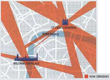
In certain cities around the world, the criteria for locating skyscrapers are less quantitative and more qualitative than the FAR-based zoning calculations common in parts of the United States. In London, For example, new towers need to meet certain subjective criteria: they must prove attractive as landmarks, prompt local economic development, and be sensitive to the character of their surroundings.
Building tall in London -- The city is particularly concerned about the impact new development might have on existing view corridors—particularly views of St. Paul’s Cathedral or the Palace of Westminster. Buildings that affect these views, either by blocking the landmark itself or by projecting into either the foregrol4nd or the background of a particular view, are scrutinized carefully. The impact on other “protected vistas,” including London panoramas, river prospects, townscape, and linear views, is also taken into account during the approval process.
The Core:
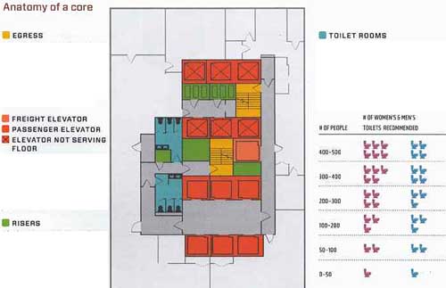
The design of almost any high-rise structure starts with locating the core—the area of a skyscraper that houses elevators, fire stairs, bathrooms, machine rooms and utility closets. “Risers,” which bring power, water, air, and telecom to each floor, are also located within the core.
The configuration and location of the core will vary from building to building, depending on its use and size. In the United States, cores are generally located at the center of commercial buildings, but they may also be placed to one side (a side-core building) or in multiple locations (more common in residential towers). Wherever it is, the core has a major impact on how each floor of a skyscraper is laid out.
The core does more than just provide a home to the building’s pipes and elevators. It can also serve as the main structural element allowing a skyscraper to withstand both horizontal and lateral forces. Generally made of a combination of steel and concrete, the cores of most buildings play a critical role in providing the stiffness needed to withstand the force of strong wind gusts— particularly for higher floors.
Designing a core is very much a mathematical exercise and involves coming up with a plan for a typical floor (a “floor plate”) that meets a developer’s programmatic needs. Two critical features in determining the floor plate in commercial towers are lease depths and the number of elevators required to service the building’s projected population.
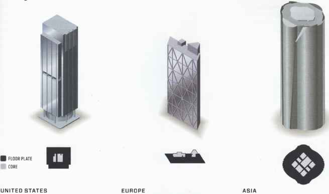
Lease depths, the amount of usable space from the exterior wall to the edge of the core, can range anywhere from 20 to 50 feet (6 to 15 meters). In commercial buildings in the United States, lease depths typically fall between 40 and 50 feet (12 to 15 meters). European floor plates tend to be shorter to allow more penetration of natural light, while commercial buildings in Asia often have deeper floors.
Elevators are equally important to core design and floor layout. The number and size of passenger elevators can vary dramatically based on building type: hotel, residential, and office towers have very different patterns of peak elevator usage and demand. Freight elevators, as well as firefighter lifts (used in certain countries by fire personnel in an emergency), vary in size and number as well and must also form part of the core.
In addition, considerations must be given to handicapped accessibility. In the United States, the Americans with Disabilities Act (ADA) sets specific accessibility guidelines for public spaces and commercial facilities. This act includes requirements on the widths of doors, the number and types of elevators, wheelchair-accessible toilet room fixtures, the design of fire stairs, and the nature of floor surfaces.
Anatomy of a core:
EGRESS -- Like other buildings, skyscrapers must have an unobstructed way for people to exit the building in an emergency. If more thon one exit access is required, two exits must be separated by a minimum distance that is based on the dimensions of the floor.
• FREIGHT ELEVATOR
• PASSENGER ELEVATOR
• ELEVATOR NOT SERVING FLOOR -- Elevator shafts and lobbies consume most of the space in a building’s core and will typically feature two or more banks of cars servicing different floors. Inactive elevator lobbies are often used for toilet rooms.
• RISERS -- Also known as service cores, these vertical penetrations allow electrical cables, plumbing, heating, cooling and ventilation ducts, and piping to find their way from the street to dedicated mechanical floors or rooms and occupied floors.
TOILET ROOMS -- While “potty parity” laws dictate the equal or equitable provision of toilets for women and men within public and commercial spaces, the American Rest Room Association recommends a greater number of toilets for women as the number of people on a given floor grows.
# OF WOMEN’S & MEN’S
# OF PEOPLE TOILETS RECOMMENDED
Building typologies-- Cultural factors have a significant impact on the layout and design of skyscraper floors, and hence on a building’s ultimate appearance. As a result, significant differences in the typical size and shape of buildings can be found around the world.
• FLOOR PLATE
• CORE
UNITED STATES--In the United States, a tradition of relatively short commercial leases (often 15 years) results in emphasis being placed on the flexibility of floor plate design. Mechanical ventilation is expected to be provided, as is redundancy of power and telecom systems, so the amount of space given over to mechanical space on each floor can be significant.
EUROPE--Continental Europe still relies heavily on natural ventilation rather than air-conditioning—in part because of the milder summers. Office workers in the European Community have a right to work within 25 feet (eight meters) of natural light, so floor plates tend to be smaller and towers more slender. This shape is conducive to private offices, which are more prevalent than they are in the United States.
ASIA--In Japan, skyscrapers are often more bulky than those in the United States. This is largely due to the value placed on structural strength and the assumption that wider buildings will perform better in earthquakes than thinner ones. Contractors play a larger role in determining the design of a building than they do in the United States or Europe, further contributing to this emphasis on structural integrity.
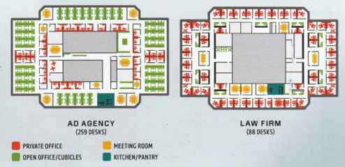
Test fit -- Most commercial spaces are offered by landlords as "core and shell," with few finishes to the space other than common areas. Prior to renting a space, most commercial tenants will hire an architect to develop a "test fit" to determine whether the space suits their operational needs.
The way tenants use a space can vary dramatically. Law firms typically tend to favor exterior offices, whereas many media and design firms favor open, collaborative spaces. Financial service firms may require large, open trading floors to accommodate several hundred traders.
AD AGENCY (259 DESKS)
LAW FIRM (88 DESKS)
- PRIVATE OFFICE
- OPEN OFFICE/CUBICLES
- MEETING ROOM
- KITCHEN/PANTRY
Stacking
Gone are the days when companies could afford to build skyscrapers simply to market their image or brand. Today, with very few exceptions, skyscrapers are built to make money. A corporate headquarters building must prove itself cheaper than the cost of renting space elsewhere—and those that do will typically not be built by the corporation itself but by developers with expertise in managing the complex process of development.
Before any skyscraper is built, a developer’s architect will complete a stacking diagram, which identifies the amount of floor area on each floor and its intended use. Typically, underground areas will be used for parking, storage, and mechanical support. One or two levels at or just above the street will be used for retail, which tends to generate greater revenues than any other ground- level use. The remainder of the tower may be devoted solely to commercial offices or developed as a hotel or residential property, with units to be sold or rented. In some cases, skyscrapers feature both commercial and residential or hotel uses stacked on top of one another—in what has come to be known as a “mixed-use building?’
The amount of space devoted to mechanical infrastructure ranges widely from building to building. The number and location of mechanical floors is generally determined by the size of the building and the amount and type of services demanded by tenants. It may also be a function of the sophistication of municipal infrastructure, and the need for backup power generation or water supply.
The stacking diagram incorporates all of these uses and is an important tool in calculating the profitability of a prospective building. It assigns specific amounts of square footage to both revenue- and nonrevenue-producing uses, each of which carries with it a specific build-out cost and a specific forecast for future revenue. The total square footage assigned to a use, together with the per-square-foot (psf) costs and revenues associated with that use, form the basis for a building pro forma that represents the overall economics of the project.
Stacking it up:
Most skyscrapers are designed to incorporate multiple types of uses, generally stacked one above the other. Historically, towers included retail below and either residential or commercial space above. Today, an increasing number of tall buildings incorporate both uses above a retail base.

HOTEL / RESIDENTIAL
In a mixed-use skyscraper, hotel or residential uses ore typically placed at the top of the tower. Placing these uses higher in the building allows the developer to command better rental rates or sales prices by selling the superior views and prestige of being “on top.” Practically, residential and hotel users place less demands on an elevator system and will therefore consume less space on the lower floors for shafts.
MECHANICAL -- The location of mechanical floors will be a trade-off between proximity to infrastructure at the street level and proximity to end users on the occupied tower floors.
• OFFICE -- Office uses place the heaviest demand on elevator systems due to the higher density of workers and peak use demands in the morning, at noon, and in the evening. Intensive uses like trading floors will be located lowest in the building and may even require dedicated elevator systems.
• RETAIL -- In most cities, street-level retail will command the highest rents on a per- square-foot basis. However, rents drop off significantly as distances from the street increase, so retail will typically only be located on the first two to three floors of a skyscraper podium.
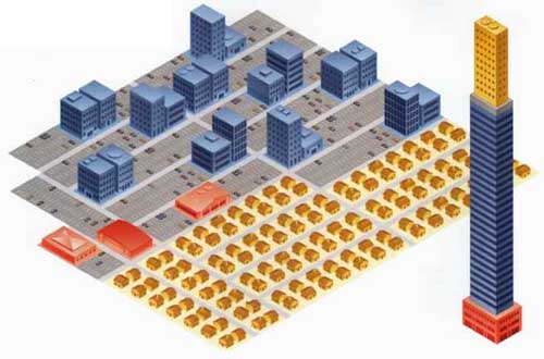
What would it look like in the suburbs?
A notional 1.3 million square foot mixed-use skyscraper with a FAR of 15 will cover 60 percent of a typical New York City block. The same 135,000 square feet of retail (12,500 square meters), 225,000 square feet of residential (21,000 square meters), and 875,000 square feet of office (81,000 square meters) spread over a typical suburban setting with strip malls, one-quarter-acre (01 hectare) building lots, and open parking would cover more than 21 New York City blocks.
How high should it be?
The decision as to how tall a skyscraper will be is only rarely an aesthetic one. Developers first determine the “economic height” of a building: the number of stories that will produce the greatest return on the money invested in the building’s construction and operation.
As buildings grow taller, they demand stronger foundations and bracing, larger mechanical systems, and—of primary importance in the days of supertall buildings—more elevators. Quite apart from the costs associated with all of this extra construction, each additional bank of elevators reduces the floor area available for rent or sale—thus pushing down the revenue potential for the building.
The ideal height for a skyscraper will vary from place to place, depending on the cost paid for land, the size of the plot, the level of rents, zoning restrictions, and the cost of construction. In assessing the economic virtues of one design against another, a developer will usually assess the cost per foot (both the “hard costs,” including materials and labor involved in construction, and the “soft costs,” including financing, permitting, and design work) and compare it to the revenue per foot to be generated in rent or sales.
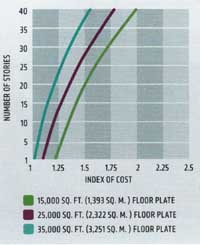
INDEX OF COST: THE HEIGHTS BUILDING IT DESIGN
Making It Memorable:
Even with all the constraints placed upon them, such as zoning rules, building codes, structural requirements, and above all the need to make money, architects have—for more than a century— found ways to realize their visions in the sky. In the early decades of the twentieth century it was the building’s crown that proved most distinctive: the spires of the Woolworth and the Chrysler buildings, For example, speak for themselves. Today, thanks to advances in electronics, materials science, and construction, there are many different techniques employed to make a skyscraper stand out from its peers—including the way it’s lit, the signage that is placed at its base or top, and the nature of its silhouette against the skyline.
Lighting
EMPIRE STATE BUILDING -- The lights at the top of the Empire State Building change almost daily to celebrate holidays (e.g., green for St. Patrick’s Day), sports events (e.g., blue and white for a Yankees championship), or official visitors (e.g., blue for the United Nations General Assembly).
BURJ AL ARAB -- This Dubai hotel is shaped like the sail of a dhow, with two “wings” spread in a V to form a vast “mast.” At night, a complex arrangement of projected lighting makes the Burj a changing beacon seen from outside and provides a dramatic show for those inside its atrium.
COMMERZBANK HEADQUARTERS -- The exterior lighting of this Frankurt tower was designed by famed lighting artist Thomas Emde, with changing hues of gold that complement and highlight the overall design of the building.
Signage: Sometimes buildings are notable simply because of the signs placed upon them. Certainly this is true of New York’s Times Square, where skyscrapers compete for the most innovative signage, ranging from advertising to news tickers to sports clips. But skyscraper signage may also be found at the top of the building, notable only from a distance or from an airplane. In most cases, the right to stick a corporate name atop a building comes with ownership—or at least a long-term lease.
Crowns
TRIUMPH PALACE The tallest tower in Europe when completed in 2006, this Moscow tower is sometimes called Stalin’s Eighth Sister” after the similarly designed Seven Sisters built during the Stalin era.
WOOLWORTH BUILDING The neo gothic New York landmark is topped by a copper pyramidal cap and distinguished by overscaled finials and crockets that add to its upward movement.
CHRYSLER BUILDING The distinctive spire of this art deco New York icon was secretly built inside of the building and raised at the last minute to win a crosstown height race with the Bank of Manhattan Building.
TORRE CAJA MADRID This Madrid headquarters building is essentially a tall arch, with the service and circulation cores framing uninterrupted office floors at its center.
CITIGROUP CENTER The slanted roof of this New York skyscraper, designed originally to house solar panels, was a departure from the prevailing flat-roof international-style buildings of its time.
TRANSAMERICA PYRAMID The shape of this San Francisco landmark allows more air and light to reach the street. Two wings on either side accommodate elevators and egress stairs.
Pairs:
EMIRATES TOWERS--While the Jumeriah Emirates Towers Hotel in Dubai has more floors, its companion Emirates Office Tower is taller due to larger floor-to-floor heights.
BAHRAIN WORLD TRADE CENTER--The sail-shaped towers of the Bahrain World Trade Center are connected via three sky bridges, each holding a wind turbine.
PETRONAS TOWERS The Petronas Towers in Malaysia feature a sky bridge that links the forty-first and forty-second floors and can be slid in and out of the towers to prevent breakage during high winds.
Previous: History
Next: Foundations


