Dressing well is an art. When creating a work of art, the artist considers elements of design principles of design, and facts about color behavior.
What are these elements, principles, and facts? How can you apply the object of this section is to provide you with this knowledge.
While you are acquiring this knowledge keep yourself in mind and consider how this knowledge can affect your appearance.
ELEMENTS of DESIGN
The elements of design which you should understand are line, color, texture, and form.
1. Line — the path along which the eye travels from one point to another.
Lines can be used to emphasize and attract attention. Lines in clothing are indicated by seams, hem edges, edges of fronts, edges of folds, necklines, belts, yokes, and so on. Lines can be suggested by the use of trimmings and ornaments which draw the eye up, down or across, to invite the attention to certain areas of the garment and body.
Lines may be vertical, horizontal, curved, straight, diagonal, radiating, angular or zigzag. Lines can be restful or suggest motion. Lines may suggest youth or be symbolic of age.
Lines are capable of creating optical illusions. By creating optical illusion you can add inches to your height if you are short; if you are stout, these added inches will make you appear slimmer. Lines, cleverly used, can seem to take inches off your height or give you a plumper figure. There are many optical illusions which do wonders for imperfect figures. Very few people have perfect figures, but many appear to have because they have used lines to conceal or to draw the eye away from their figure faults.
Study the diagrams. Observe the directions in which the lines travel. Consider how these lines can be used to conceal figure faults and to emphasize good points. Observe how they have been used in the garment design.
In all pattern books and on all pattern envelopes there are small line drawings which show the lines of the garment (seams, darts, folds, neckline, collar, cuffs, yokes, jacket edges). Study these line drawings when choosing your pattern. How your eye reacts to these lines will help you to decide how you will look in a pattern design.
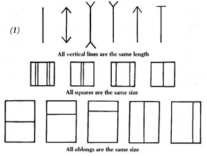
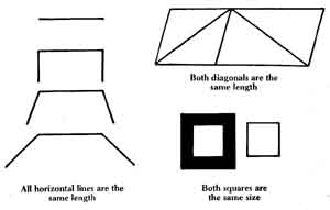
2. Color — the hue or appearance that a body presents to the eye; the property of reflecting light of a particular visible wave length.
Colors can change the apparent size and shape of an object. Colors affect the other colors near them. Colors seem to affect distance, temperature and human behavior. Colors have the quality to reflect light rays, to transmit light rays.
The neutral colors are black, white and gray.
Black — stops the rays of the sun and doesn't send the rays back. Consequently, black is the warmest color you can wear.
White — reflects the rays of the sun, so it's the coolest color you can wear.
Colors appear to be different under different types of lighting (natural, artificial). Match or choose colors for clothing in the same type of light as they will be worn (daytime wear, evening wear).
Give thought to the use of colors that appear to affect distance. Blue objects appear to recede; red objects appear to come toward you.
The closer an object is, the larger it appears.
Yellow appears to increase the size or bulk of objects because of its ability to reflect light. This ability varies according to the hue. Strong yellow should be used in small quantities because a small spot is equal in effect to a large area of a more neutral tone. The yellow center of a flower bears out this fact.
There is magic in colors, and the knowledge of how to use this magic to your advantage could change your whole life. Use color to make your surroundings more attractive, your clothing more becoming, and your outlook on life more cheerful.
3. Texture — the surface quality of an object which can be felt as well as seen.
Some of the terms used to describe texture are: smooth, rough, coarse, fine, slippery, wrinkled, sleek, shiny, and glossy. In fabrics the texture is affected by the fiber, the yarn, the weave, and the finish. Textures have a tremendous effect on colors. Rough textures make colors more dull; smooth textures intensify colors. Rough textures tend to increase the size of an object. Because of these effects, texture can be used to create illusions. There is magic in texture as well as in color.
4. Form — the outline or shape of any object as determined by line; the visible shape of a thing.
The form in dress is often referred to as the silhouette. The form of a garment may follow the form of the body closely and is referred to as form revealing. Loose fitting garments can be form concealing.
Stout women should never wear tight fitting garments because the tight fitting garment leaves no doubt as to the shape beneath it.
The smart girl or woman finds a garment or style which reveals the parts of her figure which will bear revealing or which conceals the parts which should be concealed.
Are you beginning to understand how the elements of design must be considered both separately and together?
Because of the magic that can be worked by the combination of line, color, texture, and form, designers of costumes for use in the theater use their knowledge to create comic and ridiculous characters and to emphasize undesirable characteristics. A short, stout figure can be made to appear huge by the use of wide, horizontal stripes; bright, shiny colors; rough textures or bulky fabrics; printed fabrics with huge dc signs; bold plaids; long-haired furs; flat, large-brimmed hats.
Remember:
Line
- Vertical lines move up and down, giving the appearance of height.
- Horizontal lines travel across the figure, dividing it into sections or spaces. They add width and subtract from the apparent height.
- Diagonal lines can add either width or length, depending on the angle of direction. They add interest and can give a sense of rhythm or of mo hon. Radiating lines can invite the eye as you v
Color
- Color is usually the first characteristic of an object that we notice in a costume and is remembered longer than the other characteristics.
- Warm colors seem to stand out and advance.
- Cool colors seem to recede; they are relaxing and restful.
- Warm and advancing colors tend to make the object appear larger.
- Bright colors tend to make the object appear larger.
- Cool colors tend to reduce the size of the object.
- Dull colors tend to reduce the size of the object.
- Light colors tend to enlarge the size of the object.
- Dark colors tend to reduce the size of the object.
- When warm colors and advancing colors are grayed they lose some of their brightness and power.
- Darker values of warm colors are less advancing.
Elizabeth Barrett Browning said, “Colors seen by candlelight will not look the same by day.”
Texture
- Smooth, shiny fabrics acid brightness and lightness to colors. (The same red dye will look lighter and brighter in rayon satin than it will in a soft wool crepe.)
- Rough, dull fabrics add darkness and dullness to colors.
Form
- Form denotes the size or bulk of an object and its characteristic appearance, apart from the color.
- Curved surfaces reflect light. Garments that fit tightly over body curves reveal the shape or form of the figure; if the fabric is shiny, the apparent size of the curve is increased.
- If the fabric is rough and bulky (texture) the size of the curve is increased.
- Bright, warm colors add to the apparent size of the curve.
PRINCIPLES of DESIGN
The knowledge and understanding of the principles of design will enable you to recognize good design when choosing patterns; when buying ready-made garments; when planning accessories for a costume or ensemble; when planning a wardrobe. This knowledge is equally useful. when choosing home furnishings and when building or buying a home.
The principles of design are balance, proportion, rhythm, emphasis, and harmony.
1. Balance — when two parts are equal in weight or power.
Balance in clothing is how we distribute line, color, texture, form, and other interests to give a feeling of order and restfulness.
Formal balance, bisymmetrical, is shown by two pockets at the same level; a group of pleats on either side of a garment, and so on. It is quiet and dignified but if it's repeated too often it can become monotonous.
Informal balance, asymmetrical, is achieved by having equal interest on each side but placed at different levels or different distances from the center. It is a more interesting arrangement but requires more thought and skill. The greater interest should be placed nearer the center and the lesser interest farther away so it will not be lost in the overall picture — the longer or the larger space between it and the center allows the eye to give it the amount of attention equal to the amount given to the larger interest or attraction.
In some cases the color of the object will affect the distance because, as you have learned, some colors are more eye-catching and tend to advance and increase the apparent size of an object. This also applies choosing accessories and trimmings for clothing.
You learned that form and texture affect the apparent size of an object, so, form and texture must be considered to achieve balance. For example, think of the different types of trimming that could be used on garments — fine lace, coarse lace, braid, fine embroidery, heavy em broidery, velvet collars, lace collars; think of the different types of neck laces — fine chains, heavy chains, small beads, large beads.
On garments a more balanced appearance can often be achieved by the addition of a scarf, a flower, or a piece of jewelry.
A well-balanced costume should be pleasing when viewed from side to side, top to bottom, and front to back if there is trim or details on both front and back.
2. Proportion — a pleasing and satisfying relationship between space and size; the relationship of one part to another part and of all the parts to the whole.
Many people are born with a sense of proportion, others have to learn. Fortunately, it can be learned quite easily. In many instances, particularly in clothing, it's a matter of mathematics. Use your tapeline, ruler or yardstick. Understanding and observing the laws of proportion will assist you:
- in choosing the size and color of buttons;
- in deciding the amount of space to leave between buttons;
- in deciding the width of lace or braid and the spacing if you are using more than one row.
Remember: The elements of design and the principles of design affect the apparent size and shape of every part used to produce a whole com position.
A garment is divided into parts or sections vertically and horizontally by the construction details (seams, hemlines, collars, yokes, etc.) and by trimmings.
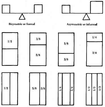

The overall picture of you as an individual in your costume, outfit or ensemble is divided into parts by: the line of the hair, the hat, the neckline of the garment, a necklace, the yoke of a dress, the blouse, the jacket, a large or small collar, wide or narrow lapels, wide or narrow cuffs, large or small pockets.
These divisions may be emphasized by a contrast in color or texture,. a combination of plain and patterned fabric, the use of lace, embroidered handing, braid, beading, the use of border-printed fabric.
What proportion should be used? Avoid the obvious — the most obvious divisions in our daily lives are halves, quarters, thirds and sixths.
- Avoid two-piece garments that cut the body in half.
- Avoid yokes on garments, with a waistline seam or belt, that will cut the length of neck to waist at exactly one-third or one-quarter. Instead, one-fifth or one-seventh will be more flattering.
This is a matter of measuring and mathematics.
The observance of this rule is very important when altering patterns or ready-made garments. The pattern designer observed the laws of proportion and balance; if you lengthen or shorten some sections of certain patterns you have changed the proportion of that section to the whole composition and the overall effect is no longer pleasing. For example:
- Two-piece garments — the skirt, jacket or overblouse, when shortened or lengthened, may divide the finished length from neck to hem in exactly half, and it's no longer flattering to your figure.
- Patch pockets on a dress, coat, jacket or overblouse have been set to divide the garment into a pleasing proportion. If the length in any part of the garment is changed the pleasing proportion could be lost.
Remember:
-When choosing styles, if you wish to appear taller, always have the longest space at the bottom of the figure to give a “long-legged” look, and you will automatically appear taller.
- Always check the position of the pockets before stitching them in place.
- Short sleeves which end at bust level will add width to that portion of the body.
- Three-quarter length sleeves which end at the hem level of a blouse or jacket will acid width to the body at that spot.
- The depth of cuffs on sleeves will affect the apparent length of the sleeve — especially if there is a contrast in color or fabric.
- Jackets or overblouses which end at hip level will seem to add width to the hips.
- Because the eye automatically follows lines, whether vertical or horizontal, lines definitely affect the over-all appearance of your figure.
3. Rhythm — a related and easy form of movement.
We achieve rhythm in clothing by the use of the elements of design (line, color, texture, form) to lead the eye in an easy form of movement. If the eye jumps from one line or one color to another and actually gets nowhere the arrangement of the elements becomes tiresome, confusing and irritating.
Decide on which direction you wish the eye to travel, usually, to draw the attention to some attractive characteristic and away from an unattractive one. The methods of using rhythm are by repetition, radiation, progression, and continuity.
Repetition — doing or repeating the same thing again and again which keeps the eve moving in a general direction. (See diagram 4 below.)
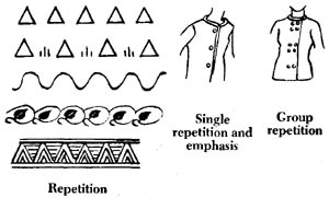
It has been said if you repeat the same line or form three or more times you have a design.
A single button halts the eye and emphasizes one spot. Three buttons keep the eye moving in a certain area. The longer the space between but tons, the longer the eve lingers at each button. Never place a large or colorful button at bust level on a large-busted figure.. Instead, have one button above and one below bust level. Buttons covered with the garment fabric draw less attention. Dull, dark buttons draw less attention. Rough-textured buttons will draw less attention than shiny buttons.
Radiation — branching out in all directions from a common center. (See diagram 5.)

Many examples of radiation are seen in jewelry (sunburst brooches); in designs for embroidery, for beading, for sequins; in darts and tucks around garment necklines. Other examples are found in the spokes of a wheel, in petals of flowers. You are surrounded by examples of radiation. Look for them.
Progression — moving forward; a regular and gradual advance. (See diagram 6.)
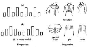
In the progression method of achieving rhythm, line lengths and area sizes are varied as they appear in groups.
In clothing the eye should be carried away from an unattractive part of the figure. Progression can be used to lead the eye up and down to emphasize length or height instead of width.
Continuity — a continuous or connected whole.
A continuous line can be straight, wavy, or zigzagged and still be unbroken. To break continuity of movement a line must be crossed by another line, or placed at an angle to it.
In clothing, princess lines reveal continuity. A dress with a waistline seam or a belt breaks the continuity of the up and down line.
4. Emphasis — to bring into special prominence.
You can put the principle of emphasis to work and create an illusion. Stress the part of the body that's worthy of emphasis and minimize the unattractive part or parts of the body, thus giving the illusion of a better figure.
Even the simplest patterns show emphasis somewhere. It is important that you are able to recognize where emphasis has been used and whether or not it will flatter you.
5. Harmony — a pleasing agreement of parts in a composition, making a pleasing whole. (See diagram 7.)

Harmony or unity is the result of law and order; all parts seem to belong together and there is a unifying clement among all the larger parts; small parts may contrast and may be used to accent or emphasize.
In clothing there should be a unifying element in line, color, form, shape, size, and texture.
To achieve harmony you must also keep in mind balance, proportion and rhythm.
Observe the beauty of line, color, texture, and form in nature. Notice harmony: in the colors of the seasons; in the colors of animals blending with the color of their natural surroundings. Notice harmony in the shapes of leaves and flowers Notice the form or shape of animals and birds; notice the proportion of parts of the body to each other and to the body as a whole; notice the rhythm of lines.
Study good pictures, good architecture, good objects of art and good clothing.
Until you can recognize how harmony of good design has been achieved you can't apply it.
Remember: “Simplicity is the keynote of good taste,” hence the expression “simply elegant”.
